


-
coffygroupAsked on April 21, 2014 at 1:57 PM
-
Mike_T Jotform SupportReplied on April 21, 2014 at 3:40 PM
Please provide us with the URL in question, so we will check the page from our side. Also, information about your mobile device might help in our investigation.
-
coffygroupReplied on April 21, 2014 at 6:04 PM
http://www.hubaxis.com/drmoche/contact-dr-moche/
-
CesarReplied on April 21, 2014 at 10:22 PM
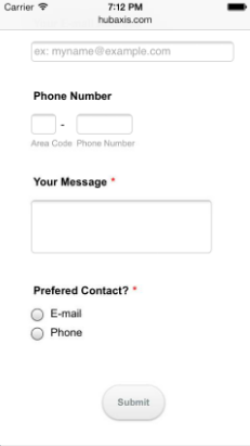
I have tested the URL you have provided on iPhone5s iOS 7.0. But I do not see any problems with the way the form is being rendered. Please provide more information on what you are experiencing. So that we may assist you further.
In any case I do suggest to use the iFrame Embed Method instead of the Standard Script Method you are currently using. This change should help avoiding any conflicts with other elements on your page.
Do let us know if you need further assistance. Thank you.
Screenshot of Test:
-
coffygroupReplied on April 22, 2014 at 2:51 PMPlease view the attached screenshot
Cheers,
*Chase Buckner*
Director of Operations
862.757.8055
... -
KadeJMReplied on April 22, 2014 at 4:20 PM
I am sorry, but we do not see any attached screenshot. Please use Our Image Repository then Our Image Tool to insert your screenshot. Alternatively, you can use a service like Imgur and simply copy then paste the image here as part of your answer.
-
coffygroupReplied on April 22, 2014 at 4:51 PMJust sent via repository. It's called jotform mobile view
Cheers,
*Chase Buckner*
Director of Operations
862.757.8055
... -
Welvin Support Team LeadReplied on April 22, 2014 at 7:54 PM
Please get the link of the uploaded image and paste it here instead. We cannot check the image as we do not have an access to our repository.
Please review this guide on how you can add the screenshot to our support forum: http://www.jotform.com/answers/277033.
Thanks
-
coffygroupReplied on April 23, 2014 at 11:11 AMYou don't have access to your own image repository???
https://cms.jotform.com/uploads/image_upload/image_upload/coffygroup/25618_jotform-mobileview.jpg
Cheers,
*Chase Buckner*
Director of Operations
862.757.8055
... -
coffygroupReplied on April 23, 2014 at 1:51 PMThe screenshot we sent is from a Galaxy S3. It does respond on iPhone
correctly.
Cheers,
*Chase Buckner*
Director of Operations
862.757.8055
... -
coffygroupReplied on April 23, 2014 at 4:21 PMThanks for your reply. We have injected the CSS, saved form, and are using
iFrame source, but the issue still persists. See screen shot from S3 phone:
https://cms.jotform.com/uploads/image_upload/image_upload/coffygroup/25629_Screenshot_2014-04-23-16-01-07.png
Cheers,
*Chase Buckner*
Director of Operations
862.757.8055
... -
Mike_T Jotform SupportReplied on April 23, 2014 at 5:38 PM
In this case, there is an issue with the iFrame height in Android browser.
We can directly increase the height via iFrame code, but this will actually increase the height on every browser:
<iframe id="JotFormIFrame" onDISABLEDload="window.parent.scrollTo(0,0)" allowtransparency="true" src="//form.jotformpro.com/form/41105149798965" frameborder="0" style="width: 100%; height: 700px !important; border: none;" scrolling="no"></iframe>
As an alternative, we can try to increase the height on mobile browsers only. If you have access to the following stylesheet:
http://www.hubaxis.com/drmoche/wp-content/themes/care/css/mobile-all.css
Add the following code (highlighted in yellow) before the last closing curly bracket }.
#footer-widget-area #first, #footer-widget-area #third, #footer-widget-area #second, #footer-widget-area #fourth{
margin-right: 10px; margin-left: 10px;
}/* Fix for JotForm iFrame on Android */
#JotFormIFrame {
min-height: 700px !important;
}
/* End of fix */
}Thank you.
-
coffygroupReplied on April 24, 2014 at 3:21 PMApplied the CSS fix Jotform sent over. Not working entirely.
Portrait view cuts off the right side of the form and does not display
submit button.
Landscape display shows nothing below first form fields and are cut off on
right as well.
Screenshots right off my phone.
Cheers,
*Chase Buckner*
Director of Operations
862.757.8055
... -
Mike_T Jotform SupportReplied on April 24, 2014 at 5:41 PM
It works better in Google Chrome of my Android phone, but it seems that default Android browser on the Galaxy S3 uses other styles based on the device-width.
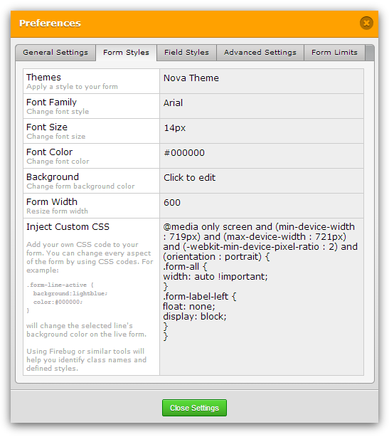
Lets try to fix the portrait mode. Please replace your current injected form CSS code with the following styles:
@media only screen and (min-device-width : 719px) and (max-device-width : 721px) and (-webkit-min-device-pixel-ratio : 2) and (orientation : portrait) {
.form-all {
width: auto !important;
}
.form-label-left {
float: none;
display: block;
}
}
Also, please add mentioned in previous post fix for iFrame height into 'MOBILE LANDSCAPE' section of http://www.hubaxis.com/drmoche/wp-content/themes/care/css/mobile-all.css file.
/* Fix for JotForm iFrame on Android */
#JotFormIFrame {
min-height: 700px !important;
}
/* End of fix */
- Templates
- Integrations
- INTEGRATIONS
- See 100+ integrations
- FEATURED INTEGRATIONS
 PayPal
- Slack
- Google Sheets
- Mailchimp
- Zoom
- Dropbox
- Google Calendar
- Hubspot
- Salesforce
- See more Integrations
- Products
- PRODUCTS
- Form Builder
- Jotform Enterprise
- Jotform Apps
- Store Builder
- Jotform Tables
- Jotform Inbox
- Jotform Mobile App
- Jotform Approvals
- Report Builder
- Smart PDF Forms
- PDF Editor
- Jotform Sign
- Jotform for Salesforce Discover Now
- Support


