


-
snoodlenoodle1Asked on April 22, 2014 at 1:55 PM
I am currently building a site for a client and trying to make the mobile version of a particular page display the jotform correctly. I have placed it in an iframe but for some reason it just won't display as it should. I have tried both the iframe code and the direct link but neither one seems to work as it should.. Can you please help me rectify this problem?
regards
Louie
-
TitusNReplied on April 22, 2014 at 4:00 PM
Hello Louie,
You can make your form responsive (or to fit in the div you have on the page) by adding Custom CSS to the embedded form.
You can add the CSS to your form by following this guide
Here is some CSS code you can use on your form to adjust the width to fit your div:
/*Make the form to accept the container width*/
.form-all {
width: inherit;
}/*Correct fields that are still spilling out*/
input#input_7_addr_line1 {
width: 100%;
}
input#input_7_addr_line2 {
width: 180px;
}
input#input_7_city {
width: 100px;
}
input#input_7_state {
width: 100px;
}
textarea#input_9 {
width: 100%;
}
select#input_7_country {
width: 100px;
}
input#input_11 {
width: 100%;
}
input#input_10 {
width: 100%;
}/*Center the submit button*/
button#input_2 {
margin-left: auto;
margin-right: auto;
display: table;
}Please let us know if this helps.
-
LouieReplied on April 22, 2014 at 11:31 PMI have placed the CSS in the form but although it is showing the form properly now, it is distorting the actual top and bottom of the site which does not happen on any other page..
Cheers
Louie http://www.sonicweb.com.au/lean/affiliate-mobile.html
... -
CesarReplied on April 23, 2014 at 12:04 AM
I have tested your website on a Alcatel 4033X and a Nexus7 (Google Chrome on both) the page appears to be rendered properly. I am not able to see anything wrong on the header and footer of your page. Please describe what you are seeing wrong and on what device is this happening.
So that we may assist you better. Thank you.
-
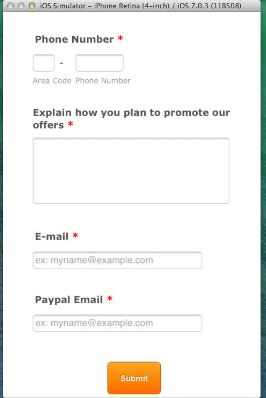
LouieReplied on April 23, 2014 at 6:51 AMI was testing it on an iphone 5S. I have attached in image so you can see how it shifts the top section to the left thus displaying a portion of the background on the right. I am however glad to hear that it works on other mobile devices.
Cheers
Louie
... -
jonathanReplied on April 23, 2014 at 9:52 AM
Hi Louie,
I also check the form in your website http://www.sonicweb.com.au/lean/affiliate-mobile.html on an Iphone 5S simulator, I was able to view the form correctly.
Unfortunately, we were not able to see the image you have attached since this forum is not capable of attachment. Please try uploading the image here http://tinypic.com/ then share to us the link of the images so that we can see also.
Please inform us if issue remains.
Thanks!
-
LouieReplied on April 23, 2014 at 10:21 AMHere is the link of the photo: http://tinypic.com/r/25i65pw/8 The form as you can see is displaying fine but it shifts the header of my site to the left.
Cheers
Louie
... -
Welvin Support Team LeadReplied on April 23, 2014 at 11:55 AM
Hi Louie,
Please try to re-embed your form using our iFrame Method: http://www.jotform.com/help/148-Getting-the-Form-iFrame-Code. See if will resolve the issue.
Thanks
- Templates
- Integrations
- INTEGRATIONS
- See 100+ integrations
- FEATURED INTEGRATIONS
 PayPal
- Slack
- Google Sheets
- Mailchimp
- Zoom
- Dropbox
- Google Calendar
- Hubspot
- Salesforce
- See more Integrations
- Products
- PRODUCTS
- Form Builder
- Jotform Enterprise
- Jotform Apps
- Store Builder
- Jotform Tables
- Jotform Inbox
- Jotform Mobile App
- Jotform Approvals
- Report Builder
- Smart PDF Forms
- PDF Editor
- Jotform Sign
- Jotform for Salesforce Discover Now
- Support


