


-
martinbondAsked on February 13, 2015 at 8:24 AM
-
CharlieReplied on February 13, 2015 at 10:10 AM
Hi,
Upon checking the previous thread that you have, I see that you are hiding and adding new contents to the table data on column 1. You could try adding this code to add a border effect:
table {
border-spacing: 3px !important;
}
td {
border: 3px solid red;
}
You could change the values depending on your preferences.
Kind regards
-
martinbondReplied on February 13, 2015 at 10:54 AM
Thank you, is it possible to add specific colour codes?
-
martinbondReplied on February 13, 2015 at 11:05 AM
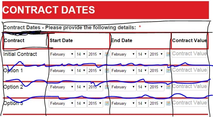
Also, how can you add a border around the title block area. See snip below, code doesn't seem to be fully functioning.
Ideally i'd have a border around the area of the whole Widget including title & column names. Then just horizontally between each column separation. Is this possible?
-
CharlieReplied on February 13, 2015 at 12:26 PM
Hi,
Here's an edited CSS code that might be simpler for you, this also involves the alignment of the static text that was first discuss, you'll need to replace all the CSS codes in the widget.
.col1, col2, col3, col4 {
margin: 3px 0;
min-width: 150px;
height: 50px;
font size: large;
}
textarea {
height: 50px !important;
width: 200px !important;
font-size: large;
}
th {
font-size : 17px;
}
tr {
font-family: arial;
font-size: large;
}
.col4 input[type="text"] {
font-size : large
}
select {
height: 30px !important;
}
table {
border-spacing: 2px !important;
border-collapse: collapse;
}
tr:nth-child(2) > td.col1 > span:before {
content: "Initial Contract";
}
tr:nth-child(3) > td.col1 > span:before {
content: "Option 1";
}
tr:nth-child(4) > td.col1 > span:before {
content: "Option 2";
}
tr:nth-child(5) > td.col1 > span:before {
content: "Option 3";
}
#customFieldFrame_249 {
padding-right: 20px !important;
margin-right: 20px !important;
}
tr td {
border-bottom: 4px solid #DC1F24 !important;
}
th {
border: 4px solid #DC1F24;
}
Here's the cloned form that I edited: http://form.jotformpro.com/form/50433479070958
Unfortunately the snip that you attached did not show, so I made assumptions on how you would like the grid and borders to show based from what you stated.
I hope this is correct. Do let me know if this works.
Thank you.
-
martinbondReplied on February 14, 2015 at 12:34 PM
Hi,
before going any further, I know I keep saying it but, this is the best customer service I've ever received online & your detailed responses are very much appreciated.My mistake, I meant to say Vertical line, see very armature snip below of how I want the grid lines to be styled. All in black is what I want, blue lines = remove existing red lines.
If you could alter the above code to suit that would be excellent.
Thank you in advance.
-
martinbondReplied on February 14, 2015 at 11:03 PM
-
martinbondReplied on February 14, 2015 at 11:09 PM
Hi please confirm if you can see the above screen shot, Can you also highlight which part of the code related to the vertical lines. If I don't like how they appear I can just remove this line of code.
-
Welvin Support Team LeadReplied on February 15, 2015 at 3:14 AM
Yes, we have received your screenshot and thanks for the outline.
How about this: http://form.jotformpro.com/form/50451822599966? ?
Thanks
-
martinbondReplied on February 15, 2015 at 3:23 AM
This looks great, only thing now is can you Vertically center all fields (text boxes, drop downs etc) so they sit in the middle of their respective border. Obviously I want the existing code to remain that horizontally aligns the fields to the border out line.
-
martinbondReplied on February 15, 2015 at 3:30 AM
as per heading fields.

-
Welvin Support Team LeadReplied on February 15, 2015 at 4:37 AM
Done! Kindly check again: http://www.jotformpro.com/form/50451822599966. Let me know if this is perfect so I can give you the overall changes in the codes.
Thanks
-
martinbondReplied on February 15, 2015 at 6:31 AM
Yes this is perfect, I assume I'll have the ability to change color codes of border lines?
-
Welvin Support Team LeadReplied on February 15, 2015 at 6:48 AM
Yes, that is correct. You can always change the color if you need to.
The overall custom CSS codes in the widget: http://pastiebin.com/54e086a4808d4. At bottom, you will find the following changes:
th {
border: 2px solid #000000;
padding: 5px;
}
tr td {
border-bottom: 2px solid #0047FF !important;
border-left: 2px solid #000;
}
td {
vertical-align: middle;
}
You have to run the widget configuration and check it in the widget custom CSS area:
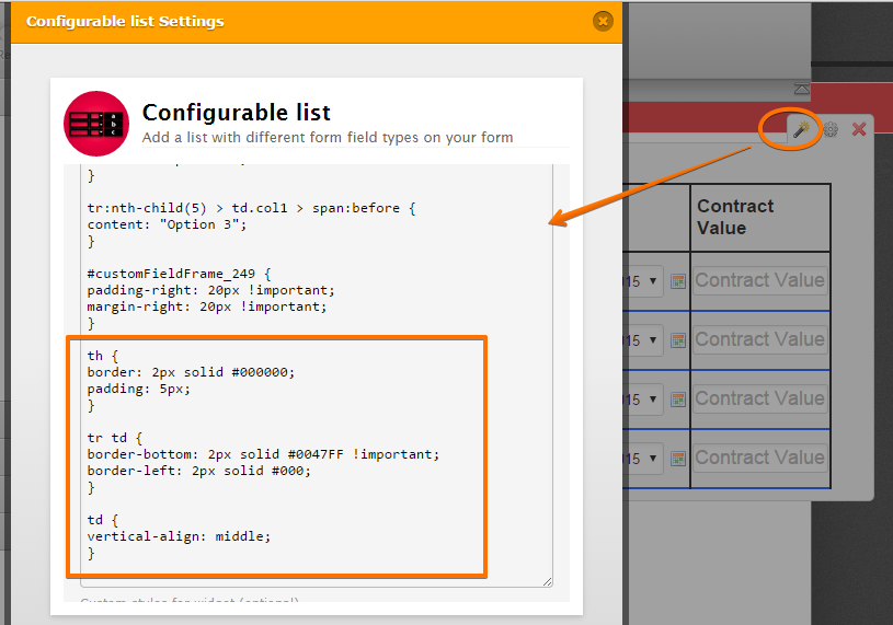
For the Label borders, the custom CSS are injected at the general CSS area of the form:
label#label_249 {
border-top: 2px solid #000;
border-right: 2px solid #000;
border-left: 2px solid #000;
margin-bottom: 0px;
margin-left: 0px;
margin-right: 38px;
}
Here's how you can check it: https://www.jotform.com/help/117-How-to-Inject-Custom-CSS-Codes. At the bottom part.
Let us know if you have any questions.
Thanks
-
martinbondReplied on February 15, 2015 at 12:49 PM
Hi, there seems to be an error in the code, it's replicating the first child text in every column. see screenshot.

-
martinbondReplied on February 15, 2015 at 1:46 PM
Perfect. Thank you. This is really pushing it but is there any way to have the following code at the start, reason being this is the info I'll be changing on my other widgets, so it will save me / future users who, believe it or not, are less competent with coding than myself, from editing any other the other styling code as they will not have to scroll down past it.
-
martinbondReplied on February 15, 2015 at 1:49 PM
tr:nth-child(2) > td.col1 > span:before {
content: "Initial Contract";
}
tr:nth-child(3) > td.col1 > span:before {
content: "Option 1";
}
tr:nth-child(4) > td.col1 > span:before {
content: "Option 2";
}
tr:nth-child(5) > td.col1 > span:before {
content: "Option 3";
}
-
martinbondReplied on February 15, 2015 at 1:57 PM
No I didn't mean within this thread, I meant within the actual code itself when injecting CCS in the widget. i.e move it above:
.col1, col2, col3, col4 {
margin: 3px 0;
min-width: 150px;
height: 50px;
font size: large;
}
I tried to simply c+p it but it took the text out of the fields.
Please advise if this is possible & apologies for not being clear.
-
martinbondReplied on February 15, 2015 at 3:11 PM
Yes but when I move it to the start of the code it takes out the "Initial Contract" text but keeps option 1, 2 & 3. please advise why this is.
-
martinbondReplied on February 15, 2015 at 10:42 PM
sorted, thank you for sticking with me on this one.
-
Welvin Support Team LeadReplied on February 16, 2015 at 2:55 AM
That's great to know and we're glad that we could help! Should you need any further assistance, please don't hesitate to contact us again.
Thanks for using Jotform!
-
martinbondReplied on February 17, 2015 at 11:45 AM
Hi,
Further to above, is it possible to have the rows in alternating colors?
-
CharlieReplied on February 17, 2015 at 12:18 PM
Hi,
Yes that is possible, you can try adding this code to your existing one:
tr:nth-child(1) {
background-color: red;
}
tr:nth-child(2) {
background-color: blue;
}
tr:nth-child(3) {
background-color: yellow;
}
tr:nth-child(4) {
background-color: pink;
}
tr:nth-child(5) {
background-color: white;
}
You can see how it looks like here: http://form.jotformpro.com/form/50475034460954. You can change the color depending on what you like.
Do let us know if you need more information on this.
Thank you.
-
cmt_adminReplied on September 6, 2016 at 9:18 PM
Hi,
I found this code in another similar discussion. Its more dynamic and easier to use.
#list tr td {
padding-top: 20px;
}
#list tr:nth-child(odd) {
background-color: lightblue;
}
#list tr:nth-child(even) {
background-color: lightyellow;
}
- Templates
- Integrations
- INTEGRATIONS
- See 100+ integrations
- FEATURED INTEGRATIONS
 PayPal
- Slack
- Google Sheets
- Mailchimp
- Zoom
- Dropbox
- Google Calendar
- Hubspot
- Salesforce
- See more Integrations
- Products
- PRODUCTS
- Form Builder
- Jotform Enterprise
- Jotform Apps
- Store Builder
- Jotform Tables
- Jotform Inbox
- Jotform Mobile App
- Jotform Approvals
- Report Builder
- Smart PDF Forms
- PDF Editor
- Jotform Sign
- Jotform for Salesforce Discover Now
- Support


