


-
clarkschoolAsked on January 25, 2016 at 5:50 PM
-
Kevin Support Team LeadReplied on January 25, 2016 at 6:32 PM
A good way to display the Configurable List widget properly on a mobile device is adding a custom CSS code, for example, on your form the widget is not being displayed properly on mobile devices, then you may add this CSS code in the widget, in order to split it in different lines:
th {
display: none;
}
.d {
display:none;
}
th {
display: none;
}
tr {
display: block;
}
.col1:before, .col2:before, .col3:before, .col4:before,.col5:before {
padding: 10px 10px;
border: 1px solid #ccc;
background: #ddd;
font-weight: normal;
font-size: 12px;
text-align: left;
display: block;
}
td.col1:before {
content:"Physician Name";
}
td.col2:before {
content:"Name of Practice";
}
td.col3:before {
content:"Location (City, State)";
}
td.col4:before {
content:"Phone Number ";
}
td.col3 {
display: block;
position: relative;
top: 20px !important;
width: 41%;
}
td.col4 {
display: block;
position: relative;
top: -79px !important;
margin-left: 151px;
}
input[type=text]{
margin-left:10px;
}
Then, the widget will be displayed in different lines, it will be displayed properly on mobile devices, since the responsive methods that could be applied to a form are not affecting the widgets.
I will provide the code that you should add to display all the Configurable List widgets by the same way on your form, the code provided above will work with the first widget that you have in your form.
For the second one, add this code:
/*custom CSS*/
th {
display: none;
}
.d {
display:none;
}
th {
display: none;
}
tr {
display: block;
}
.col1:before, .col2:before, .col3:before, .col4:before,.col5:before {
padding: 10px 10px;
border: 1px solid #ccc;
background: #ddd;
font-weight: normal;
font-size: 12px;
text-align: left;
display: block;
}
td.col1:before {
content:"Type of Allergy";
}
td.col2:before {
content:"Trigger";
}
td.col3:before {
content:"Reaction and Management";
}
td.col4:before {
content:"This causes anaphylaxis";
}
td.col3 {
display: block;
position: relative;
top: 20px !important;
width: 45%;
}
td.col4 {
display: block;
position: relative;
top: -101px !important;
margin-left: 174px;
}
input[type=text]{
margin-left:10px;
}
And this one with the third Configurable List in your form:
/*custom CSS*/
th {
display: none;
}
.d {
display:none;
}
th {
display: none;
}
tr {
display: block;
}
.col1:before, .col2:before, .col3:before, .col4:before,.col5:before {
padding: 10px 10px;
border: 1px solid #ccc;
background: #ddd;
font-weight: normal;
font-size: 12px;
text-align: left;
display: block;
}
td.col1:before {
content:"Medication ";
}
td.col2:before {
content:"Dosage ";
}
td.col3:before {
content:"Time";
}
td.col4:before {
content:"Administered at camp";
}
td.col5:before {
content:"Reason for taking";
}
td.col4 {
display: block;
position: relative;
top: 20px !important;
width: 41%;
}
td.col5 {
display: block;
position: relative;
top: -69px !important;
margin-left: 183px;
}
input[type=text]{
margin-left:10px;
}
In regards to the Scrollable Terms widget, I was unable to display it properly on mobile devices, however, you may change the width of it by using this CSS code:
div#main {
width: 50%;
}
Then, set a width that could be displayed without any problem on a mobile device.
Add the CSS on each widget by clicking on the wizard icon and then click on the Custom CSS tab:
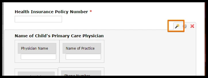
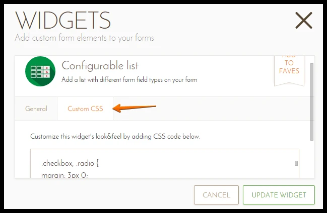
The same is with all the widgets.
-
Kevin Support Team LeadReplied on January 25, 2016 at 6:33 PM
I forgot to share you my cloned form with the changes: https://form.jotform.com/60246617834963
Take a look and see how it works.
- Templates
- Integrations
- INTEGRATIONS
- See 100+ integrations
- FEATURED INTEGRATIONS
 PayPal
- Slack
- Google Sheets
- Mailchimp
- Zoom
- Dropbox
- Google Calendar
- Hubspot
- Salesforce
- See more Integrations
- Products
- PRODUCTS
- Form Builder
- Jotform Enterprise
- Jotform Apps
- Store Builder
- Jotform Tables
- Jotform Inbox
- Jotform Mobile App
- Jotform Approvals
- Report Builder
- Smart PDF Forms
- PDF Editor
- Jotform Sign
- Jotform for Salesforce Discover Now
- Support

