


-
yajohnson37068Asked on January 29, 2016 at 1:10 PM
When I look at the Reeves Contact Form on a desktop, the image is fine. It is way too large on a cell phone.
The website address is supplied below. The form is linked to by the email graphic:
<a href="https://form.jotform.com/60146429307150" target="_blank" title="Click to Send Email"><img src="images/email-address.jpg" style="width: 85%; border:none; margin:0;"></a>

-
Mike_G JotForm SupportReplied on January 29, 2016 at 4:55 PM
I have made a clone version of your form and went to its designer page. I can see that you have set the image as a background image which made it appear on the background of the form.

If you want to have it as a header, I would suggest you try this:
First, remove the image you set as a background image of the form.

Then, since you have the link to the image when you first uploaded it as a background of your form. https://files.jotform.com/jufs/yajohnson37068/form_files/header-reeves.jpg
You can use that link to insert the image as the header of your form. Here's how:

Above you will notice that I have used 378 as the width of the header, it is because your form's with is 450. Then, the padding of your fields for both sides totals to 72(36 each side). So that would be 450 - 72 = 378.
Let us know if you need any further assistance. Thank you.
-
yajohnson37068Replied on January 29, 2016 at 6:04 PM
Mike,
This gets me closer, but your size for the graphic 378 x 210 is out of proportion when I do it. If I leave the width blank and check constrain it look correct. But the graphic is too wide when viewed on an iPhone 6. It does not appear to be adjusting to the size of the view port at all even though I have selected responsive in the Preferences.
-
Mike_G JotForm SupportReplied on January 29, 2016 at 9:31 PM
To fix that, we need the help of CSS codes which you can inject to your form.
Click this link to know how you can inject Custom CSS to your forms.
Here are the CSS codes that you need to inject to your from:
@media only screen
and (min-device-width : 375px)
and (max-device-width : 667px) {
#id_10{
padding-left: 0px !important;
padding-right: 0px !important;
}
#id_10 img{
width: 370px !important;
}
}

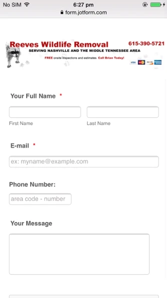
Here's how it should look like on an iPhone 6.
- Templates
- Integrations
- INTEGRATIONS
- See 100+ integrations
- FEATURED INTEGRATIONS
 PayPal
- Slack
- Google Sheets
- Mailchimp
- Zoom
- Dropbox
- Google Calendar
- Hubspot
- Salesforce
- See more Integrations
- Products
- PRODUCTS
- Form Builder
- Jotform Enterprise
- Jotform Apps
- Store Builder
- Jotform Tables
- Jotform Inbox
- Jotform Mobile App
- Jotform Approvals
- Report Builder
- Smart PDF Forms
- PDF Editor
- Jotform Sign
- Jotform for Salesforce Discover Now
- Support


