


-
vencoAsked on February 19, 2016 at 1:07 PM
Hi, I do not know how, but one of the forms when use on mobile iphone come out like a desktop witch is the best way for me, one goes responsive and became ugly. They look same
1. https://form.jotformeu.com/60411431045339 that is the ugly one!
2. https://form.jotformeu.com/60415500082341 that is the best way I want it!
how to make them same to show on iphone, want them to be like example 2.
I think if you fix the look of your site Jot Form when open on iphone will fix my issue also.
here how look your site when open on iphone!!!

-
David JotForm SupportReplied on February 19, 2016 at 1:14 PM
The form builder was not meant to be used on mobile and it is recommend to use desktop devices for creating forms.
As for the mobile responsiveness of your form, try either making the form mobile responsive:
http://www.jotform.com/help/311-How-to-make-forms-Mobile-Responsive
Or adding the mobile responsive widget to your form:
-
vencoReplied on February 19, 2016 at 3:49 PM
HI, THAT MAKE MY FORM GOING AGAIN IN ONE COLUMNS WHEN OPEN IN DESKTOP. PLEASE FIX YOUR PLATFORM TO WORK GOOD IN ALL WAYS. WE WASTE TIME GOING AROUND AND AROUND
-
David JotForm SupportReplied on February 19, 2016 at 6:08 PM
My apologies, I thought you wanted your form to be mobile responsive. If you would like the forms to be the same, you can always copy the CSS from one form to your other form:
http://www.jotform.com/help/117-How-to-Inject-Custom-CSS-Codes
Copy the code from the CSS section of the form that is formatted the way you would like and paste it to the form that is not.
-
vencoReplied on February 20, 2016 at 5:31 AM
they are same forms with different products cost, if inject custom css code, will be same as to be cloned, I am wrong?
-
Elton Support Team LeadReplied on February 20, 2016 at 12:59 PM
Yes, that's right since cloning the form will carry over the CSS codes on the cloned form. So with that, I suggest to clone your working form instead and edit all the changes you want on the cloned form.
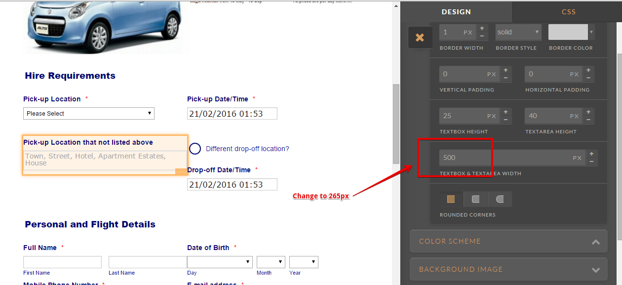
--
By the way, with regards to the formatting of the two forms on desktop.
This form https://form.jotformeu.com/60411431045339 has a max-width of 500px on the field container.
While this form https://form.jotformeu.com/60415500082341 has 265px.
So to correct the first form and have 265px width so they look the same on desktop, just edit it on the Form Designer then click one of the field and change 500px to 265px on textbox and textarea width.
Example:
--
And to make the form fully mobile responsive, just follow the guides provided by my colleague on the above post or you can click the links below.
https://www.jotform.com/help/311-How-to-make-forms-Mobile-Responsive
- Templates
- Integrations
- INTEGRATIONS
- See 100+ integrations
- FEATURED INTEGRATIONS
 PayPal
- Slack
- Google Sheets
- Mailchimp
- Zoom
- Dropbox
- Google Calendar
- Hubspot
- Salesforce
- See more Integrations
- Products
- PRODUCTS
- Form Builder
- Jotform Enterprise
- Jotform Apps
- Store Builder
- Jotform Tables
- Jotform Inbox
- Jotform Mobile App
- Jotform Approvals
- Report Builder
- Smart PDF Forms
- PDF Editor
- Jotform Sign
- Jotform for Salesforce Discover Now
- Support


