


-
RogerYelvington01Asked on December 5, 2016 at 5:29 PM
Hello!
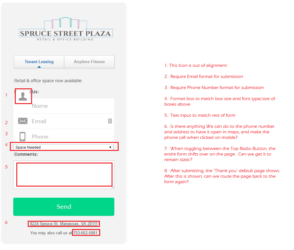
Can you please help with the following attached format edits?
Thank you!
Roger
https://form.jotform.com/63396105053957
 Page URL: https://form.jotform.com/63396105053957
 -
Chriistian Jotform SupportReplied on December 5, 2016 at 10:41 PM
I am currently checking your form for your requests. I will get back to you shortly with the responses to each of the questions. Regards.
-
RogerYelvington01Replied on December 5, 2016 at 10:46 PM
Thank you!
-
Chriistian Jotform SupportReplied on December 5, 2016 at 11:02 PM
You can inject the custom CSS code below into your form to resolve the issue regarding questions 1 , 4 and 5.
#cid_1:before {
top: 40px!important;
}
#id_9 {
width: 100%;
}
#input_9 {
width: 328px;
height: 50px;
border: none;
font-size: 18px;
font-family: 'Muli';
color: #a9acb5;
}
#input_11 {
font-size: 18px;
font-family: 'Muli';
color: #a9acb5;
}
Require Email and Phone Number format for submission.
To do this, select the field and click the Validation button on top. Then choose Email validation to require email for the email field. Do the same for the Phone field and select Numeric as the validation.

Can we route the page back to the form again?
Yes, you can achieve this by following our guide here: Redirecting Users to a Different Page. Simply use your form's link (https://www.jotform.com/63396105053957) as the link to where the page will go after the submission.
Can we have the address open in Maps?
You can set this by first getting the link to your location on google maps. Here's the link: https://goo.gl/maps/dLgvA4f6Muq
1. Then simply edit the text field and highlight the address.
2. Click the link icon
3. Insert the URL of the map to the URL field and click OK. Make sure to select New Window as the Target.

How to make phone call when number is clicked?
To make a phone call when the number is clicked, follow the same steps as the address on maps and simply insert your phone number in the URL field in this format (tel:703-662-5881) However, I recommend inserting the phone number in the international format: the plus sign (+), the country code, the local area code, and the local number, just in case you have callers from other countries. (example: tel:+1800229933)

The entire form shifts over on the page when toggling the top radio buttons. Can we get it to remain static?
I am not sure what you mean by making it static. You currently have conditions based on the button radios being toggled on top. If you do not want the form to move to the bottom when toggling the buttons, you will have to remove the conditions. If you are referring to a behavior on your website where the form is embedded, please give us the link so we can check it further.
---------------------------
You can check out my demo form here or clone it to your account to see how it should look after the changes have been applied: https://form.jotform.com/63398470801965
Please let us know if you need further assistance or if I missed anything.
Regards. -
RogerYelvington01Replied on December 5, 2016 at 11:43 PM
Thank you! I implented everything and it looks great. :)
Here's clarification on the last issue, where the form "jumps" when you hit the radio buttons.
-
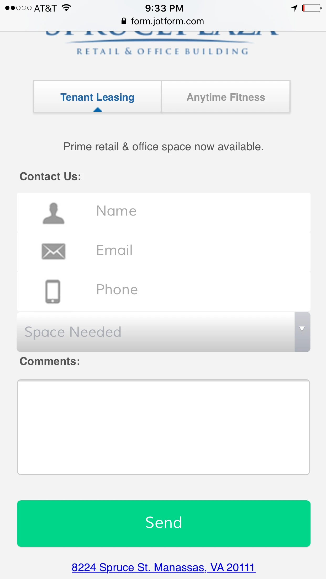
RogerYelvington01Replied on December 5, 2016 at 11:58 PM
I texted on my mobile device:
1. Logo and header not showing
2. Name and Phone fields, first letter of text is cut off
3. Dropdown box width doesn't match the width of the fields above

-
RogerYelvington01Replied on December 6, 2016 at 12:02 AM
Disregard the logo and header issue, #1, resolved just need 2, 3.
thank you
-
Chriistian Jotform SupportReplied on December 6, 2016 at 1:43 AM
Hi,
I'm currently checking your form. Please allow me some time to further investigate. I'll get back soon once I've found a solution.
Regards
-
Chriistian Jotform SupportReplied on December 6, 2016 at 2:00 AM
Hi,
Please add this custom CSS in your form:
.form-textbox {
padding-left: 100px !important;
}
.form-dropdown {
width: 340px !important;
}
Hope this works.
Let us know if you need further assistance.
Regards -
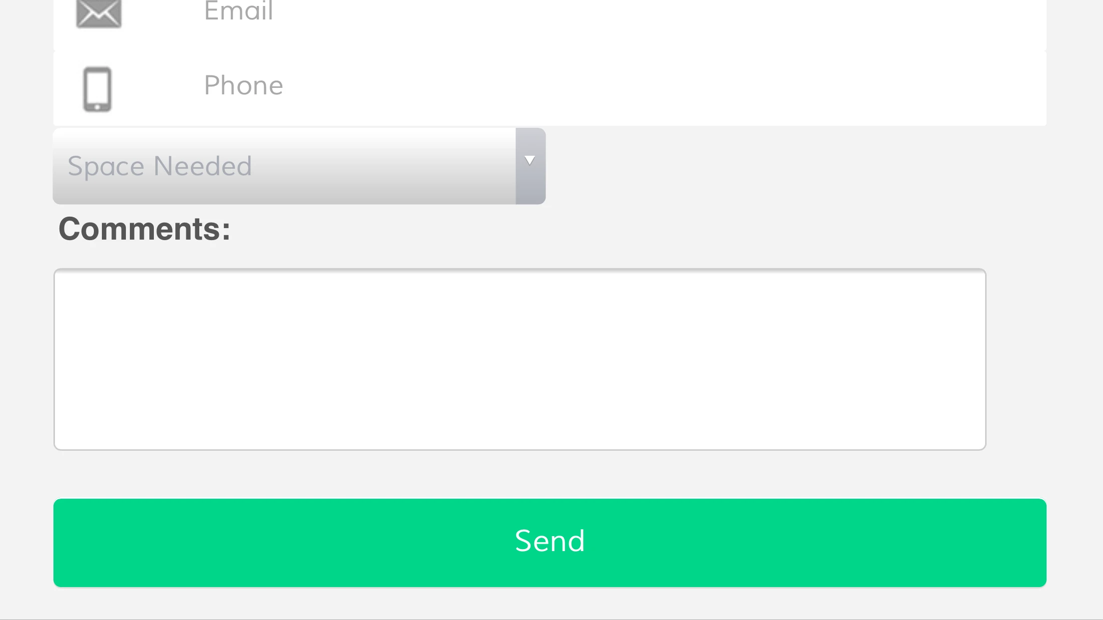
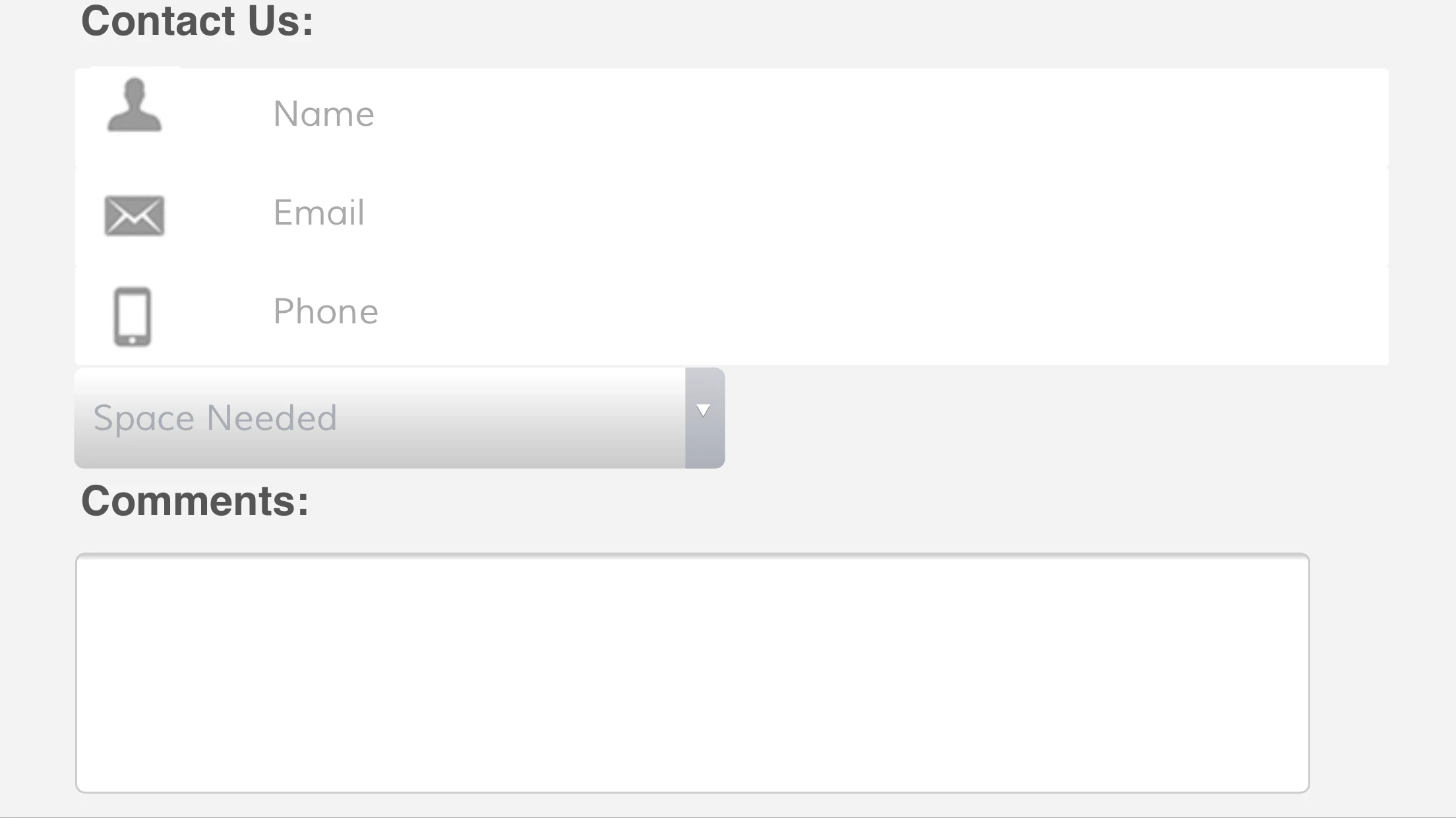
RogerYelvington01Replied on December 6, 2016 at 2:37 PM
It's almost there, the only issue is the dropdown box. I need it to stay the same width as the rest of the text boxes above it.
- On the computer, the dropdown box is longer than the other text boxes (see attached)
-

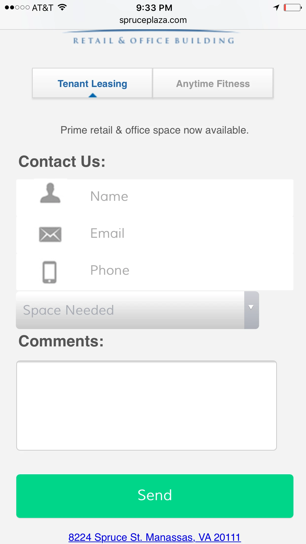
 For mobile, the dropdown box is shorter than the other text boxes (see attached)
Thank you in advance for your help!
-
Nik_CReplied on December 6, 2016 at 5:38 PM
I adjusted the width for your drop-down in your form so that is taken care of and it looks like this:

For Mobile devices, please copy and paste the below CSS in your Custom CSS field:
@media only screen and (max-width: 414px) {
.form-dropdown {
width : 372px !important;
}
}
@media only screen and (max-width: 320px) {
.form-dropdown {
width : 288px !important;
}
}
I tested with most common phone resolution and it worked fine.
Please check and let us know how it works for you.
Thank you!
-
RogerYelvington01Replied on December 6, 2016 at 5:41 PM
That worked perfectly, thank you!
How can we do the same thing to the width of the "comments" box?
-
BJoannaReplied on December 6, 2016 at 9:28 PM
Please try adding this CSS code:
@media only screen and (max-width: 414px) {
.form-textarea {
width : 372px !important;
}
}
@media only screen and (max-width: 320px) {
.form-textarea {
width : 288px !important;
}
}
Let us know if you need further assistance.
-
RogerYelvington01Replied on December 6, 2016 at 9:38 PM
So for the form:
https://form.jotform.com/63396105053957
1. it worked in portrait mode, but not in landscape (for mobile)
2. And with it embedded in the wordpress site, it does not work in landscapre or portrait (for mobile)
-
BJoannaReplied on December 7, 2016 at 2:56 AM
Instead of the code I provided you on my last post and instead of the code that my colleague Nik_C provided you, add this CSS code to your form:
@media screen and (max-width: 480px), screen and (max-device-width: 768px) and (orientation: portrait), screen and (max-device-width: 415px) and (orientation: landscape){
.form-input, .form-input-wide, .form-textarea, .form-textbox, .form-dropdown {
max-width: 500px!important;
width: 100%!important;
}}
Hope this will help. Let us know if you need further assistance.
-
RogerYelvington01Replied on December 7, 2016 at 9:14 PM
Worked great, thank you!
- Templates
- Integrations
- INTEGRATIONS
- See 100+ integrations
- FEATURED INTEGRATIONS
 PayPal
- Slack
- Google Sheets
- Mailchimp
- Zoom
- Dropbox
- Google Calendar
- Hubspot
- Salesforce
- See more Integrations
- Products
- PRODUCTS
- Form Builder
- Jotform Enterprise
- Jotform Apps
- Store Builder
- Jotform Tables
- Jotform Inbox
- Jotform Mobile App
- Jotform Approvals
- Report Builder
- Smart PDF Forms
- PDF Editor
- Jotform Sign
- Jotform for Salesforce Discover Now
- Support


