


-
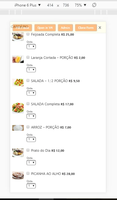
PeterKellAsked on December 11, 2016 at 2:50 PMAs you will see, under each product is a qtty field.when it appears on phone screen, it gets the size(horiz) of the screen.how to make it stay normal sizehttps://form.jotformz.com/63136160539656
-
Özlem JotForm DeveloperReplied on December 11, 2016 at 4:13 PM
Hi,
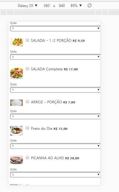
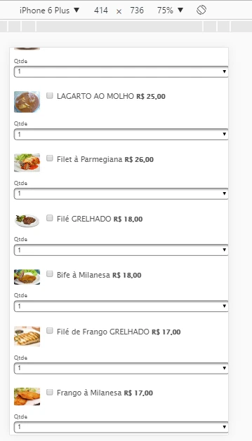
I have checked your form in Android and iOs simulators. Please have a look at the following images.
You can change the width of "Qtde" dropdown menu for mobile devices by injecting some custom CSS into your form.
Please follow the steps below:
#1-Copy following custom CSS code.
@media only screen and (max-device-width: 480px) {
span.form-sub-label-container{width:40px;}
}#2- Paste this code Design>Inject CSS.
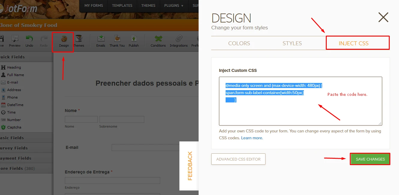
You can follow the guide below about how to inject Custom CSS Code into your form.
How-to-Inject-Custom-CSS-Codes
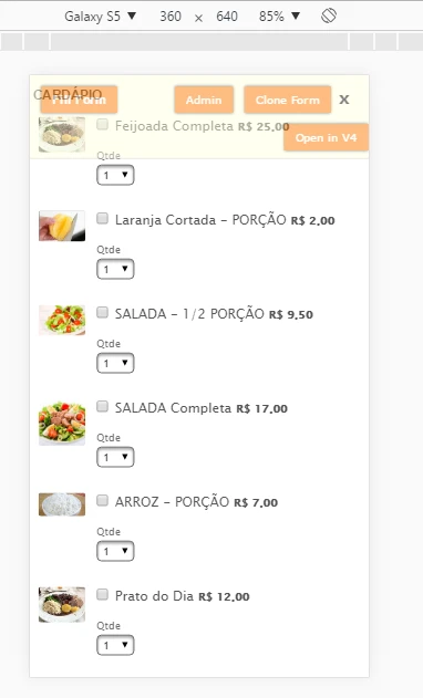
Finally, your form will be in the following images on mobile:
If you want to learn more about @media query, you can have a look at this website: @Media Rules
Basically, @media provides to style your form for mobile devices.
@media only screen and (max-device-width: 480px) {
span.form-sub-label-container{width:40px;}
}480px is the max limit of the mobile device screen.
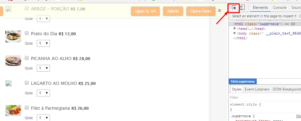
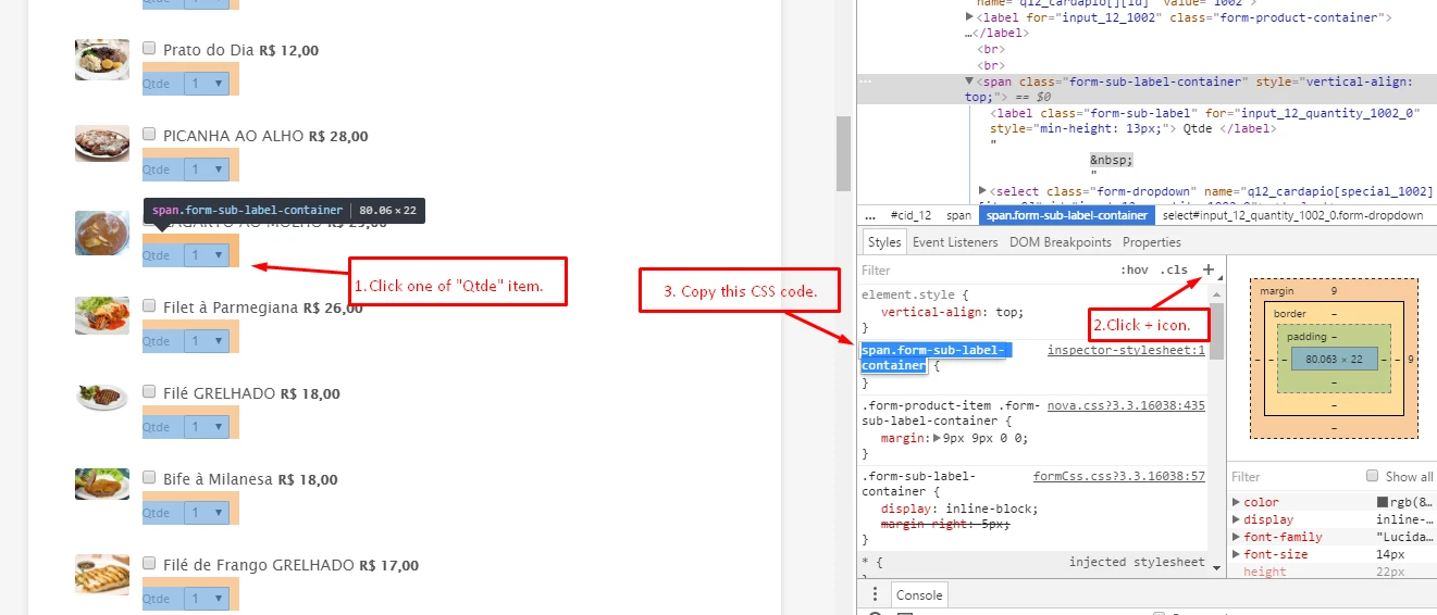
span.form-sub-label-container points your "Qtde". Please have a look at the below instruction about how to find this pointer (or field CSS name) in your form:
#1- First, open your form on a browser. Click right on the form in browser and "Inspect". Click Arrow icon as you can see in the below image:
#2- After that, please follow the steps in the below image:
If you need any further assistance, please feel free to let us know.
Thank you.
- Templates
- Integrations
- INTEGRATIONS
- See 100+ integrations
- FEATURED INTEGRATIONS
 PayPal
- Slack
- Google Sheets
- Mailchimp
- Zoom
- Dropbox
- Google Calendar
- Hubspot
- Salesforce
- See more Integrations
- Products
- PRODUCTS
- Form Builder
- Jotform Enterprise
- Jotform Apps
- Store Builder
- Jotform Tables
- Jotform Inbox
- Jotform Mobile App
- Jotform Approvals
- Report Builder
- Smart PDF Forms
- PDF Editor
- Jotform Sign
- Jotform for Salesforce Discover Now
- Support

