-
MCCJAYAsked on December 31, 2016 at 1:14 PM
Hello Everyone,
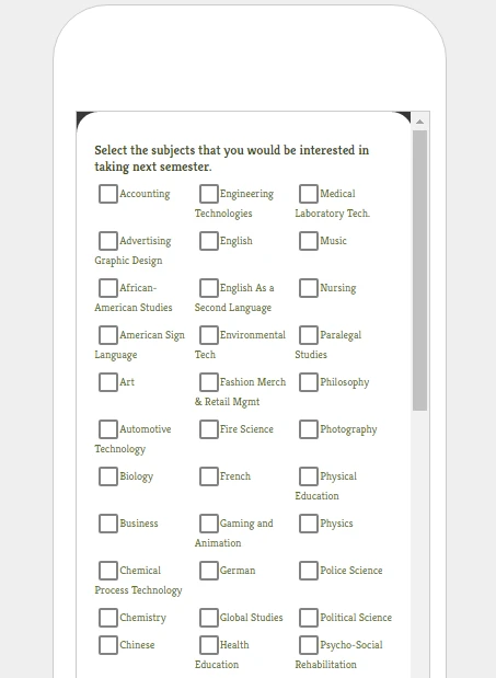
I notice that on page 5 of my form that the list of subjects tend to get all bunched up when viewing them on my phone. Does it not work because I have a lot of options? I thought the responsive widget would help format it when viewed on a phone.
Any suggestions on how to get that page to look normal on a phone would be great! Thank you!

-
liyamReplied on December 31, 2016 at 11:49 PM
Hello,
Can you add this CSS code into your form and see if it works:
@media screen and (min-width: 320px), @media screen and (min-width: 480px), @media screen and (max-width: 480px), @media screen and (min-width: 480px) and (max-width: 768px), @media screen and (min-width: 480px) and (max-width: 799px) {
span.form-checkbox-item {
margin-right: 40px;
margin-left: 10px;
width: 300px !important;
}
}If you need to learn how to insert this via CSS injection, please follow the steps from this guide: https://www.jotform.com/help/117-How-to-Inject-Custom-CSS-Codes
Please get back to us if you have more questions.
-
MCCJAYReplied on January 1, 2017 at 10:32 AM
Hello,
Thank you for that CSS code. When i add the code it then turns my class list to 2 rows and messes with the order the classes were in and looks like this

instead of this

when on the mobile view it does put them all in one line but in a different order but when on a desktop view that's now when things start to look out of order.
Thanks again for all the help and happy new year!
-
Kiran Support Team LeadReplied on January 1, 2017 at 2:37 PM
Please try enabling the option 'Make this form responsive' from the Form Designer for your JotForm. The form should be displaying the 3 column in mobile devices as well unless the screen size is less than 480px. If the screen size of the device is less than 480px, you may try reducing the font-size for the list items to display them correctly by injecting the following CSS code.
@media screen and (min-width: 320px) and (max-width: 480px) {
.form-checkbox-item:not(#foo) label {
font-size: 13px;
}
}
Please check if it works for you and let us know if you need any further assistance.
We will be happy to assist.
-
MCCJAYReplied on January 2, 2017 at 1:35 PM
Hello,
I added that new CSS code as well as turned on the make this form responsive option and yet im still having the issue on the mobile view.

any other options?
-
Kiran Support Team LeadReplied on January 2, 2017 at 1:49 PM
Could you try reducing the font size in the CSS code to 12px or 11px provided to see if that helps? Let us know if the issue still persists. We will be happy to assist you further.
-
MCCJAYReplied on January 2, 2017 at 1:56 PM
Hello Kiran,
Looks like it's still getting all bunched up. I'm thinking the only way I could work around this is if I put a question like "are you viewing this on a mobile phone" and if they say yes I'll only show a list of subjects in one line and if they say no I will show the list with 3 lines. I didn't want to have to ask if they are on a phone but I might need to go that way unless you have any other suggestions.
Once again thank you for your help!
-
JanReplied on January 2, 2017 at 3:28 PM
I checked your form and I can see that the check box field is now showing properly in portrait mode of a mobile device. You reduced the font size to 10px just like what Kiran suggested. The options are not overlapping anymore.
Yes, you can just create another check box field with the same option (alphabetically) and use the Show and Hide Field condition. This check box field will only appear if the user say "yes" in the question.
Let us know if you need further assistance. Thank you.
-
MCCJAYReplied on January 11, 2017 at 7:57 AM
Hey everyone,
If I were to make my form width wider would that stop the problem of subjects like Advertising Graphic Design showing up on top of each other and have it list as on line?

-
liyamReplied on January 11, 2017 at 9:56 AM
Hello MCCJAY,
Currently, I'm not seeing any option in the form that shows to be overlapping with another, just like what appears on the screenshot you have provided. If what you mentioned is happening on a specific device, it would be great if you can tell us more information about the device that you're using. This way we can do further tests and find a fix.
Thanks.
- Mobile Forms
- My Forms
- Templates
- Integrations
- INTEGRATIONS
- See 100+ integrations
- FEATURED INTEGRATIONS
PayPal
Slack
Google Sheets
Mailchimp
Zoom
Dropbox
Google Calendar
Hubspot
Salesforce
- See more Integrations
- Products
- PRODUCTS
Form Builder
Jotform Enterprise
Jotform Apps
Store Builder
Jotform Tables
Jotform Inbox
Jotform Mobile App
Jotform Approvals
Report Builder
Smart PDF Forms
PDF Editor
Jotform Sign
Jotform for Salesforce Discover Now
- Support
- GET HELP
- Contact Support
- Help Center
- FAQ
- Dedicated Support
Get a dedicated support team with Jotform Enterprise.
Contact SalesDedicated Enterprise supportApply to Jotform Enterprise for a dedicated support team.
Apply Now - Professional ServicesExplore
- Enterprise
- Pricing


