


-
corelightAsked on January 10, 2017 at 4:28 PM
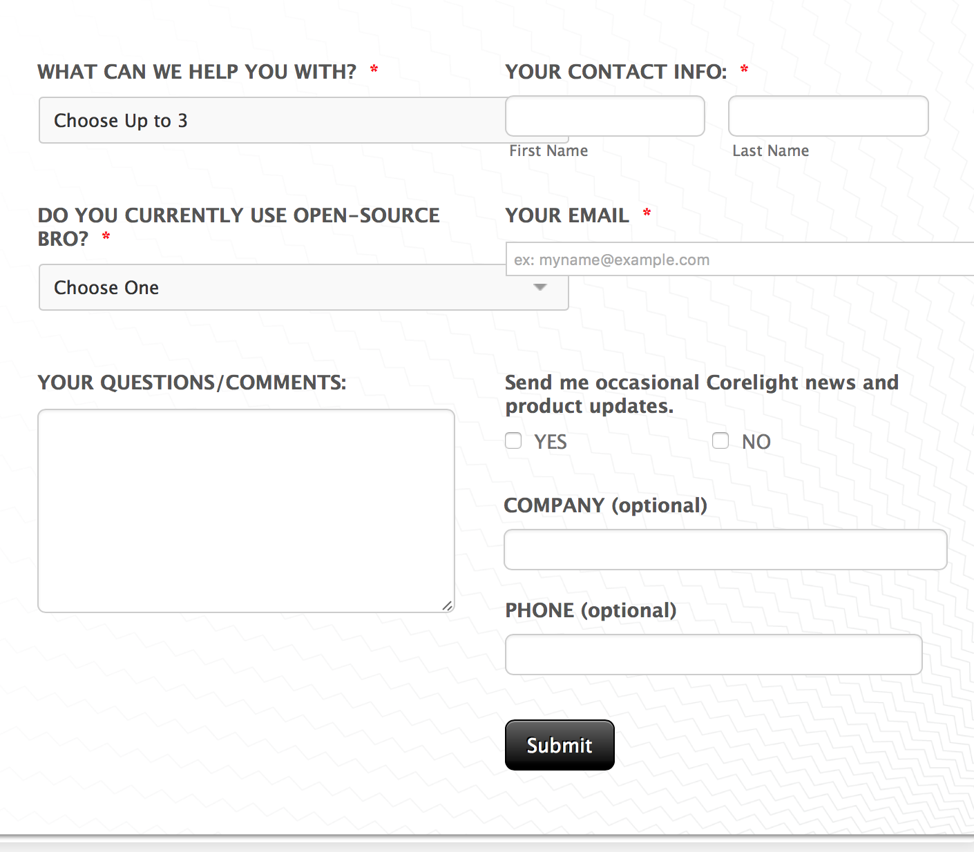
Hi - can you provide some insight into why on a mobile device as opposed to on a desktop the Company field is offset in the column it is in?
Also, when I shink this responsive form, overlap occurs with the first two fields on the top left of the form only. How can I correct this?
Thanks, Mike
-
IanReplied on January 10, 2017 at 7:28 PM
I could not replicate the issue. This is the screenshot from mobile
I would suggest you to clear the form cache and the browser cache and check again.
Browser cache http://www.refreshyourcache.com/en/home/
Form cache https://www.jotform.com/help/229-How-to-Clear-Your-Form-Cache


If you still face any issue let us know.
-
corelightReplied on January 11, 2017 at 5:50 PM
In your example the Company field should be left justified and it is indented. Any thoughts on why this is occuring and the best way to fix it?
-
Elton Support Team LeadReplied on January 11, 2017 at 11:46 PM
There's a left padding declared for that particular field.
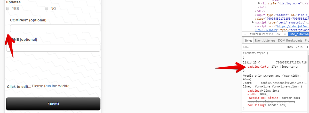
You can change it to 0 from 17px when viewed on mobile. Inject this CSS to your form, paste it into the bottom section. This should fix it.
@media screen and (max-width:480px){
li#id_23 {padding-left: 0 !important;}
}
Regards!
- Templates
- Integrations
- INTEGRATIONS
- See 100+ integrations
- FEATURED INTEGRATIONS
 PayPal
- Slack
- Google Sheets
- Mailchimp
- Zoom
- Dropbox
- Google Calendar
- Hubspot
- Salesforce
- See more Integrations
- Products
- PRODUCTS
- Form Builder
- Jotform Enterprise
- Jotform Apps
- Store Builder
- Jotform Tables
- Jotform Inbox
- Jotform Mobile App
- Jotform Approvals
- Report Builder
- Smart PDF Forms
- PDF Editor
- Jotform Sign
- Jotform for Salesforce Discover Now
- Support
