


-
wiltshsAsked on January 28, 2017 at 1:57 PM
I've read through a bunch of the Q&A on this widget but I'm afraid I just don't get the css side of it. I see you are generously willing to look at styling for an individual user's form, so perhaps I could ask you to look at mine (or give some specific guidance on the CSS so that we can do it ourselves). As most people are experiencing, I'd like to wrap the fields in the configurable widget around so it can be viewed reliably on a mobile device. I am willing to modify specific elements but the CLW doesn't provide as much control as other widgets.
Ideally I'd also love to be able to total up the number columns in the Widget too, even if it's just on the email submission not necessarily in the form.
Thank you in advance for the help.
 Page URL: https://form.jotformz.com/13632031648
 -
Welvin Support Team LeadReplied on January 28, 2017 at 4:52 PM
We can certainly help you with the custom CSS codes. I am now compiling the codes, I'll let you know later.
-
Welvin Support Team LeadReplied on January 28, 2017 at 5:10 PM
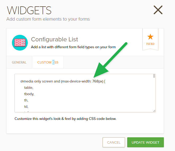
Please check this clone version of your form on a mobile device: https://www.jotform.com/70276691342963. If you like the responsive layout, you can copy/paste the following custom CSS codes:
@media only screen and (max-device-width: 768px) {
table,
tbody,
th,
td,
tr {
display: block;
}
tr {
margin-bottom: 10px;
}
td {
border: none;
position: relative;
padding-left: 50%;
}
td:before {
position: absolute;
top: 6px;
left: 6px;
width: 45%;
padding-right: 10px;
white-space: nowrap;
}
td:nth-of-type(1):before {
content: "Type";
}
td:nth-of-type(2):before {
content: "First Name";
}
td:nth-of-type(3):before {
content: "Middle";
}
td:nth-of-type(4):before {
content: "Last Name";
}
td:nth-of-type(5):before {
content: "Class";
}
td:nth-of-type(6):before {
content: "Duration";
}
#list > tbody > tr:nth-child(1) {
display: none;
}
td.buttonsColumn {
margin-bottom: 10px;
}
}
Inject the above codes in the CSS area of the widget.
Lastly, add the following custom CSS codes in the form:
@media only screen and (max-device-width: 768px) {
.custom-field-frame {
width: 100% !important;
}
}
Here's how to inject in the whole form: https://www.jotform.com/help/117-How-to-Inject-Custom-CSS-Codes.
-
wiltshsReplied on January 29, 2017 at 11:27 AM
This is awesome Welvin thank you so much. I think I can figure it out from here (change labels and so on). However, what I think might be incredibly helpful to everyone is to provided an annotated version of this, or explain what you're doing here. CSS is complex and non-intuitive to the vast majority of jotform users I am sure, so it might be worth showing some examples like this (in the case of the CLW, perhaps in the help page for that) so that people can take what you've done for me and others, and apply it more generally.
Thanks again!
-
Welvin Support Team LeadReplied on January 29, 2017 at 1:16 PM
You're welcome.
Yes, this is a great suggestion. Thank you. I have the annotation actually, but the CSS won't work if you will include this in the custom CSS area. I'm not sure why but I have already raised it to our developers.
- Templates
- Integrations
- INTEGRATIONS
- See 100+ integrations
- FEATURED INTEGRATIONS
 PayPal
- Slack
- Google Sheets
- Mailchimp
- Zoom
- Dropbox
- Google Calendar
- Hubspot
- Salesforce
- See more Integrations
- Products
- PRODUCTS
- Form Builder
- Jotform Enterprise
- Jotform Apps
- Store Builder
- Jotform Tables
- Jotform Inbox
- Jotform Mobile App
- Jotform Approvals
- Report Builder
- Smart PDF Forms
- PDF Editor
- Jotform Sign
- Jotform for Salesforce Discover Now
- Support
