
-
JBLAsked on February 6, 2017 at 8:02 PM
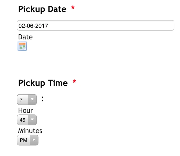
The Date field is too wide on mobile devices and the Time displays vertically. Is it possible to correct this?
Thanks.
-
Ashwin JotForm SupportReplied on February 6, 2017 at 10:54 PM
Hello,
Please inject the following custom css code in your and that should solve your problem:
@media only screen and (max-width: 480px){
#id_7 {
width: 75%;
}
#id_24 {
width: 75%;
}
}
Please check the screenshot below on how to inject custom css code in form:

Hope this helps.
Do get back to us if you have any questions.
Thank you!
-
JBLReplied on February 7, 2017 at 12:37 AM
Hello,
Unfortunately it did not work for me.

I had another open ticket which was also just resolved so I injected both sets of code. I tried them together, and then separately (in case they conflict). Either way they both don't work.
My goal is to display the Time Field horizontally and to narrow the Date Field on mobile devices.
-
Ashwin JotForm SupportReplied on February 7, 2017 at 2:11 AM
Hello JBL,
I have injected the following custom css code in your form and that seems to have fixed this issue:
@media only screen and (max-width: 480px){
#id_7 {
width: 75%;
}
#id_24 {
width: 75%;
}
input#lite_mode_7 {
width: 175px !important;
min-width: 175px !important;
}
}
I did test your form in mobile device and it seems to display the form correctly. Please check the screenshot below:

I would suggest you to please test your form again and get back to us if the issue persists.
Thank you!
-
JBLReplied on February 7, 2017 at 5:16 PM
I have tried all this morning, but I still cannot get the time to display horizontally.


If I change the first line to @media only screen and (max-device-width: 768px){ /*tablet*/, it narrows the Date field. However I still cannot get the Time to display horizontally. I have tried changing the width values, added !important, but it still cannot change.
-
Elton Support Team LeadReplied on February 7, 2017 at 9:21 PM
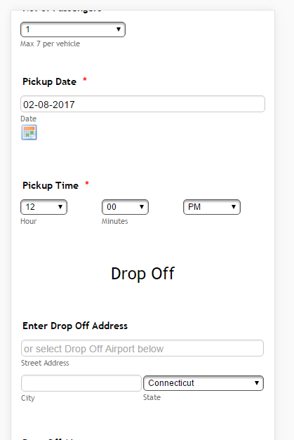
I checked your form on mobile and the time field displays side by side. Did you manage to resolve this?
If not, you can use this CSS codes. This will make all the time fields in your form to display horizontally on mobile.
@media screen and (max-width:480px){
[data-type="control_time"] select {
width: 70% !important;
}
[data-type="control_time"] .form-sub-label-container {
width: 30% !important;
}
}
Hope this helps!
-
JBLReplied on February 7, 2017 at 9:45 PM
No, I am still getting a vertical display. Is it possible for you to go to the live form and inject the codes? Maybe I am doing it wrong?
-
Elton Support Team LeadReplied on February 7, 2017 at 10:56 PM
It is working in your form already when I check it here. I have also made a small adjustment in your CSS so the name field would display nicely on mobile.
If you are not seeing this changes on your end, please clear your browser's cache.
- Templates
- Integrations
- INTEGRATIONS
- See 100+ integrations
- FEATURED INTEGRATIONS
 PayPal
- Slack
- Google Sheets
- Mailchimp
- Zoom
- Dropbox
- Google Calendar
- Hubspot
- Salesforce
- See more Integrations
- Products
- PRODUCTS
- Form Builder
- Jotform Enterprise
- Jotform Apps
- Store Builder
- Jotform Tables
- Jotform Inbox
- Jotform Mobile App
- Jotform Approvals
- Report Builder
- Smart PDF Forms
- PDF Editor
- Jotform Sign
- Jotform for Salesforce Discover Now
- Support