


-
OptronicsHDAsked on February 10, 2017 at 3:57 PM
I want to create inputs that I can disperse into 2 or 3 columns depending on space, and they will fill their column but then still stack on mobile. I've tried the "columns" option in the form designer but that keeps the columns even on mobile so I just made all my boxes "shrunk" so they appear in columns and then stack on mobile. I can achieve "something like" what I want but not exactly.
Basically I'm trying to achieve what you see in the screenshot... any ideas how to do this?
 Page URL: https://form.jotform.com/70403823140140
 -
BJoannaReplied on February 10, 2017 at 5:39 PM
Please add this CSS code to your form:
.form-textbox {
width : 360px!important;
}
@media screen and (min-width: 10px) and (max-width: 480px){
.form-all{
padding:0;
}
.form-input-wide.jf-required {
padding : 0px;
width : 100%;
}
}
How to Inject Custom CSS Codes
Also add Mobile Responsive widget to your form.
How to Add a Widget to your Form?
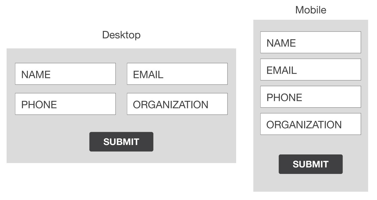
After that your form should look like this on desktop.

And like this on mobile.

Here is my demo form: https://form.jotform.com/70406939543966
Feel free to test it and clone it.
Hope this will help. Let us know if you need further assistance.
-
OptronicsHDReplied on February 13, 2017 at 10:47 AM
Thanks for the info BJoanna. 2 follow up questions:
1. What is the difference between the "Mobile Responsive" widget and the section in the "Form Designer - Form Layout" where you can check "Make this form responsive" and "Enable Form Columns"? Why choose one or the other is there a difference between making the form responsive with a widget or checking the box? and is there a difference between making my form elements "shrunk" or clicking "enable columns". The columns option seems to keep the columns no matter what size the screen, is there something I'm missing?
2. I cannot find the "Mobile Responsive" widget under the add form element widget section. I know you sent the link that lists it in the widget database section but to actually add it to my form it's not listed. Thank you for adding it but how in the future can I do this if I can't find it?
Thanks and I look forward to your reply!
David
-
BJoannaReplied on February 13, 2017 at 12:12 PM
There is few ways you can make your form to be responsive. Inside of this guide you can find more about mobile responsive forms.
https://www.jotform.com/help/322-How-to-make-mobile-friendly-forms-on-JotForm
All options can be used to make form responsive.
You can also create two columns both ways, by shrinking the fields and my enabling form columns. However it is possible that form will need to be adjusted, for example the width of the form.
More about form field positioning you can find inside of this guide:
https://www.jotform.com/help/90-Form-Field-Positioning
https://www.jotform.com/help/328-How-to-position-fields-in-JotForm
Regarding you other question, it seems that "Mobile Responsive" widget is not available in Version 4 of our Form Builder. This is already reported to our developers.
You can use Version 3 to add "Mobile Responsive" widget to your form. You can switch back to Version 3 on settings page of your account.

-
OptronicsHDReplied on February 14, 2017 at 11:38 AM
Appreciate the links, switched back to v3 and saw the widget.
I'm going to be a bit more specific to try to achieve what I want. I am able to shrink the elements and adjust the width of the form and get a basic fit, but I'm wanting exactness and symmetry if possible. I'll describe an example similar to what I was asking in the original post...
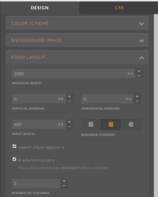
For example, say I create a form 1000px wide. I would want 2 columns 450px wide equaling 900px and using 25px of padding for each column to fill out the remaining 100px of the form width. Inside each of these columns I want the elements that are in them to fill the column 100%. And on mobile, the form elements would all stack into 1 column.
Currently, I'm getting close to what I want, but not exact. The elements spread into 2 columns and stack on mobile but they don't fill the column they are in. It's not symmetrical. I know I sound anal about this, but is there a way to achieve perfection in the layout of the form?
FYI here is my new form I cloned https://form.jotform.com/70434399980164
-
BJoannaReplied on February 14, 2017 at 12:51 PM
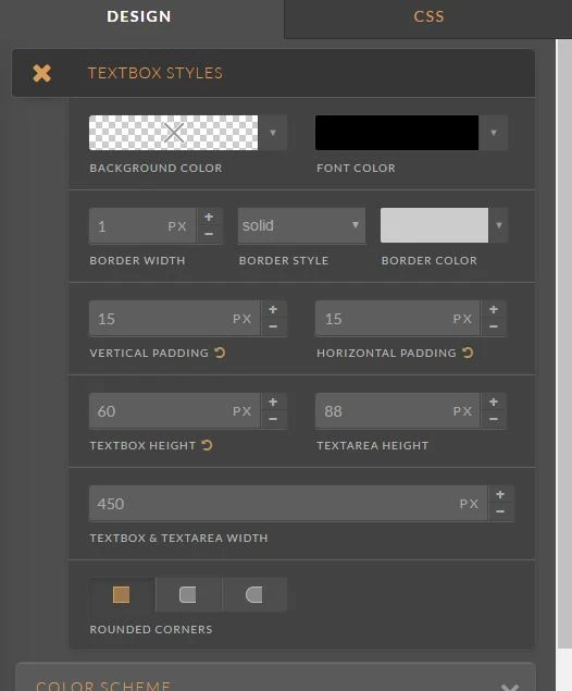
If you want that width of your form is 1000px, and width of your fields is 450px than you can set this inside of Form Designer settings. However you would also need to change CSS core that you have added for width of text box fields. You can remove it or increase it to 450px
You can style your fields inside of Form Designer without adding additional CSS code.
Here is my new demo form, that does not have any CSS and it was styled inside of Form Designer: https://form.jotform.com/70444788697980
https://www.jotform.com/help/300-Form-Designer-Tutorial-Let-s-create-fantastic-forms-
Let us know if you need further assistance.
- Templates
- Integrations
- INTEGRATIONS
- See 100+ integrations
- FEATURED INTEGRATIONS
 PayPal
- Slack
- Google Sheets
- Mailchimp
- Zoom
- Dropbox
- Google Calendar
- Hubspot
- Salesforce
- See more Integrations
- Products
- PRODUCTS
- Form Builder
- Jotform Enterprise
- Jotform Apps
- Store Builder
- Jotform Tables
- Jotform Inbox
- Jotform Mobile App
- Jotform Approvals
- Report Builder
- Smart PDF Forms
- PDF Editor
- Jotform Sign
- Jotform for Salesforce Discover Now
- Support
