


-
lesASAsked on February 11, 2017 at 10:29 AM
-
Nik_CReplied on February 11, 2017 at 11:46 AM
I assume that you're referring to this form:
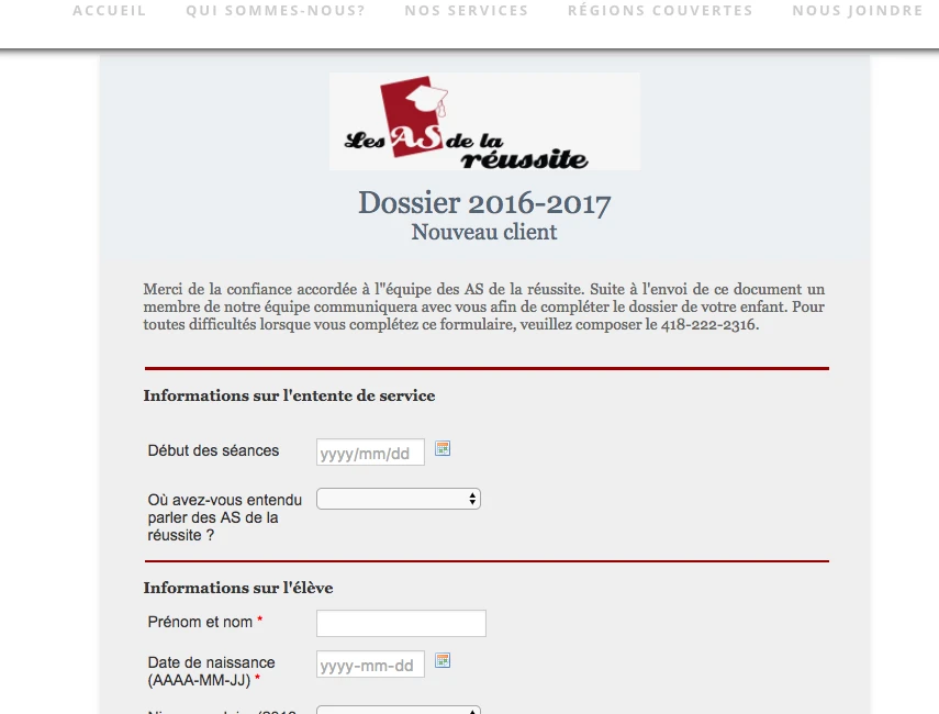
I added a Mobile responsive widget to your form, please check and let us know if it works as intended now?
We'll wait for your response.
Thank you!
-
lesASReplied on February 12, 2017 at 2:17 PM
I have check and from my cellphone it is not working. I see half of my form (larger).
-
JanReplied on February 12, 2017 at 5:51 PM
I was able to replicate the issue. Please give me more time to work on this problem. I will contact you once I have a solution. Thank you.
-
JanReplied on February 12, 2017 at 6:46 PM
Thank you for waiting. Please try the following steps:
1. In Form Builder V4, click the "Form Designer" button at the right.

2. Scroll down and click the "Advanced Designer" button.

3. Go to the "Form Layout" section and enable the "Make this form responsive" option.

4. After that, go to the "CSS" tab and paste the CSS code below:

@media only screen and (max-width: 40em){
.form-line.form-line-column {
margin-left : 0px !important;
}
img.headerimg.pngfix {
text-align : left !important;
}
tr {
text-align: left !important;
}
.wordwrap .pspan {
text-align: left !important;
}
.wordwrap .ispan {
text-align: left !important;
}
#header {
margin-left: 0px !important;
margin-right: 0px !important;
}
.pagemargins {
padding-left: 0px !important;
padding-right: 0px !important;
}
}Here's the result:

Hope that helps. Thank you.
- Templates
- Integrations
- INTEGRATIONS
- See 100+ integrations
- FEATURED INTEGRATIONS
 PayPal
- Slack
- Google Sheets
- Mailchimp
- Zoom
- Dropbox
- Google Calendar
- Hubspot
- Salesforce
- See more Integrations
- Products
- PRODUCTS
- Form Builder
- Jotform Enterprise
- Jotform Apps
- Store Builder
- Jotform Tables
- Jotform Inbox
- Jotform Mobile App
- Jotform Approvals
- Report Builder
- Smart PDF Forms
- PDF Editor
- Jotform Sign
- Jotform for Salesforce Discover Now
- Support


