


-
norwayspaAsked on February 22, 2017 at 9:14 PM
Hi!
I added the DateTime widget to my form that's embedded on an iframe on my site but I can't scroll the hours on mobile devices
the form is https://form.jotformz.com/70018065171649
and the website with the form embedded is https://www.norway-rentacar.cl/rent-a-car
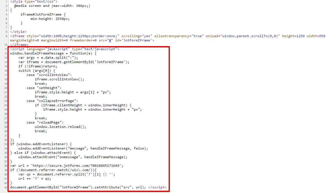
the iframe code is
<style type="text/css">
@media screen and (max-width: 380px;)
{iframe#JotFormIFrame {min-height: 2930px;}}
</style>
<iframe style="width:100%;height:1250px;border:none;" scrolling="yes" allowtransparency="true" onDISABLEDload="window.parent.scrollTo(0,0)" height=1250 width=950 marginheight=0 marginwidth=0 frameborder=0 src="#" id='JotFormIFrame'>
</iframe>
it also has a little js that passes the url parameters from the directing site to the child form (that's the id='JotFormIFrame')
Thank you in advance
-
Mike_G JotForm SupportReplied on February 23, 2017 at 4:30 AM
I have loaded the website (https://www.norway-rentacar.cl/rent-a-car) on an android phone and I was able to see what you mean (unable to scroll the drop-down for time in the DateTime widget).
However, when I tried the load the source (https://www-norway-rentacar-cl.usrfiles.com/html/28aa4b_217ec1a619fb60add8e6d9a1487e35cd.html) of the form in the said website, the widget's drop-down for the time seems to be working.
I'm not sure, but from the way I see it, it is more like a script conflict between the script on your website and the script on the form/widget.
Can you try if by removing the script part of the iframe code of the form the issue will be resolved?
We will wait for your response.
Thank you.
-
norwayspaReplied on February 23, 2017 at 9:19 PM
Same result without the script. I even tried:
<iframe src="https://secure.jotformz.com/70018065171649">
</iframe>
still the same result but you are right when it's now on an iframe (source) works perfectly I think it might have to do with a css parameters maybe?
please help, thank you
-
norwayspaReplied on February 23, 2017 at 9:40 PM
I got it to work! I tried lots of things I can't tell which one solved it but here's the code:
<style type="text/css">
.iframe-issue {
-webkit-overflow-scrolling: touch !important;
overflow: scroll !important;
}
@media screen and (max-width: 400px;)
{
iframe#JotFormIFrame {
min-height: 4000px;
}
}
</style>
<ion-view title="Dashboard">
<ion-content scroll="true" overflow-scroll="true" class="has-header padding iframe-issue">
<iframe style="width:100%;height:100%;border:none;" data-tap-disabled="true" scrolling="yes" allowtransparency="true" onDISABLEDload="window.parent.scrollTo(0,0)" height=1300 width=950 marginheight=0 marginwidth=0 frameborder=0 src="#" id='JotFormIFrame'>
</iframe>
</ion-content>
</ion-view>
any idea how could I avoid scrolling in mobile? increase height or something?
thanks
-
Ashwin JotForm SupportReplied on February 24, 2017 at 2:37 AM
Hello norwayspa,
I am glad to know that you fixed this issue yourself.
Unfortunately we cannot answer multiple questions in one thread. I would suggest you to please create a new thread for your second question and we will surely help you.
Thank you!
-
norwayspaReplied on February 24, 2017 at 3:00 AM
No worries I solved that as well thank you very much!
- Templates
- Integrations
- INTEGRATIONS
- See 100+ integrations
- FEATURED INTEGRATIONS
 PayPal
- Slack
- Google Sheets
- Mailchimp
- Zoom
- Dropbox
- Google Calendar
- Hubspot
- Salesforce
- See more Integrations
- Products
- PRODUCTS
- Form Builder
- Jotform Enterprise
- Jotform Apps
- Store Builder
- Jotform Tables
- Jotform Inbox
- Jotform Mobile App
- Jotform Approvals
- Report Builder
- Smart PDF Forms
- PDF Editor
- Jotform Sign
- Jotform for Salesforce Discover Now
- Support


