


-
phonefixersAsked on February 27, 2017 at 5:12 AM
the buttons on my mobile site are above eachother rather than side to side.
-
Kiran Support Team LeadReplied on February 27, 2017 at 8:34 AM
I have checked your JotForm on a mobile emulator and see that the buttons are not displayed side by side. It seems that the issue is being caused by the mobile responsive widget added to the form. The buttons are sized to 50% on the mobile screen by the widget. I tried to resize the width to 45% using CSS. However, the CSS on the responsive widget is overriding the CSS and the injected CSS is not affected on the form.
Please try removing the mobile responsive widget on the form so that the buttons are automatically displayed side by side. Let us know if you need any further assistance. We will be happy to assist.
-
phonefixersReplied on March 2, 2017 at 2:59 PM
then my form wont be responsive haha
-
jonathanReplied on March 2, 2017 at 5:58 PM
The mobile responsive widget script were already incorporated into the Form Builder. This was also the reason you can no longer see the mobile responsive widget in the Widgets lists.
As my colleague already mentioned, the mobile responsive widget could be the culprit for the mobile responsive issue your form was having.
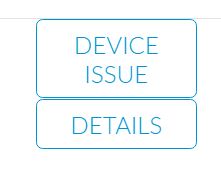
I test on my form and remove the responsive widget as instructed. When I test on mobile browser, I can see the buttons were now aligned and responsive as intended.
screenshot:

Please try removing first the responsive widget on your form as well and test again.
Let us know if issue remains.
-
phonefixersReplied on March 3, 2017 at 9:48 AM
is the rest of the form responsive?
-
Kiran Support Team LeadReplied on March 3, 2017 at 12:20 PM
The form should be responsive after removing the widget as well. If you experience any issue, please enable the mobile responsive option from the Advanced Form Designer. If you still experience any issue, please try injecting the following CSS code to the form:
@media only screen and (max-device-width: 736px) {
.form-pagebreak-back-container, .form-pagebreak-next-container {
width: 45% !important;
}
}
}
The form should be displaying on the mobile as shown below:

Hope this information helps!
- Templates
- Integrations
- INTEGRATIONS
- See 100+ integrations
- FEATURED INTEGRATIONS
 PayPal
- Slack
- Google Sheets
- Mailchimp
- Zoom
- Dropbox
- Google Calendar
- Hubspot
- Salesforce
- See more Integrations
- Products
- PRODUCTS
- Form Builder
- Jotform Enterprise
- Jotform Apps
- Store Builder
- Jotform Tables
- Jotform Inbox
- Jotform Mobile App
- Jotform Approvals
- Report Builder
- Smart PDF Forms
- PDF Editor
- Jotform Sign
- Jotform for Salesforce Discover Now
- Support


