


-
petercampbellAsked on February 27, 2017 at 11:27 AM
Hi
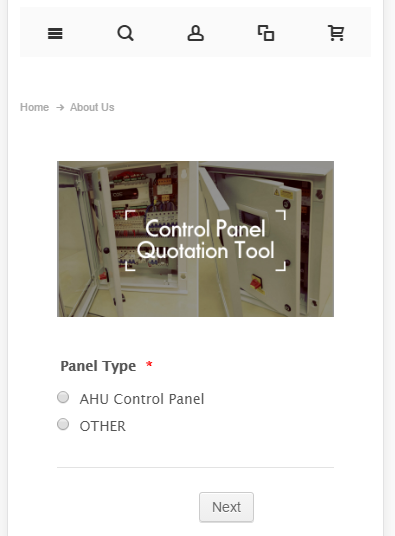
I have made a form which works well with mobiles how ever all of the images I have added are not responsive on mobiles so distort the page size.
Is there any way to make these images responsive so that they are resized based on mobile device?
Thanks
-
Elton Support Team LeadReplied on February 27, 2017 at 12:41 PM
That's possible. Inject this CSS codes to your form to make all the images in your form mobile responsive.
@media screen and (max-width:480px){
.form-image {
width: 100%;
height: auto;
}
}
Guide: http://www.jotform.com/help/117-How-to-Inject-Custom-CSS-Codes
As a result:
-
petercampbellReplied on March 9, 2017 at 8:44 AMThanks very much - that's great!
--
[image: photo]
*Peter Campbell*
Sales & Marketing Manager, i-A.C.Systems
office: +44 (0)20 81333679 | www.i-acs.co.uk
dd: +44 (0)20 3859 3321
peter.campbell@i-acs.co.uk
[image: http://www.facebook.com/pages/I-ACSystems/229467530398901]
[image: https://uk.linkedin.com/in/petercampbell93]
This message is for the designated recipient only and may contain
privileged, proprietary, or otherwise private information. If you have
received it in error, please notify the sender immediately and delete the
original. Any other use of this email by you is prohibited.
... -
petercampbellReplied on March 9, 2017 at 8:46 AMThanks very much - that's great!
--
[image: photo]
*Peter Campbell*
Sales & Marketing Manager, i-A.C.Systems
office: +44 (0)20 81333679 | www.i-acs.co.uk
dd: +44 (0)20 3859 3321
peter.campbell@i-acs.co.uk
[image: http://www.facebook.com/pages/I-ACSystems/229467530398901]
[image: https://uk.linkedin.com/in/petercampbell93]
This message is for the designated recipient only and may contain
privileged, proprietary, or otherwise private information. If you have
received it in error, please notify the sender immediately and delete the
original. Any other use of this email by you is prohibited.
...
- Templates
- Integrations
- INTEGRATIONS
- See 100+ integrations
- FEATURED INTEGRATIONS
 PayPal
- Slack
- Google Sheets
- Mailchimp
- Zoom
- Dropbox
- Google Calendar
- Hubspot
- Salesforce
- See more Integrations
- Products
- PRODUCTS
- Form Builder
- Jotform Enterprise
- Jotform Apps
- Store Builder
- Jotform Tables
- Jotform Inbox
- Jotform Mobile App
- Jotform Approvals
- Report Builder
- Smart PDF Forms
- PDF Editor
- Jotform Sign
- Jotform for Salesforce Discover Now
- Support
