


-
kyledavidAsked on March 2, 2017 at 11:43 AM
My media query for 767px is getting ignored and using the styles within the media query on all sizes.
The form URL listed contains two forms - the top is a custom HTML version and the bottom one is the Jotform.
-
Welvin Support Team LeadReplied on March 2, 2017 at 2:42 PM
You have the following styles in bootstrap.min.css file.
@media (min-width: 992px)
.col-md-offset-2 {
margin-left: 16.66666667%;
}
@media (min-width: 992px)
.col-md-8 {
width: 66.66666667%;
}
The width of the container is causing the form to expand to its full width. You may consider adjusting your mobile query or this column width value to fix the problem.
-
kyledavidReplied on March 2, 2017 at 3:03 PM
Hi there,
What you're referring to isn't affecting the form items itself, just the parent.
I have a screen attached from my inspector in Chrome of the media query. You can see that even above 767 pixels width, the media query is being activated. It's being loaded from <style></style>, which is the style sheet inserted through the Jotform Script source.

-
Welvin Support Team LeadReplied on March 2, 2017 at 4:15 PM
I understand that part. However, your container width is limited to a percentage which is causing the media query to be activated in the form, causing you the problem. Try to place the form into one column container. You'll see the correct output of the form.
Here's a screenshot of the container:
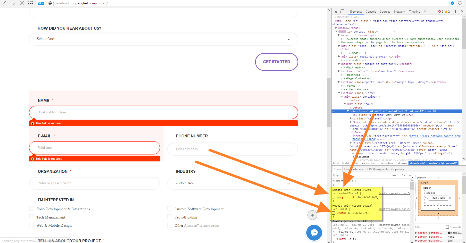
You'll see that if I unchecked the width value for the .col-md-8. The form resolves itself to the desktop view, not 100% for the media query.
I hope that explains it. Let me know if you are confused.
- Templates
- Integrations
- INTEGRATIONS
- See 100+ integrations
- FEATURED INTEGRATIONS
 PayPal
- Slack
- Google Sheets
- Mailchimp
- Zoom
- Dropbox
- Google Calendar
- Hubspot
- Salesforce
- See more Integrations
- Products
- PRODUCTS
- Form Builder
- Jotform Enterprise
- Jotform Apps
- Store Builder
- Jotform Tables
- Jotform Inbox
- Jotform Mobile App
- Jotform Approvals
- Report Builder
- Smart PDF Forms
- PDF Editor
- Jotform Sign
- Jotform for Salesforce Discover Now
- Support

