


-
endersislandAsked on March 6, 2017 at 9:27 PM
I have this problem on one of my forms but not another. Very strange. The mobile browser needs to display in one column, not two, but I can't figure out how to accomplish this, because it seems random.
The other form at this address (https://www.endersisland.com/office) is functioning perfectly.
 Page URL: https://www.endersisland.com/payment
 -
BJoannaReplied on March 7, 2017 at 12:46 AM
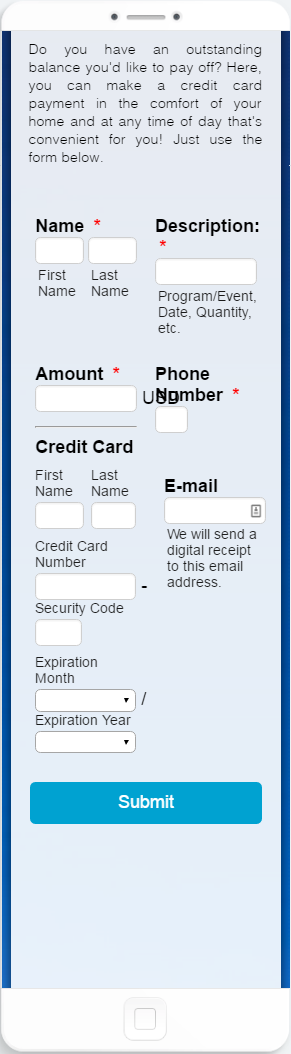
I have tested your form and I was able to replicate mentioned issue. Form is not displayed properly on mobile devices.
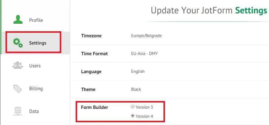
To resolve your issue, please add Mobile Responsive widget to your form. This widget is currently not available in Version 4 of our Form Builder, so you will have to switch back to Version 3 and add it to your form. You can switch back to Version 3 on settings page of your account.
After you add Mobile Responsive widget to your form, you can switch back to Version 4.
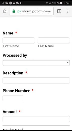
Also here is my cloned form, with Mobile responsive widget: https://form.jotform.com/70651093962964
My form looks like this on mobile devices.
Feel free to test it and clone it.
Hope this will help. Let us know if you need further assistance.
- Templates
- Integrations
- INTEGRATIONS
- See 100+ integrations
- FEATURED INTEGRATIONS
 PayPal
- Slack
- Google Sheets
- Mailchimp
- Zoom
- Dropbox
- Google Calendar
- Hubspot
- Salesforce
- See more Integrations
- Products
- PRODUCTS
- Form Builder
- Jotform Enterprise
- Jotform Apps
- Store Builder
- Jotform Tables
- Jotform Inbox
- Jotform Mobile App
- Jotform Approvals
- Report Builder
- Smart PDF Forms
- PDF Editor
- Jotform Sign
- Jotform for Salesforce Discover Now
- Support

