


-
waldensecurityAsked on March 17, 2017 at 9:57 AM
The image/logo I've placed in the header is great in every view mode except the mobile portrait view. It shrinks the logo way beyond proportion.
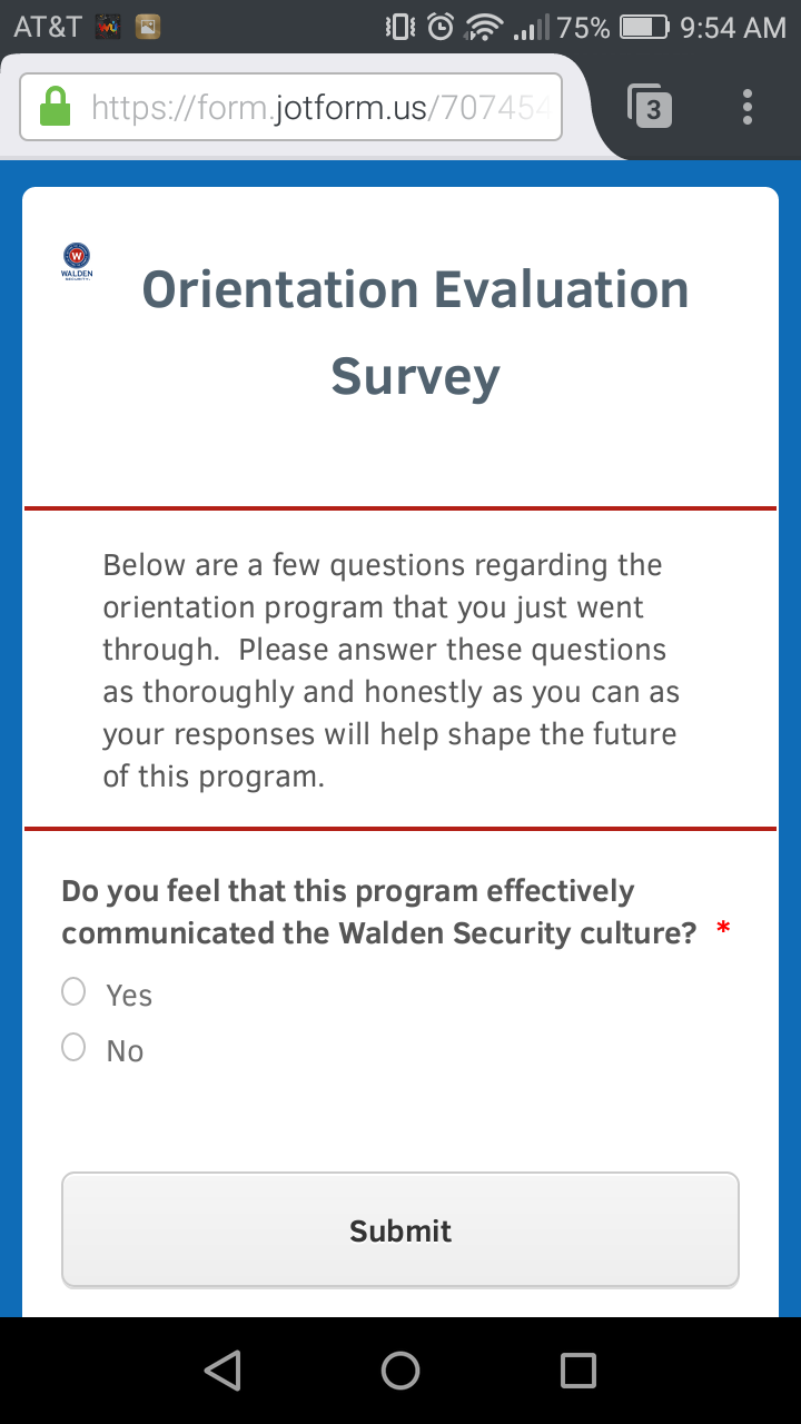 Page URL: https://form.jotform.us/70745423567158
 -
Kevin Support Team LeadReplied on March 17, 2017 at 1:13 PM
Please, inject the following CSS code to your form in order to resolve the issue:
@media screen and (max-width: 480px), screen and (max-device-width: 768px) and (orientation: portrait), screen and (max-device-width: 415px) and (orientation: landscape)
{
div.form-header-group.hasImage img {
max-width: initial !important;
}
}
Guide: How-to-Inject-Custom-CSS-Codes
Here's my cloned form of yours where I've injected the given code and worked: https://form.jotformpro.com/70755363457968
Hope this helps.
-
waldensecurityReplied on March 17, 2017 at 2:27 PM
This worked. Thanks.
- Templates
- Integrations
- INTEGRATIONS
- See 100+ integrations
- FEATURED INTEGRATIONS
 PayPal
- Slack
- Google Sheets
- Mailchimp
- Zoom
- Dropbox
- Google Calendar
- Hubspot
- Salesforce
- See more Integrations
- Products
- PRODUCTS
- Form Builder
- Jotform Enterprise
- Jotform Apps
- Store Builder
- Jotform Tables
- Jotform Inbox
- Jotform Mobile App
- Jotform Approvals
- Report Builder
- Smart PDF Forms
- PDF Editor
- Jotform Sign
- Jotform for Salesforce Discover Now
- Support
