


-
MartinCoAsked on March 21, 2017 at 10:31 AM
Hi, I just followed this code in Investment profile section of https://form.jotform.me/70745086704459
Can you please tell me how to make this content responsive so It's viewed on mobile screens.
Thanks
-
Support_Management Jotform SupportReplied on March 21, 2017 at 11:06 AM
I'm seeing you declared an 800px width to all the custom hover texts you added via CSS.
To make this responsive, you need to have 2 sets of the entire CSS Codes given by my colleague on the previous thread
1. For desktop
2. For mobile, using the @media query you already have on your CSS section
So, just copy the entire code block for the custom hover text > change all the width values from 800px to auto > then enclose the entire chunk within your @media query.
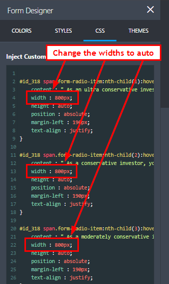
Place it within this:
@media only screen and (max-width:
480px) and (max-width : 1024px) {
/* The entire css chunk with the widths set to auto this time */
}
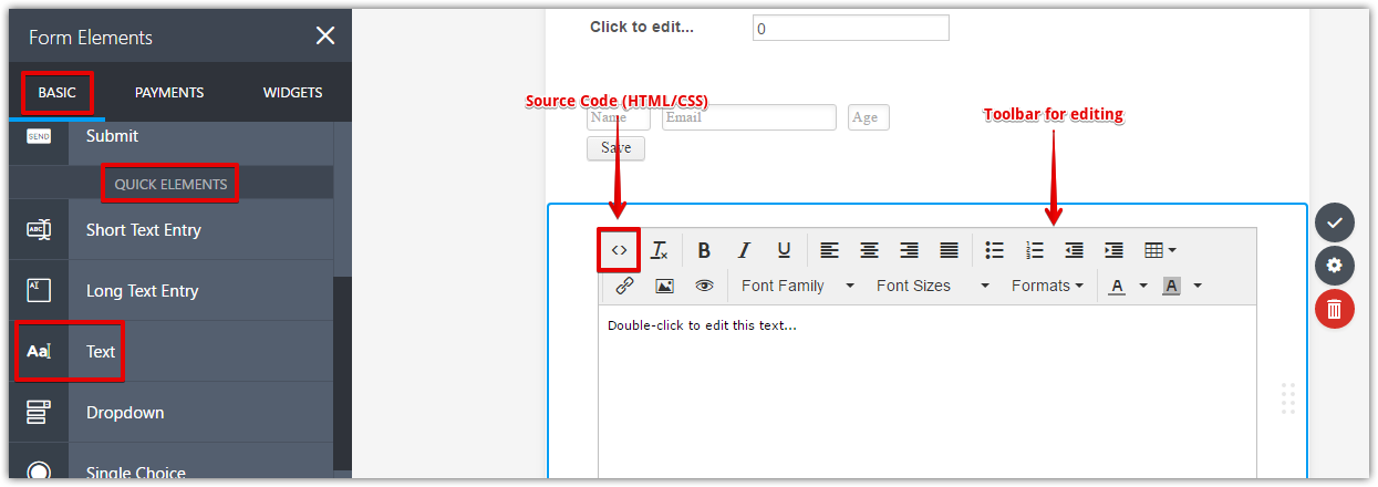
IMHO, it still won't look good on mobile due to the length of your description. As a user, I honestly think the hover texts won't be needed but if you think otherwise, another nifty way of adding more info to your form is by using the Text (HTML) Field, then use Conditions to conditionally show a description based on what was selected on the Single Choice Option (Radio Button).
Related guides:
-
MartinCoReplied on March 23, 2017 at 6:26 AM
Hi, I set width to auto but it's not working fine, it's colliding with next text block.
Yes the second option is more appropriate.
Thanks for the remarks.
- Templates
- Integrations
- INTEGRATIONS
- See 100+ integrations
- FEATURED INTEGRATIONS
 PayPal
- Slack
- Google Sheets
- Mailchimp
- Zoom
- Dropbox
- Google Calendar
- Hubspot
- Salesforce
- See more Integrations
- Products
- PRODUCTS
- Form Builder
- Jotform Enterprise
- Jotform Apps
- Store Builder
- Jotform Tables
- Jotform Inbox
- Jotform Mobile App
- Jotform Approvals
- Report Builder
- Smart PDF Forms
- PDF Editor
- Jotform Sign
- Jotform for Salesforce Discover Now
- Support
