


-
cyclingsneekAsked on March 27, 2017 at 4:22 AM
Hi there,
I have added the form using the WordPress.org platform option. All works well on desktop, but I don't get the form to be responsive. I have tried both options you offer (ticked the selection box in the designer and integrated the widget in the bottom of the form), but still no change..
Could you please have a look into this matter.
Thx.
Regards,
Johan
-
Chriistian Jotform SupportReplied on March 27, 2017 at 4:40 AM
Hi,
Have you tried embedding your form using the Embed Form Plugin? Please see this guide on Embed JotForm in Wordpress using the Embed Form Plugin.
Hope this helps.
Regards. -
cyclingsneekReplied on March 27, 2017 at 6:05 AM
Hi,
just tried it by using the embed plugin you suggested. However, without any succes..
Suggestions?
-
liyamReplied on March 27, 2017 at 7:06 AM
Hello Johan,
I tried visiting your website in order to get to see how it looks like while the form is embedded on the page but I can't seem to get to access it. The error states that the site can't be reached.
Anyhow, can you try using the iframe embed code to place on your web page instead? Here is a guide which you can follow if you need the steps how to get the code: https://www.jotform.com/help/148-Getting-the-form-iFrame-code
If this does not work, please let us know. It would also be great if you can share with us more information on what device you are using.
Thanks.
-
cyclingsneekReplied on March 27, 2017 at 7:59 AM
Hi,
Thx for your reply. I have tried your suggestion to use an iframe embed code. Unfortunately, without succes on my iPhone 7.
However when I check the page (http://wvsnits.nl/lid-worden-van-wv-snits-test/) on http://deviceponsive.com/?url=http%3A%2F%2Fwvsnits.nl%2Flid-worden-van-wv-snits-test%2F
everything is displayed accordingly. I have cleared cache.
When I visited the page using the iphone 7 in landscape it displays the proper way.
Hope to hear from you.
-
cyclingsneekReplied on March 27, 2017 at 9:03 AM
In adition to the above:
On android devices the form is displayed correct.
On the iPhone 7 and 5C the form is displayed incorrect in portrait view but displayed correct in landscape view.
-
Nik_CReplied on March 27, 2017 at 11:46 AM
I inserted a CSS code that should adjust your form on iPhone devices. This is the code that I pasted in your form:
@media only screen
and (min-device-width : 375px)
and (max-device-width : 667px) {
div#cid_3 {
width: 290px;
}
div#cid_10 {
width: 290px;
}
div#cid_16 {
width: 290px;
}
div#cid_5 {
width: 290px;
}
div#cid_12 {
width: 290px;
}
div#cid_6 {
width: 290px;
}
div#cid_7 {
width: 290px;
}
div#cid_8 {
width: 290px;
}
div#cid_9 {
width: 290px;
}
div#cid_11 {
width: 290px;
}
div#cid_13 {
width: 290px;
}
div#cid_14 {
width: 290px;
}
div#cid_15 {
width: 290px;
}
div#text_17{
width:290px;
}
div#cid_26 {
width: 290px;
}
div#cid_20 {
width: 290px;
}
div#cid_21 {
width: 290px;
}
div#cid_22 {
width: 290px;
}
div#cid_23 {
width: 290px;
}
div#cid_27 {
width: 290px;
}
div#text_28{
width:290px;
}
div#text_17{
width:290px;
}
li#id_26{
width:290px;
}
li#id_14{
width:290px;
}
li#id_19{
width:290px;
}
li#id_24{
width:290px;
}
li#id_25{
width:290px;
}
}
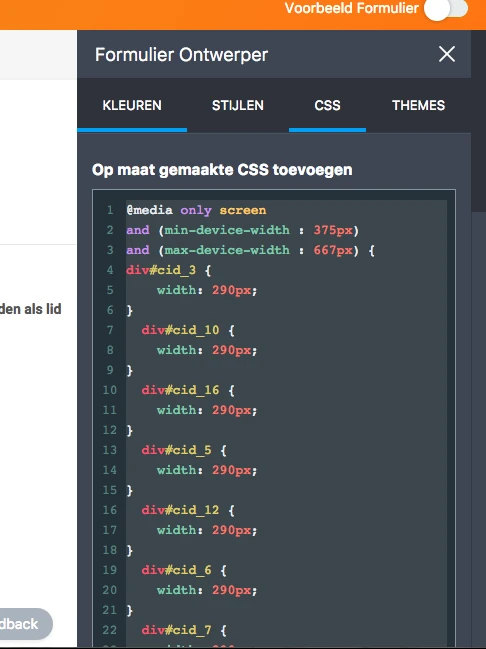
I tested and it looks fine, but please check and let us know if that works for you.
Thank you!
- Templates
- Integrations
- INTEGRATIONS
- See 100+ integrations
- FEATURED INTEGRATIONS
 PayPal
- Slack
- Google Sheets
- Mailchimp
- Zoom
- Dropbox
- Google Calendar
- Hubspot
- Salesforce
- See more Integrations
- Products
- PRODUCTS
- Form Builder
- Jotform Enterprise
- Jotform Apps
- Store Builder
- Jotform Tables
- Jotform Inbox
- Jotform Mobile App
- Jotform Approvals
- Report Builder
- Smart PDF Forms
- PDF Editor
- Jotform Sign
- Jotform for Salesforce Discover Now
- Support


