


-
betwrestlingAsked on March 27, 2017 at 7:51 AM
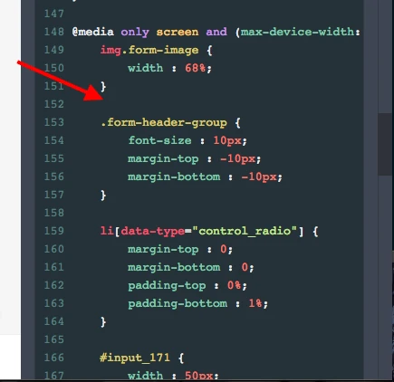
So i am attempting to change some CSS code for when viewing the form on mobile devices like form-label font size, form-header-group font size, etc but no matter what font size i change it to, when viewing the form on mobile devices nothing seems to change at all. Could somebody please look at my CSS code to see if there are any mistakes and perhaps find the reason for why things aren't changing (on mobile devices) when i edit the code? Thank you!
Page URL: https://form.jotform.co/70773161313854 -
BorisReplied on March 27, 2017 at 10:29 AM
I see that the custom CSS has been added to your form successfully. However, the @media queries inside your CSS code are rather specific and targeting only some mobile devices - are you sure you are using a mobile device that matches one of the @media queries you are using?
Your @media queries are targeting the following:
@media screen
and (device-width: 320px)
and (device-height: 640px)
and (-webkit-device-pixel-ratio: 3)@media screen
and (device-width: 360px)
and (device-height: 640px)
and (-webkit-device-pixel-ratio: 3)@media screen
and (device-width: 360px)
and (device-height: 640px)
and (-webkit-device-pixel-ratio: 3)If your device does not match the specifications, the CSS code inside such media queries will not be applied. If you want to match all mobile devices, you may want to omit the -webkit-device-pixel-ratio, ans use a single max-width instead of device-width and device-height, like so:
@media screen
and (max-width: 320px)@media screen
and (max-width: 640px)Etc. Please try it out, and let us know should you need further assistance.
-
betwrestlingReplied on March 27, 2017 at 4:40 PM
Hello,
I did as you suggested and it now isn't working at all.
Am i meant to put the CSS code in between both @media screens or underneath both?
-
jonathanReplied on March 27, 2017 at 8:35 PM
I test your form on the mobile device browser but I could not reproduce the issue.

When I checked your form injected CSS codes, I see the code was already the same as to what my colleague had suggested.

Please let us know if the issue persist up to this time. You can also share to us a screenshot image of the issue so that we can identify further what exactly was the error.
-
betwrestlingReplied on March 27, 2017 at 8:54 PM
I am really confused now. In that image you sent me there is only one column per radio options. This is not meant to happen. It has been set up so that there are two columns. When i view my website the form is on on my mobile there are two columns which is correct, i have no idea why there is only one column showing up on your end.
Also, i changed the code to what your colleague suggested which is why you can see it. However this hasn't fixed anything, at least at my end.
-
jonathanReplied on March 27, 2017 at 10:46 PM
Can you please take a screenshot of the issue. You can upload the screenshot image here so that we can see the problem.
Right now we could not replicate the issue when we test the form.
We will wait for your response.
-
betwrestlingReplied on March 28, 2017 at 1:22 AM
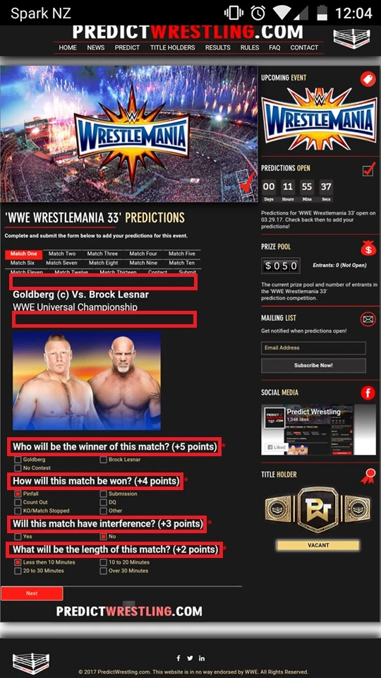
This is a screenshot of the form on my website when viewing on my mobile.
The image under ' WWE Universal Championship' is far too big and isn't 68% as it is set as in the CSS codes. Not only that, none of the codes under the @media screen codes (the mobile responsive codes) seem to be working which is why i'm wondering if there is errors in the @media screen codes. What i'm trying to do is make the image on all of the pages smaller (68%) on mobile devices, and also have the headings and radio labels smaller on all of the pages on mobile devices.
Hope that makes sense!

-
Chriistian Jotform SupportReplied on March 28, 2017 at 3:35 AM
Can you please provide your site's link also so that we can further check? I would also recommend visiting this link: https://css-tricks.com/snippets/css/media-queries-for-standard-devices/ for more info about Media Queries for any standard device.
-
betwrestlingReplied on March 28, 2017 at 3:56 AM
Sorry about that. My site with the form is http://www.predictwrestling.com/abcd.
It works absolutely fine on computers, its just when viewing on mobiles the form doesn't show correctly.
-
Chriistian Jotform SupportReplied on March 28, 2017 at 4:26 AM
Can you please try injecting this CSS code in your form and see if this works:
@media only screen and (max-device-width: 540px) {
img.form-image {
width: 68% !important;
}
}
-
betwrestlingReplied on March 28, 2017 at 5:05 AM
Thank you so much i am finally having some luck! The image is finally resized.
However the radio labels don't seem to be changing. For example i use this code...form-label {
font-size : 14px !important;
margin : 0px 0px 10px 0px;
width : 500px;
}
No matter what i change the font size to, when i view it on mobile it doesn't change at all.
-
Chriistian Jotform SupportReplied on March 28, 2017 at 5:15 AM
Glad that the image is finally resized when viewing it on mobile. I have moved your next question to a separate thread. Please follow this link: https://www.jotform.com/answers/1104092. We will answer your question there shortly.
Regards.
-
betwrestlingReplied on March 28, 2017 at 5:17 AM
Also, one other thing.. i need to decrease the space between the tabs and the header as well as between the header and the image, as shown in the screenshot. (The red boxes is where i need the space decreased). What is the code to do this? Thank you.

-
Nik_CReplied on March 28, 2017 at 5:57 AM
You can use the below CSS code to adjust your Heading's margins:
.form-header-group {margin-top: -5px;margin-bottom: -5px;}Just adjust the numbers so it match what you're expecting.
Let us know if you have any further questions.
Thank you!
-
betwrestlingReplied on March 28, 2017 at 6:53 PM
Thank you but that is not working. I copied the code and put it under the '@media only screen codes but no matter what i change the numbers to it doesn't change when viewing it on mobile devices.
-
Chriistian Jotform SupportReplied on March 28, 2017 at 8:51 PM
Hi,
Can you please try injecting this CSS code on your form but not inside the @media?
.form-header-group {
margin-top: -5px;
}
.form-subHeader {
margin-bottom: -5px;
}
Regards.
-
betwrestlingReplied on March 28, 2017 at 9:10 PM
Thank you but i don't understand. The form looks completely fine on computers. I only want the margins adjusted on mobile devices so i don't see how that code would help?
-
Chriistian Jotform SupportReplied on March 28, 2017 at 10:22 PM
Hi,
Sorry for the confusion. If you want to adjust it when viewing on a mobile device, please put the code inside the @media.
For example:
@media only screen and (max-device-width: 540px) {
.form-header-group {
margin-top: -5px;
}
.form-subHeader {
margin-bottom: -5px;
}
}
Then adjust the margin according to your preferences.
Regards.
-
betwrestlingReplied on March 29, 2017 at 2:31 AM
This is my form that is on my website at http://www.predictwrestling.com/abcd. The screenshot below is how it looks when viewing on mobile devices.
The form works absolutely fine when viewing on a computer, it is only when viewing on a mobile device where i need the following changes made. It seems like i have tried everything however no matter what i can't seem to make the following changes..
I need the space decreased in the first two boxes.
I need the text in the third, fourth, fifth and sixth to be smaller.
Could somebody please have a play around with my CSS code so that these changes are made? I only want the changes made for when viewing on mobile devices, not when viewing on computers.
Thank you so much in advance!
-
Nik_CReplied on March 29, 2017 at 3:57 AM
For the header margins please use the below CSS code and insert it in @media only screen class:
.header-text.httal.htvam {
margin-top: -10px!important;
margin-bottom: -10px!important;
}
For the text size please copy the below CSS to the same @media only screen class:
#label_73 {
font-size: 10px!important;
}
#label_74 {
font-size: 10px!important;
}
#label_75 {
font-size: 10px!important;
}
#label_99 {
font-size: 10px!important;
}
And please change the numbers (green) to fit your needs. Let us know how it worked.
Thank you!
- Templates
- Integrations
- INTEGRATIONS
- See 100+ integrations
- FEATURED INTEGRATIONS
 PayPal
- Slack
- Google Sheets
- Mailchimp
- Zoom
- Dropbox
- Google Calendar
- Hubspot
- Salesforce
- See more Integrations
- Products
- PRODUCTS
- Form Builder
- Jotform Enterprise
- Jotform Apps
- Store Builder
- Jotform Tables
- Jotform Inbox
- Jotform Mobile App
- Jotform Approvals
- Report Builder
- Smart PDF Forms
- PDF Editor
- Jotform Sign
- Jotform for Salesforce Discover Now
- Support


