


-
betwrestlingAsked on March 28, 2017 at 10:09 PM
My form has two headers (with subheaders) and are the exact same size. However when viewing on mobile devices they are two different sizes.
My website the form is on is http://www.predictwrestling.com/abcd
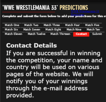
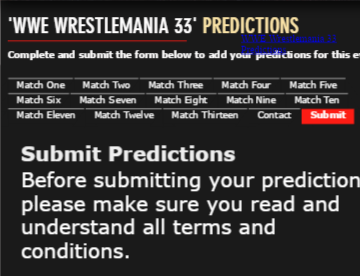
Please see the screenshots below to understand what i mean. The first screenshot has the header 'Submit Predictions' with a subheader. The size of the header (and subheader) is different to the header under the 'Contact' tab in screenshot two even though they are both set as exactly the same size.
I would like the header (and subheader) under the 'Submit' tab to be the same size as the header (and subheader) in the 'Contact' page. Again, its absolutely fine when viewing on computers so i am assuming there is something wrong with the @media screen code.
Help would be much appreciated thank you!
Screenshot one: Submit Tab. ('Submit Predictions' header/subheader is INCORRECT size)

Screenshot Two: Contact Tab ('Contact Details' header/subheader is CORRECT size)
 Page URL: https://form.jotform.co/70773161313854
 -
Support_Management Jotform SupportReplied on March 29, 2017 at 3:45 AM
That's odd, you don't have any @media queries on your Custom CSS and the Headers are identical. When viewed on the standalone form, regardless on mobile or desktop, they are the same. The difference only happens when viewed from mobile on your website.
Can you try adding these CSS codes:
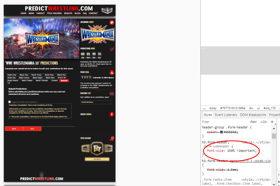
h3.form-header, .form-subHeader {
font-size: 250%;
}
If that won't work, append !important to it:
h3.form-header, .form-subHeader {
font-size: 250% !important;
}
Complete guide: How-to-Inject-Custom-CSS-Codes
Result:
-
betwrestlingReplied on March 29, 2017 at 4:25 AM
Thank you for your help however neither code changed anything at all. I have no idea what to do.
-
Support_Management Jotform SupportReplied on March 29, 2017 at 5:21 AM
I saw the codes on your website but it appears you used 150% instead of 250%.
Can you try it again and use 250% this time? Thanks 😊
-
betwrestlingReplied on March 29, 2017 at 5:33 AM
I changed both codes to 250% and still no change to the 'Submit' header and subheader when viewing on mobile
-
IanReplied on March 29, 2017 at 7:34 AM
I am sorry but http://www.predictwrestling.com/abcd is not loading for me and giving me PAGE NOT FOUND error.
Am I looking at the wrong URL?
-
betwrestlingReplied on March 29, 2017 at 7:43 AM
Sorry about that. The URL is now http://www.predictwrestling.com/predict
-
Welvin Support Team LeadReplied on March 29, 2017 at 11:14 AM
Inject the following custom CSS codes to your form:
@media only screen and (max-device-width: 767px) {
.form-header {
font-size: 16px !important;
}
.form-subHeader {
font-size: 15px !important;
}
}
Adjust the sizing until you'll get the desired result in mobile devices. Note, this will override the size of all the headers and sub-headers in the form.
Let us know if you need further assistance.
- Templates
- Integrations
- INTEGRATIONS
- See 100+ integrations
- FEATURED INTEGRATIONS
 PayPal
- Slack
- Google Sheets
- Mailchimp
- Zoom
- Dropbox
- Google Calendar
- Hubspot
- Salesforce
- See more Integrations
- Products
- PRODUCTS
- Form Builder
- Jotform Enterprise
- Jotform Apps
- Store Builder
- Jotform Tables
- Jotform Inbox
- Jotform Mobile App
- Jotform Approvals
- Report Builder
- Smart PDF Forms
- PDF Editor
- Jotform Sign
- Jotform for Salesforce Discover Now
- Support

