


-
TannerAsked on April 6, 2017 at 4:39 PM
I have a developer creating a custom survey using your Jotform platform. Everything looks good so far, except for the buttons on mobile. I was wondering if you would know of any possible way to have the buttons stacks one on top of the other, as opposed to have them running side by side. If so, I'd love to hear from you. I've included an image to give you an idea of what it looks like now. I look forward to your response! :)
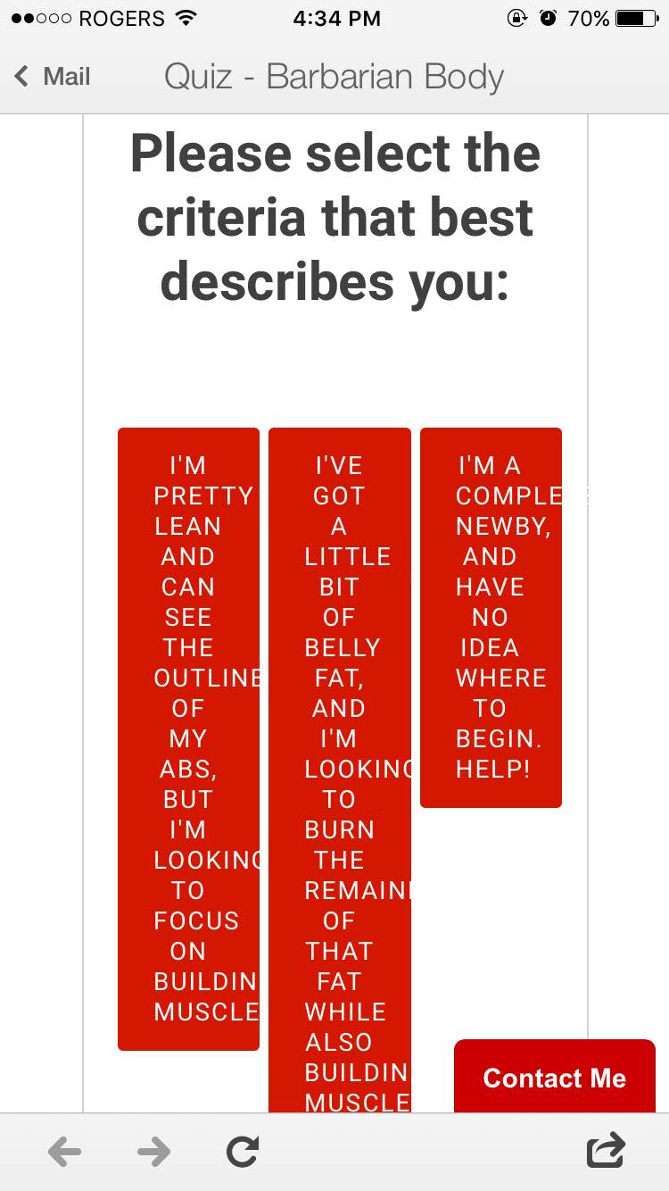 Page URL: https://thebarbarianbody.com/pages/quiz
 -
Kevin Support Team LeadReplied on April 6, 2017 at 5:59 PM
Please, try injecting the following CSS code to your form:
@media screen and (max-width: 480px){
span.form-radio-item {
width: 100% !important;
}
.form-all .form-section.page-section:nth-child(4) .form-radio-item {
width: 100% !important;
}
.form-all .form-section.page-section:nth-child(4) .form-radio-item label{
min-height: initial !important;
}
}
This guide will help you to do it: How-to-Inject-Custom-CSS-Codes
Here's a cloned form of yours where you can see the result: https://form.jotform.com/70956594053969
If you have any question, let us know.
- Templates
- Integrations
- INTEGRATIONS
- See 100+ integrations
- FEATURED INTEGRATIONS
 PayPal
- Slack
- Google Sheets
- Mailchimp
- Zoom
- Dropbox
- Google Calendar
- Hubspot
- Salesforce
- See more Integrations
- Products
- PRODUCTS
- Form Builder
- Jotform Enterprise
- Jotform Apps
- Store Builder
- Jotform Tables
- Jotform Inbox
- Jotform Mobile App
- Jotform Approvals
- Report Builder
- Smart PDF Forms
- PDF Editor
- Jotform Sign
- Jotform for Salesforce Discover Now
- Support
