


-
fhpwAsked on April 13, 2017 at 7:28 PM
I have created a PayPal product with quantity option. It works and is responsive for all fields except the PayPal product quantity. Is there a way to make the quantity not go beyond the boarders? This only occurs on the mobile device vertical view; otherwise the form is responsive.

https://www.jotform.com/fhpw/seminar
Thanks,
-
John_BensonReplied on April 14, 2017 at 1:28 AM
I cloned your form and I can replicate the issue. Please add this custom CSS code to fix the product quantity:
@media screen and (max-width: 480px),
screen and (max-device-width: 768px) and
(orientation: portrait), screen and
(max-device-width: 415px) and
(orientation: landscape) {
#label_35 .form-dropdown {
width: 45px !important;
}
}
@media only screen and (max-width: 40em) {
.form-sub-label-container {
width: 100px !important;
}
}
Here's a guide on: How-to-Inject-Custom-CSS-Codes
Result:

-
fhpwReplied on April 14, 2017 at 10:10 AM
Thank you. This worked great. However, I noticed that now the Member Organization dropdown field does not expand to the width of the of the mobile device (portrait or landscape) view.
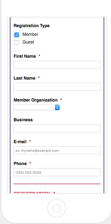
https://www.jotform.com/fhpw/seminar
Assistance to have the media screen adjust for this drop down is greatly appreciated.
Thanks,
-
fhpwReplied on April 14, 2017 at 10:47 AM
Since the dropdown has the long text options, using the same original sizing I reset the dropdown property and dropdown style values. It now appears to be working.
Thanks,
- Templates
- Integrations
- INTEGRATIONS
- See 100+ integrations
- FEATURED INTEGRATIONS
 PayPal
- Slack
- Google Sheets
- Mailchimp
- Zoom
- Dropbox
- Google Calendar
- Hubspot
- Salesforce
- See more Integrations
- Products
- PRODUCTS
- Form Builder
- Jotform Enterprise
- Jotform Apps
- Store Builder
- Jotform Tables
- Jotform Inbox
- Jotform Mobile App
- Jotform Approvals
- Report Builder
- Smart PDF Forms
- PDF Editor
- Jotform Sign
- Jotform for Salesforce Discover Now
- Support


