


-
GandSEandWAsked on April 18, 2017 at 10:42 AM
Hi there,
You mentioned that the configurable list widget is not mobile responsive. A lot of the forms on our website use the configurable list widget. As you say, you can overcome this by injecting CSS codes into the widget. Unfortunately, I do not know how to do this myself. It seems like a very custom, specific fix.
Anyway, I have two other forms that use the configurable list widget that are not working in mobile view - very similar to what was happening with the form above that you fixed. I am wondering if perhaps you can provide CSS codes that will make them work. However, I also wonder if the plan is to make the configurable list widget mobile responsive because that would fix all future problems. It is a very useful widget so I am surprised it is not as user friendly as it should be.
The forms that need fixing can be found here:
http://www.gandselectric.com/clothing---workwear
http://www.gandselectric.com/clothing-office
You will need to log in to our website to access them. You do have an account under the support@jotmail.com address so you should still be able to access them.
Let me know how you make out!
Thanks
-
Nik_CReplied on April 18, 2017 at 12:08 PM
The issue with configurable list widget is that it is a custom field and it is mostly different for every user so it is hard to make it responsible by default, but it can be adjusted by CSS, that it's true.
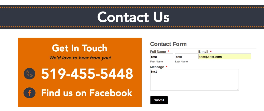
Could you please navigate us to that form on your website, the only what I see is this:
We'll wait for your response.
Thank you!
-
GandSEandWReplied on April 18, 2017 at 12:50 PM
you have to click the employees button on the main menu and log in to view the forms. You guys have already registered your email.
-
Nik_CReplied on April 18, 2017 at 2:36 PM
Thank you for additional information, I'm sorry I oversaw that.
I will try to apply the CSS that will work for your Configurable list and I'll get back to you once I do.
Thank you!
-
Nik_CReplied on April 19, 2017 at 6:40 AMThank you very much for your patience.I tried various CSS codes but the best solution was to shrink the width of fields when they are viewed on mobile phones. I inserted for this form already: http://www.jotformpro.com/form/52285974302963 and tested so it should look like this:That's for iPhone 6/6s:
 And this is for iPhone 5:
 Maybe you could change the remove button text from "Remove Item" to "Remove".And this is the code I inserted:@media only screenand (min-device-width : 375px)and (max-device-width : 667px) {.col1 select {width: 120px!important;}.col2 input[type="text"] {width: 50px!important;}.col3 input[type="text"] {width: 70px!important;}}@media only screenand (min-device-width : 320px)and (max-device-width : 568px) {.col1 select {width: 92px!important;}.col2 input[type="text"] {width: 50px!important;left: -13px!important;position: relative;}.col3 input[type="text"] {width: 70px!important;position: relative;left: -9px;}button.remove {width: 73px;position: relative;left: -8px;}}Please test and let us know how it worked.I'm still working on the other one.
 -
Nik_CReplied on April 20, 2017 at 6:33 AM
Thank you for your patience.
I inserted the CSS in your other form: http://www.jotformpro.com/form/52306464669967
And here it is:
@media only screen
and (min-device-width : 375px)
and (max-device-width : 667px) {
td.col2 {
position: relative;
top: 17px!important;
}
td.col3 {
position: relative;
display: block;
top: 16px!important;
}
td.col4 {
position: relative;
display: block;
top: -22px!important;
left: 125px!important;
}
tr {
display:block;
}
iframe#customFieldFrame_5 {
height: 160px!important;
}
th {
display: none;
}
.col1:before, .col2:before, .col3:before, .col4:before {
font-weight: bold;
}
td.col1:before {
content:"Item Name and Number";
display:block;
width:100px;
}
td.col2:before {
content:"Colour";
display:block;
}
td.col3:before {
content:"Size";
display:block;
}
td.col4:before {
content:"Quantity";
display:block;
}
}
On iPhone 6 here is how it looks like:

Please check and let us know how it worked.
Thank you!
-
GandSEandWReplied on April 20, 2017 at 8:25 AM
Hi there,
Thank you for your help. The work wear form now works although the fields are very small and people will have difficulty seeing the selections they make in the 'item name and number' field. I have edited the remove item button as you recommended so that it looks a bit better. However, I'm still not 100% happy with the way it looks. Ideally, it would be great to have the item name and number on one line and the size, quantity and remove button on a 2 line.
The office form still does not work on my android device. It looks pretty good on your iphone, but I am thinking that maybe the item name and number should be on one line and the colour, size and quantity fields be on the second line.
Let me know what you com up with. Thanks!
-
Nik_CReplied on April 20, 2017 at 11:15 AM
Thank you for your feedback.
Ok, so for this form: http://www.jotformpro.com/form/52285974302963 I adjusted the CSS and it looks like this on iPhones now:

I understand that is what you had in mind. I left the Remove button below because of the devices with smaller screens.
Regarding the Android devices, I'm still checking that, since on some will work properly on some will not. So I will get back to you on that one.
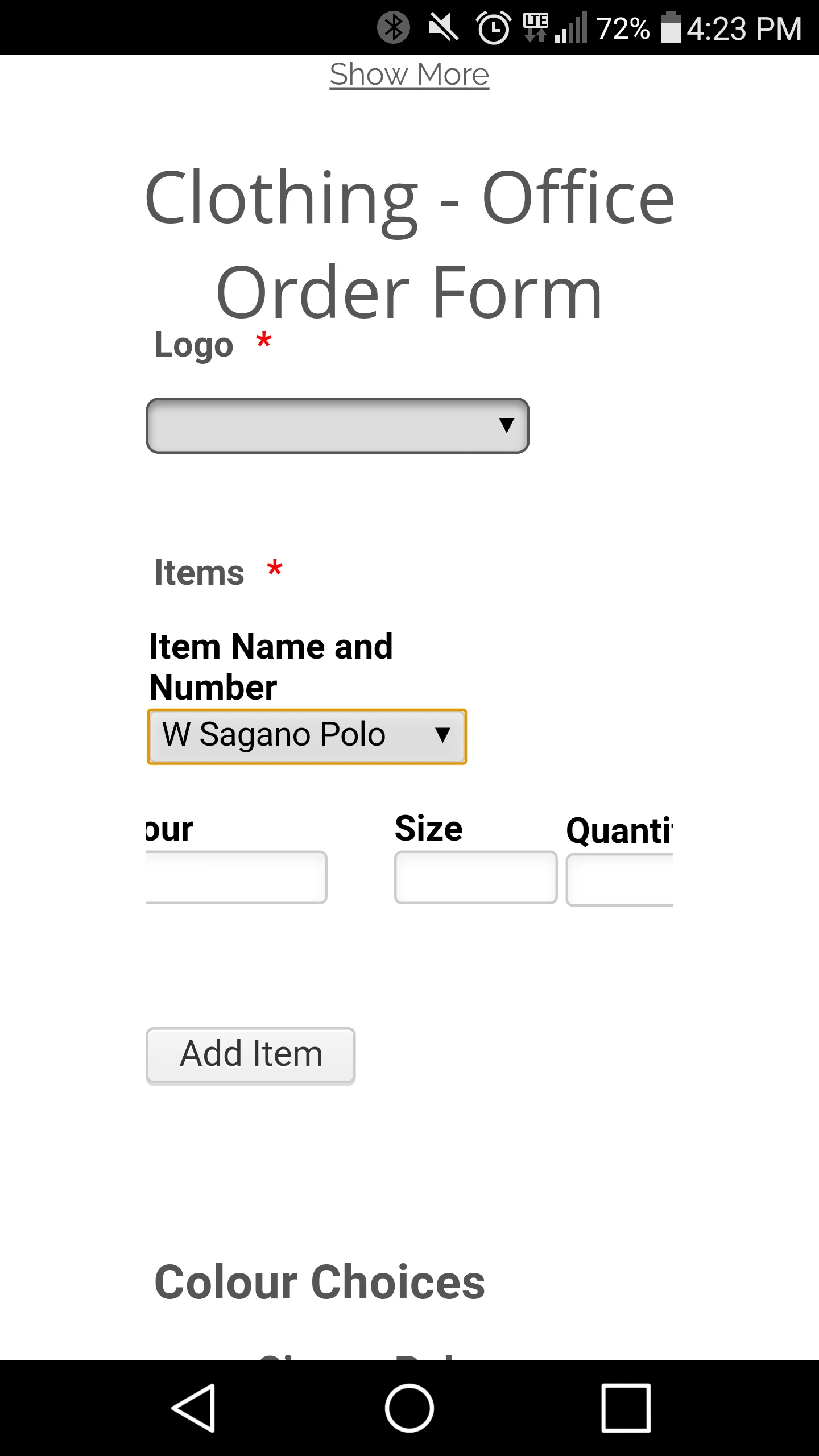
Regarding the Office form, I adjusted as you proposed:

I tested on iPhone 5/5s and iPhone 6/6s and it works fine.
Still, I'm working on Android.
But let us know your thoughts.
Thanks!
-
GandSEandWReplied on April 20, 2017 at 4:30 PM
You are on the right track! They are still a little off though. This is how the work wear form looks for me on android:
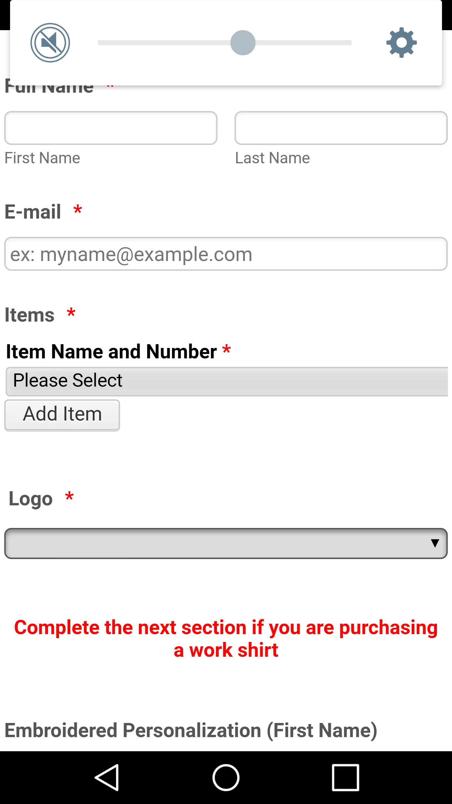
I only see the item name and number field.
This is how the office one looks:
I don't know why the fields get cut off at the ends. Also, the item name and number field is a little small - could be longer.
I think we are getting close tho. Thanks for all your hard work! Let me know how you make out!
-
Nik_CReplied on April 20, 2017 at 4:45 PM
I actually increased the Item name and number field for the Office order form, but it changes depending on where it is viewed.
I'm still working on Android version, so I will let you know once I finish.
Thank you!
-
Nik_CReplied on April 21, 2017 at 6:22 AM
I fixed this form https://form.jotform.com/52285974302963 for some Android devices, please check and let us know how it worked. Also, if it doesn't work properly on the Android device you tested please let us know the model.
I had some difficulties with this one: https://form.jotform.com/52306464669967 but test it as well.
Thank you!
-
GandSEandWReplied on April 21, 2017 at 11:33 AM
I am using an LG G3 android version 6.0. Both forms are still not working for me. They look the same as yesterday. I will try to check on some other devices. Thanks
-
Nik_CReplied on April 21, 2017 at 11:53 AM
Thanks for letting me know, I will try to find CSS that will fit.
Also, I will wait for your response.
Thank you!
-
Nik_CReplied on April 22, 2017 at 7:29 AM
I was able to insert the CSS that will make the forms working as we planned on Android devices, I tested specifically on LG G5 but that should work on G3 and G4 since it is the same resolution, but please test and confirm. It should look like this:
https://form.jotform.com/52306464669967: https://form.jotform.com/52285974302963:


I tested on my Samsung Note 3 as well and it worked the same, there could be some problems with iPhones now since the CSS is in conflict but I'll still have to check that.
-
GandSEandWReplied on April 24, 2017 at 9:27 AM
So the work wear form looks good! The office form was still a little off, but I have edited the page on our website builder and that has corrected the issue for me. Although I'm not exactly sure why. I have looked at a couple other phones and they look ok too. Unless you discover that the forms look weird on some other devices I think we are good to go.
Thank you for all your help! You have been a real pleasure! I will let you know if anything else comes up!
-
Elton Support Team LeadReplied on April 24, 2017 at 11:02 AM
We are happy to hear that everything worked out as expected.
If you come across any problems again, please let us know. We'd be happy to help.
- Templates
- Integrations
- INTEGRATIONS
- See 100+ integrations
- FEATURED INTEGRATIONS
 PayPal
- Slack
- Google Sheets
- Mailchimp
- Zoom
- Dropbox
- Google Calendar
- Hubspot
- Salesforce
- See more Integrations
- Products
- PRODUCTS
- Form Builder
- Jotform Enterprise
- Jotform Apps
- Store Builder
- Jotform Tables
- Jotform Inbox
- Jotform Mobile App
- Jotform Approvals
- Report Builder
- Smart PDF Forms
- PDF Editor
- Jotform Sign
- Jotform for Salesforce Discover Now
- Support


