


-
iAssistAsked on May 6, 2017 at 11:37 PM
Hi team
I have created an optin page https://form.jotform.co/71242195992866
When I view the page on mobile the image is cut off (however on the Jotform Preview page it shows as covering the screen)
Can you please advise how I can have the image cover the full screen on mobile devices?
Thank you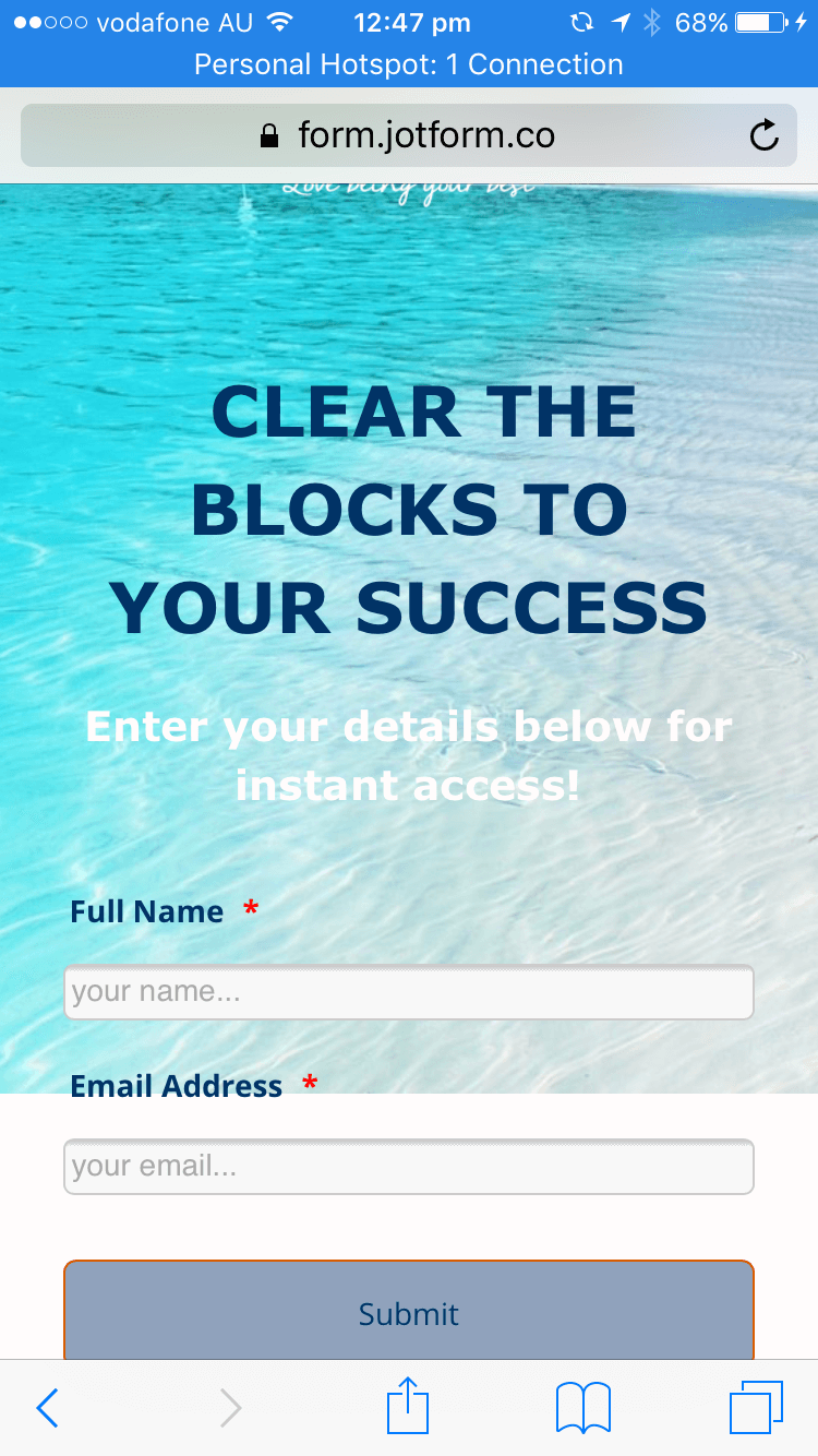 Page URL: https://form.jotform.co/71242195992866
 -
Mike_G JotForm SupportReplied on May 7, 2017 at 12:07 AM
Please try to add the following CSS codes to your form and see if that would fix the issue you're having in your mobile device.
@media only screen and (min-device-width : 414px) and (max-device-width : 736px) {
.supernova {
background-attachment: fixed !important;
}
}
How-to-Inject-Custom-CSS-Codes
Thank you.
-
iAssistReplied on May 7, 2017 at 11:00 PM
Thank you for your response ... unfortunately this has not made any difference :(
-
Nik_CReplied on May 8, 2017 at 3:11 AM
Please remove the code provided by my colleague earlier and copy and paste the below one:
.supernova {
background-repeat: no-repeat;
background-attachment: fixed;
}
@media screen and (max-width: 480px){
.supernova {
background-image : url("https://www.jotform.com/uploads/iAssist/form_files/Island%20cropped.295.jpg");
background-size : cover;
height : 100%;
overflow : hidden;
}
body {
height : 100%;
overflow : scroll;
-webkit-overflow-scrolling : touch;
}
}
I tested and that should work as intended.
Please let us know how it worked.
Thank you!
-
iAssistReplied on May 8, 2017 at 11:30 AM
Thank you! That worked perfectly!!
Ever so grateful :D
- Templates
- Integrations
- INTEGRATIONS
- See 100+ integrations
- FEATURED INTEGRATIONS
 PayPal
- Slack
- Google Sheets
- Mailchimp
- Zoom
- Dropbox
- Google Calendar
- Hubspot
- Salesforce
- See more Integrations
- Products
- PRODUCTS
- Form Builder
- Jotform Enterprise
- Jotform Apps
- Store Builder
- Jotform Tables
- Jotform Inbox
- Jotform Mobile App
- Jotform Approvals
- Report Builder
- Smart PDF Forms
- PDF Editor
- Jotform Sign
- Jotform for Salesforce Discover Now
- Support

