


-
SaleBootCampAsked on May 24, 2017 at 1:35 PM
Hello,
Love Jot Form and love the forms. Quick question, I am following the on-line suggestion to make your form mobile responsive by ticking the "Make this Form responsive" in the Advanced bit of Advanced Designer, Form Layout - however the tick box is not there and as a result on an iphone length ways it cuts off the form - it works if you turn it horizontally though, I have also added in the Mobile Plugin but it is the same issue.
Any suggestions?
Thanks,
Andrew.
-
Kiran Support Team LeadReplied on May 24, 2017 at 3:07 PM
I have checked your form on iPhone mobile emulator and see that the form is not displaying with the responsive width. Please try injecting the following code to the form to reduce the width of the form while viewing on mobile devices.
@media screen and (min-width: 10px) and (max-width: 540px){
.supernova {
width: 90%;
}
}
Please get back to us if the issue still persists. We will be happy to assist you further.
-
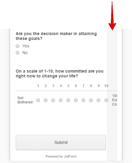
SaleBootCampReplied on May 24, 2017 at 5:53 PM
Hello,
I've added that into the CSS bit on the Advanced bit - it is better but...
1. Still has a few bits missing to the side.
2. The last question which is a 1-10 question is missing
3. The submit button is now missing
Any suggestions?
Thanks in advance,
Andrew.
-
Elton Support Team LeadReplied on May 24, 2017 at 7:35 PM
You're right, it is a bit cut-off on the right side and there's an overlapping field.
Can you please try to remove the CSS codes provided by my colleague and replace it with the following?
@media screen and (max-width:500px){
.form-scale-table th, .form-scale-table td {
padding: 9px 2px;
}
}
I actually don't see any cut off in your form except the overlapping scale rating field. Making it horizontal is a bit complex. The easier way is to reduce it's left and right spacing.
Here's the expected result:
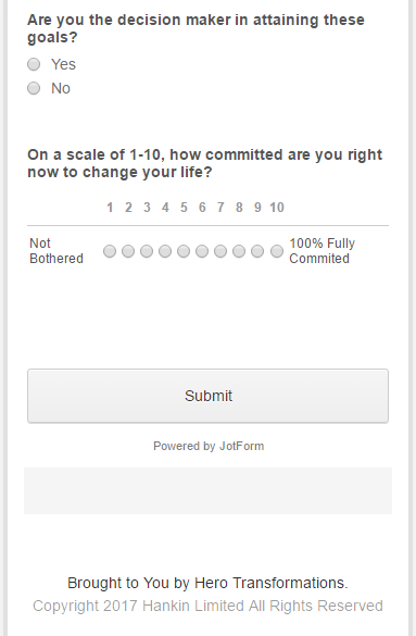
Please let us know if this doesn't fix the problem on your phone so we will try another solution.
Regards!
- Templates
- Integrations
- INTEGRATIONS
- See 100+ integrations
- FEATURED INTEGRATIONS
 PayPal
- Slack
- Google Sheets
- Mailchimp
- Zoom
- Dropbox
- Google Calendar
- Hubspot
- Salesforce
- See more Integrations
- Products
- PRODUCTS
- Form Builder
- Jotform Enterprise
- Jotform Apps
- Store Builder
- Jotform Tables
- Jotform Inbox
- Jotform Mobile App
- Jotform Approvals
- Report Builder
- Smart PDF Forms
- PDF Editor
- Jotform Sign
- Jotform for Salesforce Discover Now
- Support

