


-
ImmobiliareUSAAsked on May 31, 2017 at 12:51 PM
5) Form "EastCoast Contatti: Ebook" > it should look like this, but currently on desktop the form comes out huge (see the following image):

while on the mobile version the form comes out too long (see the following image):

-
SvenReplied on May 31, 2017 at 2:22 PM
Hi,
I checked your form, and I can see that you are using an iFrame with a set width that is bigger than the original form size, please see:

Please re-embed your form using the iFrame method, by getting the iFrame code. Here's how to get the iFrame code:
Thank you!
-
ImmobiliareUSAReplied on May 31, 2017 at 6:46 PM
Just would like to resize the form in order to make it smaller and more proportionated to the rest of the page content on the desktop version, and definitely reduce the width of all the fields and green button on the mobile version.
Unfortunately I'm not familiar with HTTP and codes so just asking if you could give me a little help resizing the form in the correct way.Thank you so much in advance :)))
Davide -
MikeReplied on May 31, 2017 at 8:42 PM
I have added the next CSS to the form which is embedded at http://www.immobiliareusa.it/c.asp?url=Ebook-Consigli-per-Investire-nel-Mercato-Immobiliare-USA.
.form-all {
max-width: 300px;
}
.jotform-form .form-all {
margin: 0 auto !important;
}
.supernova {
background: transparent;
}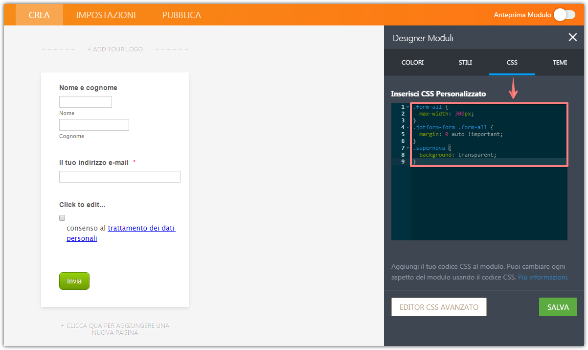
Please re-check the embedded form.
-
ImmobiliareUSAReplied on June 1, 2017 at 3:24 PM
Unfortunately I still have issues with this form, which is embedded here: http://www.immobiliareusa.it/c.asp?url=Ebook-Consigli-per-Investire-nel-Mercato-Immobiliare-USA
There are 2 grey bands on the sides of the form (see black arrows) which I would like to delete.
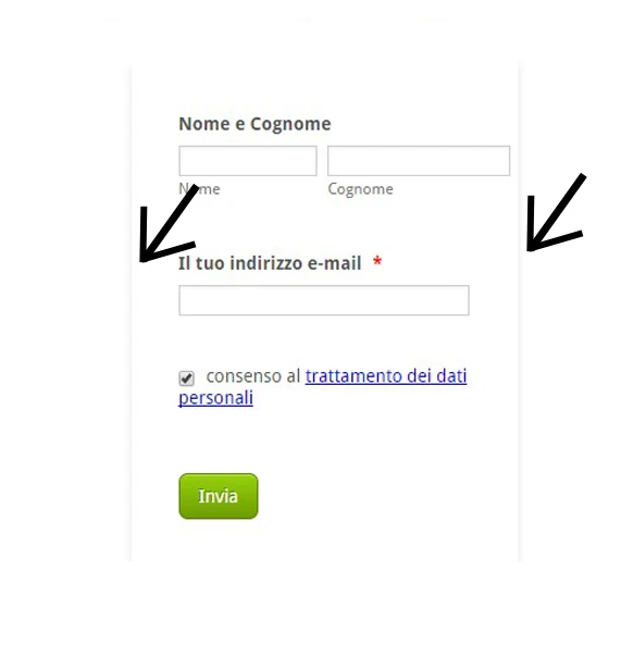
As specified, I'm not familiar with HTTP and codes so just asking if you could give me a little help deleting the grey bands.
Thank you very much :)))))
Davide
-
MikeReplied on June 1, 2017 at 4:32 PM
I have added the next CSS to your form https://form.jotform.com/10490150475 in order to remove the shadows.
.supernova .form-all {
box-shadow: none !important;
}
Thank you.
-
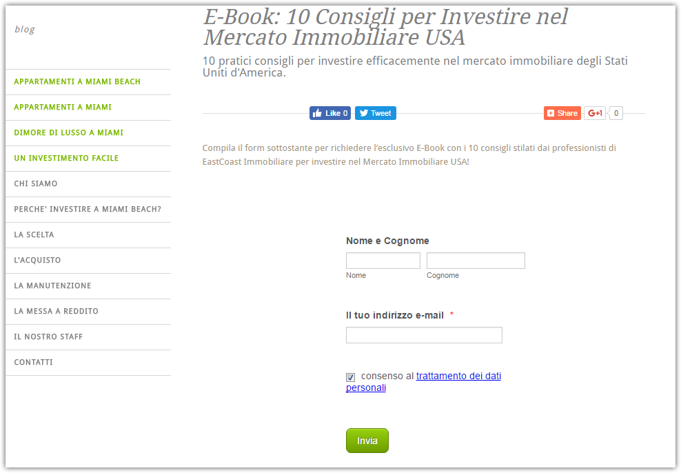
ImmobiliareUSAReplied on June 1, 2017 at 6:04 PM
Thank you so much!!
One last question: could you help me aligning the fields NOME and COGNOME on an only line (right now there are two levels, please see the picture)

-
SvenReplied on June 1, 2017 at 7:13 PM
Hi,
I checked your form and I can see that those fields are already side by side:

So I assume you have fixed the issue, let us know if you need any further help.
Thank you! -
ImmobiliareUSAReplied on June 2, 2017 at 11:26 AM
Actually, if you check from a mobile device they're already aligned. But from a DESKTOP device, the 2 fields are on 2 different lines
Could you help me aligning the fields NOME and COGNOME on an only line?
Thanks!
Davide
-
Kevin Support Team LeadReplied on June 2, 2017 at 12:26 PM
This code should display the fields properly:
.form-line{
padding-left: 0px !important;
padding-right: 0 !important;
}
You can see the result on my cloned form here: https://form.jotformpro.com/71525078414960
Please, inject the given code and let us know how it goes on your end: How-to-Inject-Custom-CSS-Codes
Hope this helps.
-
ImmobiliareUSAReplied on June 2, 2017 at 12:41 PM
Thank you so much!!!!
-
ImmobiliareUSAReplied on June 2, 2017 at 1:27 PM
Can I ask you one more thing?
I have another form embedded here: http://www.immobiliareusa.it/c.asp?url=newsletter.eastCoast.immobiliare.USA
The form used to look like this:
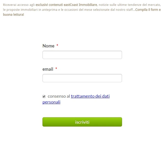
Then I touched something here in the CSS, thinking I was doing a good thing
And now the form looks has 2 issues:1. Two fields are super wide (nome e cognome + email) and the green button is not responsive anymore. Previously all the elements were alligned in a perfect rectangle;
2. As you can notice in the picture, there's a field which should be named CONSENSO AL TRATTAMENTO DEI DATI PERSONALI (consent to treatment of personal data) but for some reason I can't explain the words are now inverted and the current writing is TRATTAMENTO DEI DATI PERSONALI CONSENSO AL, which in English would correspond to "treatment of personal data consent to", so it's meaningless.
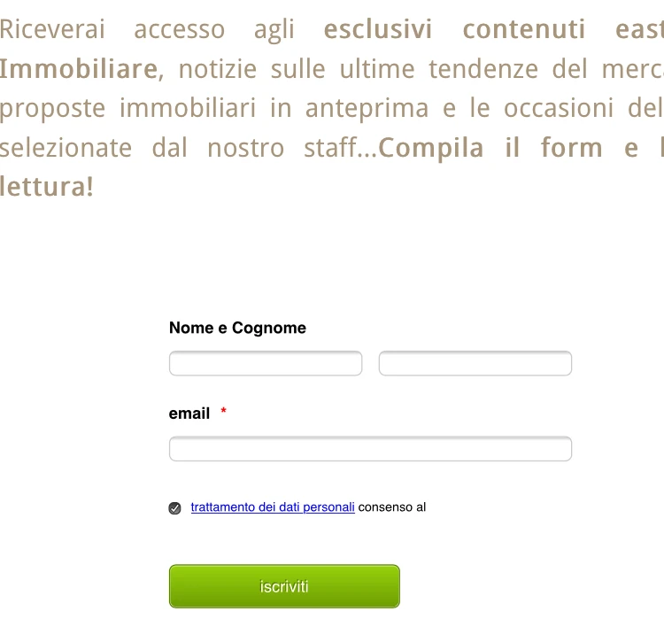
As you can easily undersatnd, I'm not familiar with CSS and codes in general so just asking if you could give me a little help fixing these 2 issues.
Thank you very much :)))))
Davide
-
Kevin Support Team LeadReplied on June 2, 2017 at 2:05 PM
1. I have reviewed your webpage and noticed the form displays properly, the issue seems to happen only when you're on a mobile device.
Please, inject this CSS code that will help you to reduce the fields width and display the button with the full form's width:
@media screen and (max-device-width: 480px){
.form-all{
width: 50% !important;
margin-left: auto !important;
margin-right: auto !important;
}
.form-submit-button{
width: 100% !important;
}
}
The guide I previously shared above will help you injecting the code.
2. I can see you have already opened a thread for this question, you have already received a reply, please check it out here: https://www.jotform.com/answers/1161580
Using the Terms & Conditions widget will help you to display the terms link as well as the text in a check box, the issue about the words order will not happen with the widget.
Here's also a demo form where you can see the difference between using the widget and the check box field: https://form.jotformpro.com/71525261714957
Hope this helps.
-
ImmobiliareUSAReplied on June 2, 2017 at 2:35 PM
The issue actually happens even in the desktop version of the page, since the green button is currently unresponsive (you can see it by the fact that it's less wide than the other fields both in the mobile and desktop version of the page)
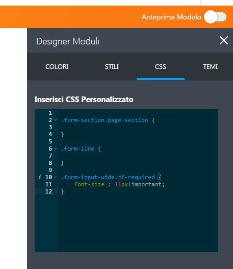
So do I have to delete all the existing code and inject just the one you provided or do I have to inject the new code after the old one on line 13 (please see the previuos image).
Thanks again for your support!
Davide -
Kevin Support Team LeadReplied on June 2, 2017 at 3:57 PM
Thank you for the details.
I have modified the code based on your reply, so the button displays on the entire form now, the updated code is this one:
@media screen and (max-device-width: 480px){
.form-all{
width: 50% !important;
margin-left: auto !important;
margin-right: auto !important;
}
[data-type="control_button"], .form-submit-button{
width: 100% !important;
}
}
[data-type="control_button"], .form-submit-button{
width: 100% !important;
}
Paste the code right under the existing code on your form, do let us know how it goes.
-
ImmobiliareUSAReplied on June 6, 2017 at 10:24 AM
Thank you! The button displays on the entire form now, as I wanted
The form displays nice on mobile devices now but it is still too wide on desktop. I'd like to reduce the width to 80% (as we did for mobile devices). How can I do that? :)
Can you also please check if I pasted the codes you provided in the right way? I'm so dumb!!
Thank you so much
Davide
-
Kevin Support Team LeadReplied on June 6, 2017 at 10:58 AM
I have checked the current CSS code and it seems that you have properly injected the given code.
To reduce the form's width on desktop, you only need to add this code:
.form-all{
width: 60% !important;
margin-left: auto !important;
margin-right: auto !important;
}
Paste it at the very bottom of the current CSS code on your form, you could also change the width value and test how the form looks.
Hope this helps.
-
ImmobiliareUSAReplied on June 6, 2017 at 11:50 AM
Thank you so much for your precious help!!!!!
- Templates
- Integrations
- INTEGRATIONS
- See 100+ integrations
- FEATURED INTEGRATIONS
 PayPal
- Slack
- Google Sheets
- Mailchimp
- Zoom
- Dropbox
- Google Calendar
- Hubspot
- Salesforce
- See more Integrations
- Products
- PRODUCTS
- Form Builder
- Jotform Enterprise
- Jotform Apps
- Store Builder
- Jotform Tables
- Jotform Inbox
- Jotform Mobile App
- Jotform Approvals
- Report Builder
- Smart PDF Forms
- PDF Editor
- Jotform Sign
- Jotform for Salesforce Discover Now
- Support


