


-
TalmorAsked on June 12, 2017 at 6:55 AMSorry
this is the form
maybe the problem is with CSS
you can see it with your mobile device the see the problem -
Support_Management Jotform SupportReplied on June 12, 2017 at 7:22 AM
Just to confirm, is this the problem on mobile?
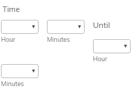
Where the UNTIL text causes the 2nd range's Hour field to display lower?
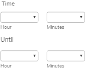
If that's the case, try injecting these CSS Codes to move the Until text in between the Time Range:
.form-sub-label-container:nth-child(3) {
min-width: 100%;
margin-top: 12px;
}
This would make the Time Field with Time Range to look like the regular Time Field on both desktop and mobile.
Complete guide: How-to-Inject-Custom-CSS-Codes
Result:
If that's not the issue, I'm afraid you'd have to be a bit clearer on what field needs to be checked and fixed. So far, here's how I see your form:
1. You have 3 Time Fields.
2. The 1st and 2nd fields I guess are supposedly Time In and Time Out.
3. The 3rd one has the Time Range option turned on and this is the one that looks odd on mobile.
4. I'm also seeing a Text Field that has Total Hours: in it but doesn't show any Form Fields.
Related guide: Pass-an-Input-Field-to-a-Text-HTML-Field
Are you planning to show the difference of the 1st and 2nd Time Fields there OR are you hoping to show the Time Range there? Screenshots are also welcome and you may post them on your thread (not on your email).
Related guide: How-to-Post-Screenshots-to-Our-Support-Forum
Just get back to us with a bit more info and a clearer description of what you're trying to do so we can better assist you.
- Templates
- Integrations
- INTEGRATIONS
- See 100+ integrations
- FEATURED INTEGRATIONS
 PayPal
- Slack
- Google Sheets
- Mailchimp
- Zoom
- Dropbox
- Google Calendar
- Hubspot
- Salesforce
- See more Integrations
- Products
- PRODUCTS
- Form Builder
- Jotform Enterprise
- Jotform Apps
- Store Builder
- Jotform Tables
- Jotform Inbox
- Jotform Mobile App
- Jotform Approvals
- Report Builder
- Smart PDF Forms
- PDF Editor
- Jotform Sign
- Jotform for Salesforce Discover Now
- Support
