


-
3bridgesAsked on June 13, 2017 at 12:52 PM
Hello,
I sent in a request for assistance last week but did not receive a response. We have been actively using our online forms and have become completely dependent on it for our business. I have had these forms up for well over a year without any issues. About two weeks ago, my employees and clients started complaining about these forms, specifically that they were not working properly on a mobile device, (which most of them use to complete my forms). When I look at the form on my website, it looks perfect
http://www.3bridgesaustin.com/interpreter-timesheet.html
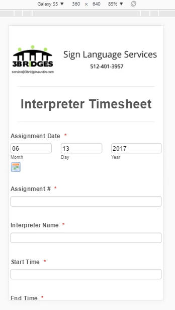
Here is a screen shot of the same online form using my phone

As you can tell, for some reason the Mobile Responsive Widget either stopped working or something else is going on. I've tested my forms on several different phones and they all look the same. Can you please assist me in figuring out how to return my forms to being mobile responsive? Thank you very much for your help!
-
David JotForm Support ManagerReplied on June 13, 2017 at 2:38 PM
Your form is mobile responsive, please try to load it through it's direct link: https://form.jotformpro.com/43156328204954

However, it looks a bit different in your site, because it is being affected by dimensions of the page where you have embedded it.
Please try injecting the following CSS code if you are only viewing your form through your site: https://www.jotform.com/help/117-How-to-Inject-Custom-CSS-Codes
@media only screen and (max-width: 480px) {
input[type=text], input[type=email], input[type=tel], textarea {
height: 80px !important;
font-size: 40px !important;
}
.form-label-top, .form-label-left, .form-label-right, .form-html, .form-label-auto, .form-checkbox-item label, .form-radio-item label {
font-size: 25px !important;
}
div.calendar td, div.calendar th {
font-size: 25px !important;
padding: 3px !important;
text-align: center !important;
}
.form-header-group, .form-header {
color: #555;
font-size: 35px !important;
}
}
This should make your form more responsive in the embedded version.
-
3bridgesReplied on June 13, 2017 at 3:44 PMHello David,
Thank you for your reply. The problem isn't with the dimensions of the
page that our form is embedded on. Our mobile form has always looked
exactly how it looks on our website. As you can tell from your screenshot,
the mobile version of this form doesn't match the form that is on my
website. The answer fields extends to the end of the page for all of the
responses. This just started about two weeks ago. The direct link you
sent me to my online form, (https://form.jotformpro.com/43156328204954 )
looks perfect while viewing in desktop. Now, open that same link on a
mobile page and it is no longer mobile responsive. Since I've created this
form and it has been used over 7k, it looked exactly like the desktop
version. Two weeks ago, something happened and how it looks like the
screenshot that you sent.
Since this problem is still coming from the Jotform direct link, it must
mean that something has changed with the mobile responsive functionality of
the form. The direct link shows the correct formatting in desktop but a
different formatting while a mobile device. Since I depend on these forms
for my business, I need to find a way to fix this issue and get the mobile
form looking like the desktop. Can you please help me figure out what has
happened?
I really appricate your help with this one. I'm getting several complaints
per day and I've done everything possible on my end to fix the problem. I
even created a new online form but it is still having the same problem.
Help!!
--
*Brandon Bridges* | 3 Bridges Sign Language Services, LLC
Website: http://3bridgesaustin.com | Email: service@3bridgesaustin.com
Officephone: (512) 401-3957 | Fax: (512) 358-6186 | Cellphone: (512)
815-7476
The information contained in this transmission may contain privileged and
confidential information, including patient information protected by
federal and state privacy laws. It is intended only for the use of the
person(s) named above. If you are not the intended recipient, you are
hereby notified that any review, dissemination, distribution, or
duplication of this communication is strictly prohibited. If you are not
the intended recipient, please contact the sender by reply email and
... -
David JotForm Support ManagerReplied on June 13, 2017 at 5:13 PM
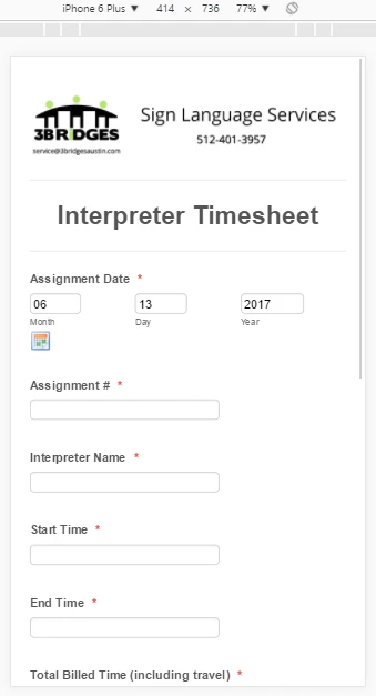
By default, our responsive forms look like yours:
Please remove the mobile responsive widget, and try injecting this code:
@media only screen and (max-width: 480px) {
.form-dropdown,.form-textbox {
width: 60% !important;
}
}
This should be the result:
Let us know if you need more help.
-
3bridgesReplied on June 13, 2017 at 5:43 PMHi David,
Can you tell me where I need to inject this code?
--
*Brandon Bridges* | 3 Bridges Sign Language Services, LLC
Website: http://3bridgesaustin.com | Email: service@3bridgesaustin.com
Officephone: (512) 401-3957 | Fax: (512) 358-6186 | Cellphone: (512)
815-7476
The information contained in this transmission may contain privileged and
confidential information, including patient information protected by
federal and state privacy laws. It is intended only for the use of the
person(s) named above. If you are not the intended recipient, you are
hereby notified that any review, dissemination, distribution, or
duplication of this communication is strictly prohibited. If you are not
the intended recipient, please contact the sender by reply email and
... -
David JotForm Support ManagerReplied on June 13, 2017 at 6:29 PM
Apply the steps shown on this guide: https://www.jotform.com/help/117-How-to-Inject-Custom-CSS-Codes, to inject the code in your form.
-
3bridgesReplied on June 13, 2017 at 8:43 PMI don't know what else to do. I have injected the code you provided in the
Form Designer in the CSS section, saved and then embedded the code on my
site and nothing has changed. Here is a direct link to my online form,
https://form.jotformpro.com/43156328204954
It looks perfect on the desktop but it's the same stretched out form while
mobile viewing. I've used this timesheet for the past 2.5 years with over
7k entries and we've never had any problem. Even the "Submit" button is
stretched across the screen. I have absolutely loved Jotform and referred
many of our clients to your service but I need to find some solution or I
can't use the forms any more. If you can view the direct link on your
phone, you will clearly see what I'm talking about. Something isn't right
and now all of my forms are not mobile responsive. I've checked out my
forms using the direct jotform link directly on my phone, (iphone) and my
wife's phone, (android) and both devices are seeing a stretched screen. At
this point, I don't know what else to do.
I'm just hoping you can help us get this resolved so we can figure out what
happened and return to using our forms as usual. Thank you for your time
and assistance!
... -
Ashwin JotForm SupportReplied on June 13, 2017 at 11:12 PM
Hello 3bridges,
I did check your webpage where you have embedded your form and found that you have used your form's full source code. That is the reason that any changes your are making in your form is not reflecting in your webpage.
I would suggest you to please re-embed your form using its iFrame embed code and see if that solves your problem. The following guide should help you how to grab your form's iFrame embed code: https://www.jotform.com/help/148-Getting-the-form-iFrame-code
Hope this helps.
Do get back to us if you have any questions.
Thank you!
-
3bridgesReplied on June 14, 2017 at 12:43 AMHello Ashwin,
Thank you for your response. I have tried embedding my form using the
snippet, source code and iFrame all with the same results. My form looks
perfect while previewing it on Jotform but even if I use the direct Jotform
link and try to open it on my phone, I get the same results that I get on
my website. That leads me to believe the problem is not related to my
website. I haven't changed anything with this form. One day, it just
changed without any reason
I understand how to use your platform as I've been a user for about 3
years. I've tried everything but my online form is just NOT mobile
responsive any longer. Is there anything else I can do? I really don't
want to switch over to another online form generator as I've always enjoyed
working with Jotform but I have to find a solution. My employees and
clients are less than pleased with my online forms and that I haven't fixed
it yet is starting to make me look bad. I really appreciate your help as I
don't know what else to do other than set up an account somewhere else.
... -
Ashwin JotForm SupportReplied on June 14, 2017 at 3:35 AM
Hello 3bridges,
I hear your concern but the issue here is that since you have embedded your form using its full source code, any changes made in form and injected custom css code will not be visible in embedded form.
I would again suggest you to please re-embed your form using its iFrame embed code and then we will help you solve your problem.
We will wait for your response.
Thank you!
-
3bridgesReplied on June 14, 2017 at 7:43 AMI have embedded my form on my website using it's iFrame embed code and we
are getting the same result. What would you suggest as our next move?
... -
candyReplied on June 14, 2017 at 10:27 AM
Hello,
We are sorry for the inconvenience you have.
I have checked your website and its codes. I have seen that you have some syntax errors in the CSS codes as you can see the screenshot below:

Moreover, I have seen that the main reason is you were using HTTP in your website link. Please change them as https due to security reasons. Some web browsers can block HTTP as seen below:

The website doesn't have these errors on the desktop. Please fix these errors in order to make this form work on mobile.
I hope this helps.
Regards.
- Templates
- Integrations
- INTEGRATIONS
- See 100+ integrations
- FEATURED INTEGRATIONS
 PayPal
- Slack
- Google Sheets
- Mailchimp
- Zoom
- Dropbox
- Google Calendar
- Hubspot
- Salesforce
- See more Integrations
- Products
- PRODUCTS
- Form Builder
- Jotform Enterprise
- Jotform Apps
- Store Builder
- Jotform Tables
- Jotform Inbox
- Jotform Mobile App
- Jotform Approvals
- Report Builder
- Smart PDF Forms
- PDF Editor
- Jotform Sign
- Jotform for Salesforce Discover Now
- Support


