


-
m1hunterAsked on June 13, 2017 at 7:09 PM
I would like to start off saying thank you so much for helping me to create this one of a kind form.
On webydo you can make a different website for your iphone which I did and placed a jotform in a iframe with in the iphone website and I had to resize the iframe so the form would be sized correctly on my iphone.
I got everything working but 2 days ago I looked at my webpage on my iphone and my form is all misaligned and unusable now.
I tried to resize the iframe like I did last time to get the form to display correctly but no matter what size I make the iframe I can not get the form to display correctly on my iphone.
Was something changed on your end in the way the forms are rendered or something because it was working fine.
Anyways please look at my webpage http://www.americanpatchandpin.com on a iphone and you will see what I am talking about.
Let me know if their is a way to make this work again.
If you look at my webpage http://www.americanpatchandpin.com on a desktop pc you will see what the form is exposed to look like.
Here is the link to my form I use on my iphone.
https://form.jotform.us/70869042228156 This is form I use for iphone portrait version of my website
https://form.jotform.us/70868681680166 This is the form I use for the iphone landscape version of my website.
Here is a link to my website http://www.americanpatchandpin.com so you can see what I am talking about. View it on a desktop to see how the form is exposed to look then load it on a iphone and you see the problem I am having.
Like I said everything was working fine 2 days ago please help me to get this form to look correctly on my iphone again.
Page URL: http://www.americanpatchandpin.com -
MikeReplied on June 13, 2017 at 8:05 PM
According to the revision history the forms were updated on May 24.
Have you used two column layout (same as on the desktop) or one column layout for your mobile form view? The form is currently displayed in one column.

-
m1hunterReplied on June 13, 2017 at 8:16 PM
I used a two column layout (same as on the desktop) for mobile view.
The mobile view used to look just like the desktop.
Thank you so much for trying to fix this.
-
Chriistian Jotform SupportReplied on June 13, 2017 at 9:47 PM
I'm currently checking your form. Please allow me some time to further investigate. I'll get back to you once I've found results.
Regards.
-
Chriistian Jotform SupportReplied on June 13, 2017 at 9:59 PM
Thank you for your patience.
Could you please try adding this custom CSS on your form and see if this helps to solve the display issue of your form on the mobile device?
@media screen and (max-device-width: 40em)
{
.form-line, .form-line.form-line-column {
width: 50% !important;
}
#input_11{
width: 100% !important;
}
}
Here's the guide on How to Inject Custom CSS Codes
If the issue still persists, please let us know.
Regards. -
m1hunterReplied on June 13, 2017 at 11:15 PM
Ok we are getting closer here is an image of the iphone site with out the above code.

Here is an image of the iphone site with the new code.

We are getting closer what should we do next to get this form back to normal?
Here is what the form used to look like.

Please help me fix it. Thanks so much in advance.
-
Chriistian Jotform SupportReplied on June 14, 2017 at 3:08 AM
Please try replacing the previous code with this one:
@media screen and (max-device-width: 40em)
{
.form-line, .form-line.form-line-column {
width: 50% !important;
}
#input_11 {
width: 200% !important;
height: 40px !important;
}
.form-textbox {
height: 30px !important;
}
.supernova .form-all, .form-all {
height: 500px !important;
}
}
This should fix the problem. If you need further assistance, please let us know.
Regards.
-
m1hunterReplied on June 14, 2017 at 11:27 AM
We are getting closer I injected the above code and the form is better. This is how it looks now.

If we can just eliminate the space between the cells we will be god to go. Let me know how to do that. Thanks so much.
-
Ashwin JotForm SupportReplied on June 14, 2017 at 12:46 PM
Hello m1hunter,
Please inject the following custom css code in form and see if that solves your problem:
@media screen and (max-device-width: 40em)
{
.form-line, .form-line.form-line-column {
width: 50% !important;
margin-top: -5px !important;
}
#input_11 {
width: 200% !important;
height: 40px !important;
}
.form-textbox {
height: 30px !important;
}
.supernova .form-all, .form-all {
height: 500px !important;
}
}
Hope this helps.
Do get back to us if you need any other changes.
Thank you!
-
m1hunterReplied on June 14, 2017 at 7:19 PM
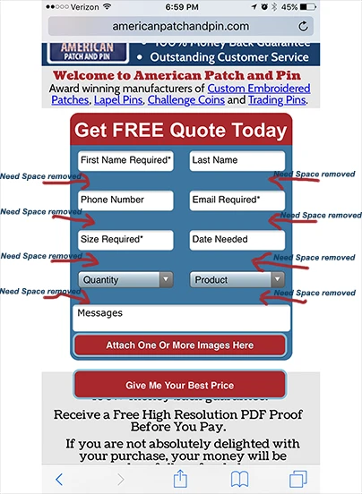
Getting even closer but all that above code changed was the space between the messages box and the attach one or more images button I need a way to remove the spaces between all the cells. Image below for expiation to what I am talking about.
Here is a link to the form if you guys need to you can edit this form to try to get the settings back to normal thanks so much. or you can give me the css code to inject it either way. Would have to be viewed on a iphone to see the changes. Please help.
https://form.jotform.us/71645175274157
-
Chriistian Jotform SupportReplied on June 14, 2017 at 8:59 PM
Please try this code below and see if this helps to eliminate the spacing between cells:
@media screen and (max-device-width: 40em)
{
.form-line, .form-line.form-line-column {
width: 50% !important;
margin-top: -5px !important;
padding: 5px !important;
}
#input_11 {
width: 200% !important;
height: 40px !important;
}
.form-textbox {
height: 30px !important;
}
.supernova .form-all, .form-all {
height: 500px !important;
}
}
Thanks.
-
m1hunterReplied on June 15, 2017 at 10:30 AM
Thank you very much Chriistian the above code removed the space between the cells.
I just need one more thing. Can we add css code to make the cells a little smaller vertically to remove the space on the bottom of the text boxes. Pic below to explain what I am talking about.

-
David JotForm Support ManagerReplied on June 15, 2017 at 12:27 PM
Try injecting this code: https://www.jotform.com/help/117-How-to-Inject-Custom-CSS-Codes
.form-line {
padding: 0px !important;
margin-bottom: 0px !important;
}
@media screen and (max-device-width: 40em){
.form-line{
padding: 0px !important;
argin-bottom: 0px !important;
}
}
Let us know if you need more help.
-
m1hunterReplied on June 15, 2017 at 5:55 PM
The above code did not change anything.
-
Welvin Support Team LeadReplied on June 15, 2017 at 8:40 PM
I have modified your form CSS codes for the mobile. I removed the height values and replace it with line-height. Please check.
-
m1hunterReplied on June 16, 2017 at 10:50 AM
"I have modified your form CSS codes for the mobile. I removed the height values and replace it with line-height. Please check."
Thanks for trying that actually made it worse. It looks good enough now no more code changes unless I do them. If you guys have any more suggestions on how to make the text boxes not as high let me now but it looks good for now thanks every buddy.
-
Welvin Support Team LeadReplied on June 16, 2017 at 12:06 PM
My sincere apologies. I have checked the form with my Android device after changing the codes and it looks great based on your requirement. Anyways, the codes given by my colleague BDAVID has a missing character, it should be:
.form-line {
padding: 0px !important;
margin-bottom: 0px !important;
}
@media screen and (max-device-width: 40em){
.form-line{
padding: 0px !important;
margin-bottom: 0px !important;
}
}
Letter M is missing from the Margin, you may consider trying this out.
- Templates
- Integrations
- INTEGRATIONS
- See 100+ integrations
- FEATURED INTEGRATIONS
 PayPal
- Slack
- Google Sheets
- Mailchimp
- Zoom
- Dropbox
- Google Calendar
- Hubspot
- Salesforce
- See more Integrations
- Products
- PRODUCTS
- Form Builder
- Jotform Enterprise
- Jotform Apps
- Store Builder
- Jotform Tables
- Jotform Inbox
- Jotform Mobile App
- Jotform Approvals
- Report Builder
- Smart PDF Forms
- PDF Editor
- Jotform Sign
- Jotform for Salesforce Discover Now
- Support


