


-
bmccombsAsked on August 8, 2017 at 2:04 PM
Hi folks,
Here's an example of a form I've created using JotForms:
http://www6.wittenberg.edu/lib/ill/book.php
The desktop version looks great, but it's not so good on mobile. Is there something I need to do differently in the setup to make it work better?
Here are some of the things I notice:
1. The form fields are way to wide, which means the whole thing needs to be super tiny to fit on a screen. It appears to be set to display the full width of the form, so everything is hard to read.2. Even the phone number fields are ridiculously wide -- I can fit a whole phone number in just the area code.
3. If it's going to take up that much width, maybe firstname and lastname should stack on top of each other?
Thanks
Ken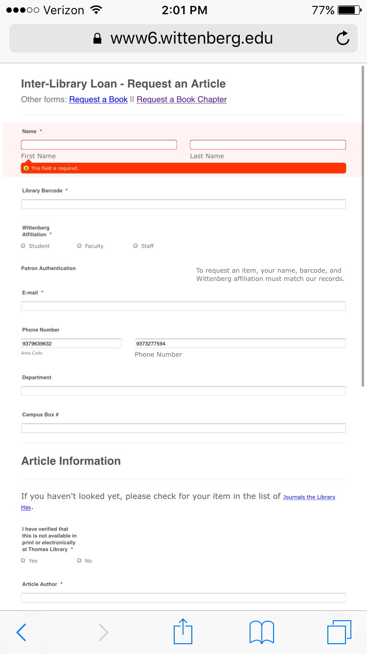
-
Ashwin JotForm SupportReplied on August 8, 2017 at 2:32 PM
Hello Ken,
I did check your webpage where you have embedded your form and found that you have used your form's full source code to embed your form.
Please note that for your form to be mobile responsive, we recommend you to embed form using its iFrame embed code. I would suggest you to embed your form using its iFrame embed code and then we will take a look how it appears in mobile device. If the issue persists, we will try to help you with desired custom css code for your form to appear correctly in mobile devices.
We will wait for your response.
Thank you!
-
bmccombsReplied on August 8, 2017 at 3:03 PM
Hi Ashwin -- thanks for the quick reply. I should have mentioned in the first message: please reply to me at kirwin@wittenberg.edu.
I tried using the iFrame embed at a new URL and the problem persists:
http://www6.wittenberg.edu/lib/ill/jotform/test.php
We're already using the responsive widget, but I can't tell what different it makes. The page looks the same with or without it.It is worth noting that in the long run, the iFrame embed is not an option for us - we're using the full source code because that it necessary for other aspects of what we're working on.
Any other ideas?
Thanks
Ken -
David JotForm SupportReplied on August 8, 2017 at 4:06 PM
Mobile responsiveness in the form attempts to fill the width of the screen the form is being displayed on and it does set widths to 100%. This is how it would look on a phone with a much smaller width than the device you are using:

You can set the width of the frame in the iFrame code to a defined amount to prevent the form from stretching too wide:
<iframe id="JotFormIFrame-71574587729170" onDISABLEDload="window.parent.scrollTo(0,0)" allowtransparency="true" src="https://form.jotform.us/71574587729170" frameborder="0" style="width:100%; height:539px; border:none;" scrolling="no"> </iframe>
-
bmccombsReplied on August 8, 2017 at 4:12 PM
David - this code is already in place on the test page I referenced above:
http://www6.wittenberg.edu/lib/ill/jotform/test.php
The screenshot you sent looks great, but it's not what I'm getting. Is there something I can change so it will behave this way on my phone?
Thanks
Ken -
David JotForm SupportReplied on August 8, 2017 at 5:37 PM
What I meant was changing the width of the iframe so that it does not fill the full screen. Currently, it set to 100% of the screen size since there is no div to contain it. Updating the iFrame code to the following would set a defined width:
<iframe id="JotFormIFrame-71574587729170" onDISABLEDload="window.parent.scrollTo(0,0)" allowtransparency="true" src="https://form.jotform.us/71574587729170" frameborder="0" style="width:690px; height:539px; border:none;" scrolling="no"> </iframe>
You can also try setting the form width on mobile with the following CSS added to the form:
@media screen and (max-width:580px){
.form-all{
max-width:600px !important;
}.form-textbox, .form-textarea, .form-radio-other-input, .form-checkbox-other-input, .form-captcha input {
box-sizing: border-box;
-webkit-box-sizing: border-box;
width: 480px !important;
}
} -
bmccombsReplied on August 9, 2017 at 8:57 AM
David - I tried both of these approaches and neither of them helps:
width-690 : http://www6.wittenberg.edu/lib/ill/jotform/width.php
added-css : http://www6.wittenberg.edu/lib/ill/jotform/styled.php
width+css : http://www6.wittenberg.edu/lib/ill/jotform/both.php
All of these suffer from the same problem. The width: 690 actually makes the iphone display even worse.
Any other ideas?
Thanks
Ken -
bmccombsReplied on August 9, 2017 at 9:25 AM
In an effort to simplify my testing process, I've made a new form with just two things: the responsive widget and a single form element.
I embedded the iframe and tried a few of the variations David suggested. All result in the same non-responsive behavior I've been getting with the more complex form.Can you point me toward a working form that's behaving in the way that you expect it to just so I can see how a form in good working order will work?
Thanks
Ken -
bmccombsReplied on August 9, 2017 at 9:45 AMHi folks -- I've solved the problem by adding a viewport declaration:
<meta name="viewport" content="width=device-width"/>
It was not necessary to use the iframe embed, monkey with the css, or anything else. You might consider adding the viewport declaration to what your mobile widget does.
ThanksKen
- Templates
- Integrations
- INTEGRATIONS
- See 100+ integrations
- FEATURED INTEGRATIONS
 PayPal
- Slack
- Google Sheets
- Mailchimp
- Zoom
- Dropbox
- Google Calendar
- Hubspot
- Salesforce
- See more Integrations
- Products
- PRODUCTS
- Form Builder
- Jotform Enterprise
- Jotform Apps
- Store Builder
- Jotform Tables
- Jotform Inbox
- Jotform Mobile App
- Jotform Approvals
- Report Builder
- Smart PDF Forms
- PDF Editor
- Jotform Sign
- Jotform for Salesforce Discover Now
- Support


