
-
makersbootcampAsked on August 8, 2017 at 11:05 PM
Hi there,
I can't figure out the CSS to size down a custom submit button image to work well for retina displays.
My form is here: https://www.jotform.com/build/72118654882463
-
selenhaysalReplied on August 9, 2017 at 3:11 AM
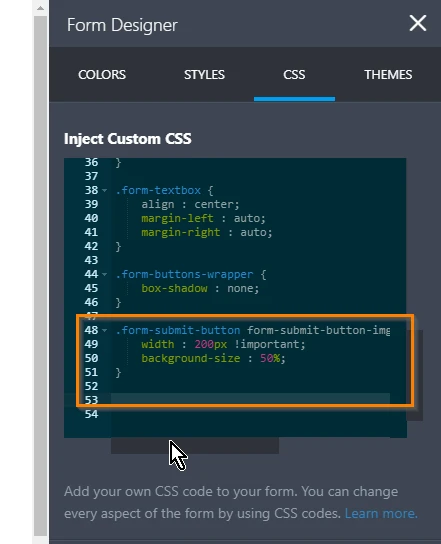
I have reviewed your form, and to resize the custom button you may add the following code into your CSS codes:
transform: scale(0.5,0.5); // resizes
-ms-transform: scale(0.5,0.5);
-webkit-transform: scale(0.5,0.5);
-moz-transform: scale(0.5,0.5);
margin-left:25%!important; //centers the image
I am sending a screenshot of the applied code, please contact again for any further problems.

-
CharlieReplied on August 9, 2017 at 4:26 AM
If the above suggestion by selenhaysal does not work, please do try the following:
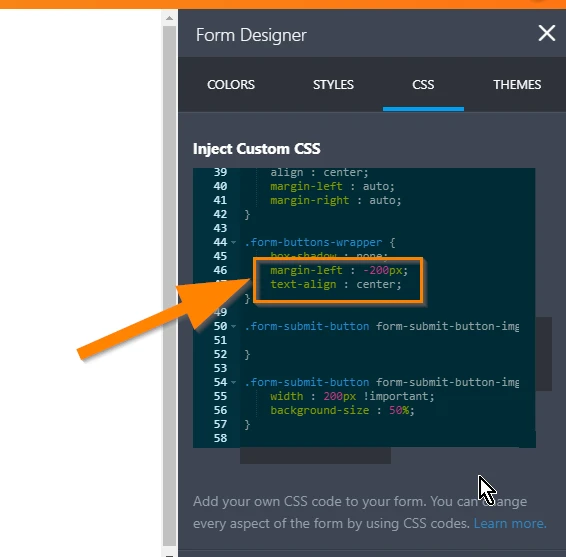
1. First, remove the margin-left and text-align on the .form-buttons-wrapper:
2. Also remove the code block highlighted below.
3. After that, simply inject this custom CSS code in your form:
#input_2 > img {
width: 100% !important;
}
The alignment of the button and the width of the parent element should not be a problem as they are already defined. You just need to set the image button to follow the width of the parent element button. Here's a cloned test form that I have: https://form.jotformpro.com/72201529026952. You can test it on different mobile device as it should already be mobile responsive.
I hope that helps.
-
makersbootcampReplied on August 11, 2017 at 2:08 AM
Sweet.
I see the above sample is kind of a back and forth dance while the lower works in most cases. Thanks so much!
-
CharlieReplied on August 11, 2017 at 3:13 AM
Glad to hear that the suggestion works. If you need any help again, feel free to drop by here in the forum.
Thank you.
- Templates
- Integrations
- INTEGRATIONS
- See 100+ integrations
- FEATURED INTEGRATIONS
 PayPal
- Slack
- Google Sheets
- Mailchimp
- Zoom
- Dropbox
- Google Calendar
- Hubspot
- Salesforce
- See more Integrations
- Products
- PRODUCTS
- Form Builder
- Jotform Enterprise
- Jotform Apps
- Store Builder
- Jotform Tables
- Jotform Inbox
- Jotform Mobile App
- Jotform Approvals
- Report Builder
- Smart PDF Forms
- PDF Editor
- Jotform Sign
- Jotform for Salesforce Discover Now
- Support