


-
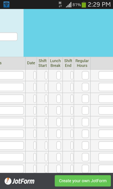
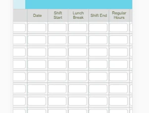
A_S_GAsked on August 22, 2017 at 5:32 AM
-
nurulmac11Replied on August 22, 2017 at 8:29 AM
This is because of false padding percentage in small devices.
To fix it;
You must add this css to your form. You can learn how to add custom css to form, following by this guide.
@media screen and (max-width: 480px), screen and (max-device-width: 767px) and (orientation: portrait), screen and (max-device-width: 415px) and (orientation: landscape) { table td + td {
padding-left: 0 !important;
}
}
I hope this helps.
-
A_S_GReplied on August 22, 2017 at 10:53 AM
Thank you. This has improved the form a bit but still middle columns are showing as too narrow. I chose the first and last column width 250px n middle ones 150px but you can see middle ones are way too small than the first and last when opened on a mobile phone
-
Chriistian Jotform SupportReplied on August 22, 2017 at 12:04 PM
Can you please try to inject the following custom CSS code on your form and see if this will fix the issue?
.form-matrix-table td {
min-width: 50px;
}
- Templates
- Integrations
- INTEGRATIONS
- See 100+ integrations
- FEATURED INTEGRATIONS
 PayPal
- Slack
- Google Sheets
- Mailchimp
- Zoom
- Dropbox
- Google Calendar
- Hubspot
- Salesforce
- See more Integrations
- Products
- PRODUCTS
- Form Builder
- Jotform Enterprise
- Jotform Apps
- Store Builder
- Jotform Tables
- Jotform Inbox
- Jotform Mobile App
- Jotform Approvals
- Report Builder
- Smart PDF Forms
- PDF Editor
- Jotform Sign
- Jotform for Salesforce Discover Now
- Support


