


-
iEyadoAsked on August 24, 2017 at 11:41 AM
dears,
my problem is when I browsing the form from smartphones.
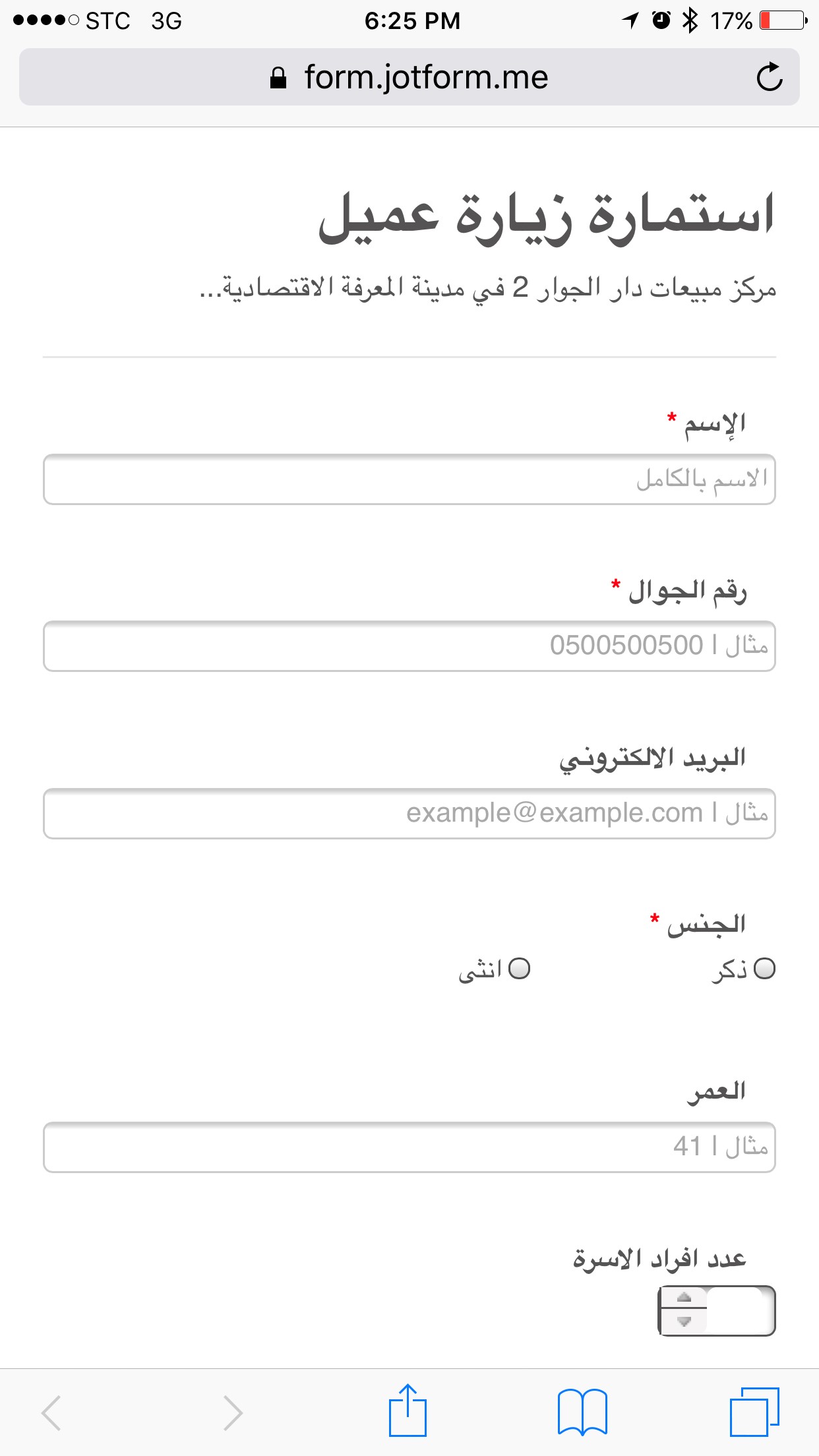
the link source from jotform.com "https://form.jotform.me/72112361912446" comes perfectly on phone screen "see attached no.1"
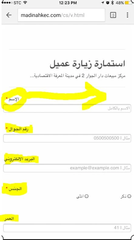
but when I created my own link "http://madinahkec.com/cs/visitor.html" for the same form, comes very small!! why??
kindly I need my own link to look like same jotform.com link on the smartphones ??
 Page URL: https://form.jotform.me/72112361912446
 -
Nik_CReplied on August 24, 2017 at 12:48 PM
That depends on how the form is embedded.
Could you please try re-embedding your form by using the code below:
<iframe id="JotFormIFrame-72112361912446" onDISABLEDload="window.parent.scrollTo(0,0)" allowtransparency="true" src="https://form.jotform.me/72112361912446" frameborder="0" style="width: 1px; min-width: 100%; height:1095px; border:none;" scrolling="yes"> </iframe>
Please let us know how it worked when you tested.
We'll wait for your response.
Thank you!
-
iEyadoReplied on August 25, 2017 at 8:12 AM
thanks Nik_C for your support. Unfortunately, the code does not work :(
still comes a very small character

-
JanReplied on August 25, 2017 at 10:28 AM
I was able to replicate the issue when I checked your webpage.
Please try inserting the Mobile Responsive widget to your form. Here's a guide on How-to-Add-a-Widget-to-your-Form.

Let us know if the issue is still the same. Thank you.
-
iEyadoReplied on August 25, 2017 at 11:24 AM
I added the mobile responsive widget but nothing happened !!
why the custom link come on mobile not responsive and jotform.com link come responsive ??
I'll explain to you how I customize the link
1- copy the embed code
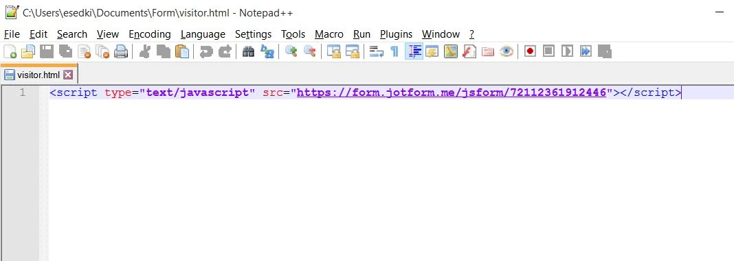
<script type="text/javascript" src="https://form.jotform.me/jsform/72112361912446"></script>
2- paste the code on notepad++
3- save as .html format file
4- upload the file to my website
that's it.. so is there any things wrong?
-
Nik_CReplied on August 25, 2017 at 11:42 AM
I'm afraid that that could be the cause of the problem.
You should copy and paste your script code anywhere between the body tags (where you want your form to appear) in your website's HTML code.
So, you don't have to create it as html file.
If this is your website's structure:
<html>
<head>
--some code here--
</head>
<body>
...some code....
...some code....
--here you can paste the embed code--
<script type="text/javascript" src="https://form.jotform.me/jsform/72112361912446"></script>
...some code...
...some code...
</body>
</html>
Hope it helps.
Let us know how it worked.
-
iEyadoReplied on August 25, 2017 at 12:06 PM
actually the form in a separate page (this link it is only for this form page) nothing else
thanks for your help but the problem still remaining
-
Nik_CReplied on August 25, 2017 at 12:35 PM
I understand that it is another page, would you mind providing that page's code? You could use JsFiddle or PasteBin to paste the code. And then we can completely check what could be the issue.
This thread is marked as private so only you and our support team can view it.
We'll wait for your response.
Thank you!
-
iEyadoReplied on August 27, 2017 at 3:25 AM
I put only the code provided from jotform.com nothing more. if you can provide me a full page code I will be very happy.
-
Kiran Support Team LeadReplied on August 27, 2017 at 5:02 AM
Please try using the following code so that the web page should be displaying correctly on mobile devices as well.
<html>
<head>
<meta name="viewport" content="width=device-width, initial-scale=1">
</head>
<body>
<script type="text/javascript" src="https://form.jotform.me/jsform/72112361912446"></script>
</body>
</html>
Please get back to us if you need any further assistance. We will be happy to help.
-
iEyadoReplied on August 27, 2017 at 5:34 AM
this code works :) thank you
but there is a little problem, the label alignment come on the left!! it should be on the right.
-
Elton Support Team LeadReplied on August 27, 2017 at 8:33 AM
Glad my colleague's solution worked for you. Proper scaling on mobile through meta viewport is all you need.
Upon checking this page on mobile http://madinahkec.com/cs/v.html all the labels are right aligned. Did you manage to fix the issue?
If the problem persists on your side, please clear your browser's cache and check it again.
If that doesn't help, inject this CSS codes to your form.
@media screen and (max-width:480px){
.form-label-right,
.form-label-top {
float: right;
text-align: right;
}}
-
iEyadoReplied on August 27, 2017 at 8:40 AM
now it's ok ... thanks for all I appreciate your cooperation ..
- Templates
- Integrations
- INTEGRATIONS
- See 100+ integrations
- FEATURED INTEGRATIONS
 PayPal
- Slack
- Google Sheets
- Mailchimp
- Zoom
- Dropbox
- Google Calendar
- Hubspot
- Salesforce
- See more Integrations
- Products
- PRODUCTS
- Form Builder
- Jotform Enterprise
- Jotform Apps
- Store Builder
- Jotform Tables
- Jotform Inbox
- Jotform Mobile App
- Jotform Approvals
- Report Builder
- Smart PDF Forms
- PDF Editor
- Jotform Sign
- Jotform for Salesforce Discover Now
- Support


