


-
EliteInsitesAsked on September 28, 2017 at 1:13 AM
It's extremely frustrating that Jotform takes it upon themselves to inject a CSS style that is substituted for the user's CSS on mobile layouts. What's the point in giving us the ability to go in and customize the CSS if you override it on mobile views? I want my form layout to look consistent on all versions of my site. On mobile, Jotform moves the field titles above the fields, changes the widths, changes the buttons, and changes the background color.
How can I prevent Jotform from doing this?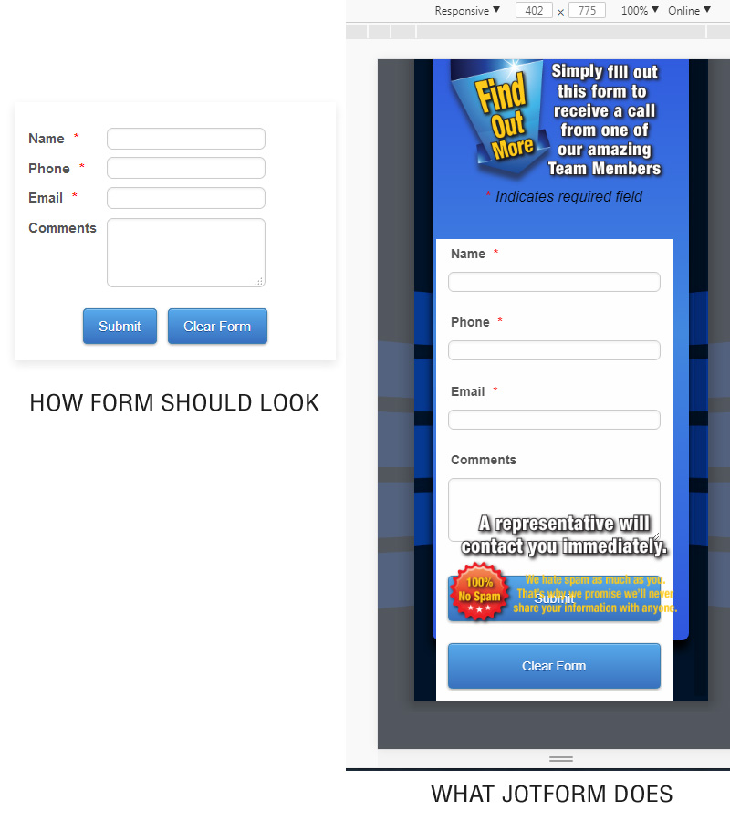
-
Nik_CReplied on September 28, 2017 at 2:22 AM
We're sorry for the inconvenience. But we actually don't modify the mobile versions of our forms.
They are, by default, mobile responsive and should look exactly the same if they weren't modified with CSS that could cause form not to show properly on smaller screens.
Your form looks fine when viewed in mobile responsive mode:

So the issue could be related to the way the form is embedded in your website.
With that said, please share the website URL where the form is embedded so we can investigate this issue further.
Thank you!
-
EliteInsitesReplied on September 28, 2017 at 11:39 AM
No, the form does not look "fine." Your CSS has changed the layout in a mobile viewport. It should stay looking like it does in my uploaded imagine, on the left, where it says, "HOW FORM SHOULD LOOK"
http://pennmarma.com/page1.html
Simply resize the browser window down to mobile width, and you will see the form layout changes.
-
amyReplied on September 28, 2017 at 12:54 PM
I display the form like as you can see from the screenshot. I can not see any difference except button colour.
Would you please let us know whether your problem persists?
-
EliteInsitesReplied on September 28, 2017 at 1:13 PM
You cannot see any difference? How about the field labels are all on top of the fields instead of on the left? How about the width of the fields is now wider? All the padding is different as well. It should look EXACTLY like this no matter what device it's displaying on...
I can see I'm not going to get any help from your support. I'll just have to go in and manually adjust all the CSS with !important to override your changes. Jotforms has a real hang up with trying to control what clients want. -
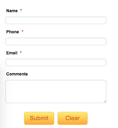
amyReplied on September 28, 2017 at 1:38 PM
I apologise that I missed.
Please give a try these custom CSS codes:
.form-label-left, .form-label-right, .form-label-left.form-label-auto, .form-label-right.form-label-auto {
width: 25% !important;
}
@media screen and (max-width: 480px), screen and (max-device-width: 767px) and (orientation: portrait), screen and (max-device-width: 415px) and (orientation: landscape) {
.form-address-city, .form-address-line, .form-address-postal, .form-address-state, .form-address-table, .form-address-table .form-sub-label-container, .form-address-table select, .form-input {
width: 70%;
}
How to Inject Custom CSS Codes
Here is my result:

You can also find my cloned form on this link: https://form.jotformpro.com/72704856723967
Please feel free to clone it on your end: How to Clone an Existing Form from a URL
-
EliteInsitesReplied on September 28, 2017 at 2:03 PM
Okay, I appreciate everyone's effort, but nobody seems to be getting the problem. All I am trying to do is stop Jotforms from changing the layout in the mobile view. Here is an actual video screen grab of what I'm talking about. You can see as soon as the viewport goes under 640px wide, the layout changes. All I want to do is stop this.

-
EliteInsitesReplied on September 28, 2017 at 2:04 PM
Here is the actual live page
http://pennmarma.com/pennmarma-mob-contact.html
-
Nik_CReplied on September 28, 2017 at 2:34 PM
I understand what you're referring to.
That is, the mobile responsiveness of fields, that's why they are changing the width like that and labels are moving up so on smaller screens (phones) you will have a better view. Since, if the labels are on the left, the text-box will have to be much smaller so it could fit the screen.
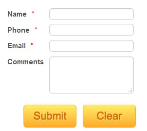
I adjusted the CSS provided by my colleague to this:
@media screen and (max-width: 640px), screen and (max-device-width: 767px) and (orientation: portrait), screen and (max-device-width: 415px) and (orientation: landscape) {
.form-address-city, .form-address-line, .form-address-postal, .form-address-state, .form-address-table, .form-address-table .form-sub-label-container, .form-address-table select, .form-input {
width: 50%;
}
.form-label {
display: inline-block!important;
width: 80px!important;
text-align: left!important;
}
And this is how it works:
You can check my cloned form to see how it works:
https://form.jotformpro.com/72705321551954
Let us know if that is what you had in mind.
Thank you!
-
EliteInsitesReplied on September 28, 2017 at 3:37 PM
Well, that's definitely closer, but still not exactly what I'm looking for. I really don't want there to be ANY responsiveness in the mobile view. I'm probably going to have to custom code the whole thing. Ugh!
-
Nik_CReplied on September 28, 2017 at 4:20 PM
I'm afraid that, aside from the code, I provided above, another solution would be to download the Full source code of the form, do the necessary changes and embed it like that.
You will have more control over the form in that way, and you can adjust the HTML which I think is the necessary way to make this work.
If you have any further questions please let us know.
Thank you!
-
EliteInsitesReplied on September 28, 2017 at 5:05 PM
That's what I ended up doing.
The problem is solved.(clear your browser cache first)
http://pennmarma.com/pennmarma-mob-contact.html
In keeping with the "most advanced form designer ever" boast, I think JotForms should consider including a way to either completely disable responsiveness from within the builder, or allow the client to set the media queries as they see fit. JotForms has created a mobile layout they like, and while it probably works fine for the majority of people, it may not be the right layout for some client's websites.Thank you everyone for your help.
-
Support_Management Jotform SupportReplied on September 28, 2017 at 6:16 PM
I'm glad my colleagues were able to help. 😊
I personally appreciate your candor. These kinds of feedback allow us to improve in the long run. You're correct with your assumption that majority of our users prefer the mobile responsiveness of their forms as this means another less thing to worry about design-wise.
However, having an option to disable the mobile responsive behavior of the form may also benefit others (like you in this case).
I put this up as a Feature Request and created a separate thread for you to follow.
-
wakinggirlReplied on October 5, 2017 at 2:17 PM
Many of us who use Jotform are using it because of the easy drag and drop that it once had.
That means, many of us are also using DRAG AND DROP website editors (Weebly).
It's almost impossible to make a Jotform look good in Weebly with the mobile-responsiveness. If I make a form 300pixels wide, it's gonna be mobile friendly, no matter what.
But for some reason, the form looks like ass on a website.
The whole reason I got into Jotform was because I could build a form in a minute. Now it takes HOURS to make it look decent.
Your solutions did not help me.
-
Support_Management Jotform SupportReplied on October 5, 2017 at 3:39 PM
Hello @wakinggirl - The solutions being discussed on this thread may not apply in your case. For us to better assist you, I moved your post to a separate thread:
https://www.jotform.com/answers/1266025
We'll have it addressed there shortly.
- Templates
- Integrations
- INTEGRATIONS
- See 100+ integrations
- FEATURED INTEGRATIONS
 PayPal
- Slack
- Google Sheets
- Mailchimp
- Zoom
- Dropbox
- Google Calendar
- Hubspot
- Salesforce
- See more Integrations
- Products
- PRODUCTS
- Form Builder
- Jotform Enterprise
- Jotform Apps
- Store Builder
- Jotform Tables
- Jotform Inbox
- Jotform Mobile App
- Jotform Approvals
- Report Builder
- Smart PDF Forms
- PDF Editor
- Jotform Sign
- Jotform for Salesforce Discover Now
- Support


