


-
yogeshdangiAsked on October 2, 2017 at 1:10 PM
Hi,
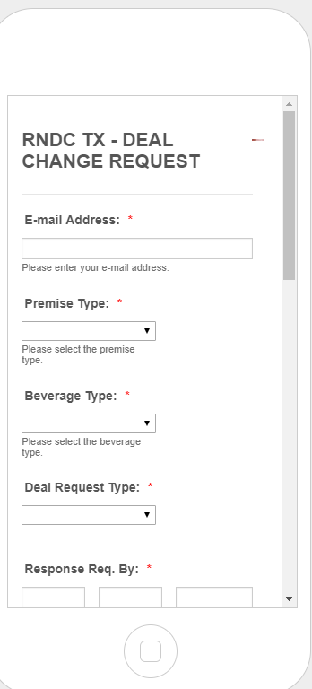
My form on mobile view is not displaying the image logo properly in header it appear very tiny on right side.
I also tried using this CSS
.form-all:before {
background-size: 75% auto;
background-position: center;
}Please let me know what changes I have to make.
-
Nik_CReplied on October 2, 2017 at 1:44 PM
Please try inserting the below CSS code in your Custom CSS Field:
@media only screen and (min-device-width : 375px) and (max-device-width : 667px) {
.form-header-group.hasImage>.header-logo {
display: inline-block;
float: right;
width: 165px!important;
bottom: 30px!important;
position: relative;
}
.header-text.httal.htvam {
font-size: 10px!important;
width: 150px!important;
}
}
Also, remove the existing CSS from that field.
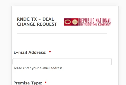
The form should look like this on phone:
Please let us know how that worked for you.
Thank you!
-
yogeshdangiReplied on October 2, 2017 at 2:16 PM
Hi Nik,
Thank you for the quick response. I tried these changes but it did not worked for me, still displaying in the same format. Anything else that I should add ?
Thank you
-
Nik_CReplied on October 2, 2017 at 2:59 PM
I'm sorry for that.
I assume you're testing your form on Android device. Since the form is working fine on several iPhones I test on?
Anyhow, please test this form: https://form.jotformpro.com/72745800051955 it should be working I tested on several devices (Android and iPhone) and it worked properly.
If it works for you please copy and paste the below CSS code instead of the one you already have:
@media only screen and (max-device-width : 667px) {
.form-header-group.hasImage>.header-logo {
display: inline-block;
float: right;
width: 165px!important;
bottom: 30px!important;
position: relative;
}
.header-text.httal.htvam {
font-size: 10px!important;
width: 150px!important;
}
}
Please let us know how it worked.
Thank you!
-
yogeshdangiReplied on October 3, 2017 at 12:40 PM
Thank you it worked for me now.
- Templates
- Integrations
- INTEGRATIONS
- See 100+ integrations
- FEATURED INTEGRATIONS
 PayPal
- Slack
- Google Sheets
- Mailchimp
- Zoom
- Dropbox
- Google Calendar
- Hubspot
- Salesforce
- See more Integrations
- Products
- PRODUCTS
- Form Builder
- Jotform Enterprise
- Jotform Apps
- Store Builder
- Jotform Tables
- Jotform Inbox
- Jotform Mobile App
- Jotform Approvals
- Report Builder
- Smart PDF Forms
- PDF Editor
- Jotform Sign
- Jotform for Salesforce Discover Now
- Support
