


-
CatalinaaAsked on October 5, 2017 at 11:21 PM
Hello,
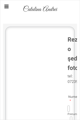
I have a custom page on Zenfolio platform that I did it with Jotform. It looks fine on desktop, but on mobile the page is squeezed.
Would you please have a look at this problem?
Kind regards,
Catalina
Page URL: http://www.catalina-andrei.com/contact -
Support_Management Jotform SupportReplied on October 6, 2017 at 3:50 AM
Hey Catalina - Is this what you're seeing from mobile?
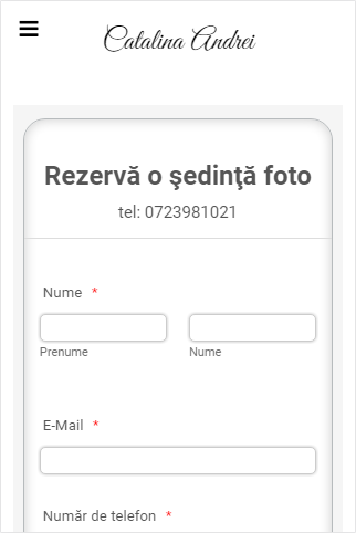
Can you please try injecting the following CSS Codes to your Form Builder:
@media only screen and (min-device-width: 320px) and (max-device-width: 480px) and (-webkit-min-device-pixel-ratio: 2) {
.form-section {
padding: 0 !important;
}
}
Result:
Complete guide: How-to-Inject-Custom-CSS-Codes
-
CatalinaaReplied on October 6, 2017 at 10:43 AMHello,
It worked! Thank you very much!
Kind regards,Catalina
On Friday, 6 October 2017, 10:50:55 EEST, JotForm wrote:
A new response has been received: Answered by Jim_R
Hey Catalina - Is this what you're seeing frommobile?
Can you please try injecting the following CSS Codes to your FormBuilder:
@media only screen and(min-device-width: 320px) and (max-device-width: 480px) and(-webkit-min-device-pixel-ratio: 2) {
.form-section{
padding: 0!important;
}
}
Result:
Completeguide: How-to-Inject-Custom-CSS-Codes
View this thread on browser » Unsubscribe Thread 1507276254
...
- Templates
- Integrations
- INTEGRATIONS
- See 100+ integrations
- FEATURED INTEGRATIONS
 PayPal
- Slack
- Google Sheets
- Mailchimp
- Zoom
- Dropbox
- Google Calendar
- Hubspot
- Salesforce
- See more Integrations
- Products
- PRODUCTS
- Form Builder
- Jotform Enterprise
- Jotform Apps
- Store Builder
- Jotform Tables
- Jotform Inbox
- Jotform Mobile App
- Jotform Approvals
- Report Builder
- Smart PDF Forms
- PDF Editor
- Jotform Sign
- Jotform for Salesforce Discover Now
- Support
