


-
milladesignmaccomAsked on October 13, 2017 at 9:38 AM
-
amyReplied on October 13, 2017 at 10:27 AM
Please inject these custom CSS to your form:
.calendar table, tr.days, .title{
width: 400px;
color: #144564 !important;
}
.calendar.popup {
border: 1px solid #0092cf !important;
border-radius: 3px;
-webkit-border-radius: 3px;
-moz-border-radius: 3px;
overflow: hidden;
}
.calendar tr.days td {
color: #353535 !important;
}
.calendar tr.days td:hover:not(.unselectable), div.calendar td.button:hover:not(.unselectable) {
background-color:#C5C9CC !important;
}
How to Inject Custom CSS Codes
Here is the result:

-
milladesignmaccomReplied on October 13, 2017 at 11:33 AM
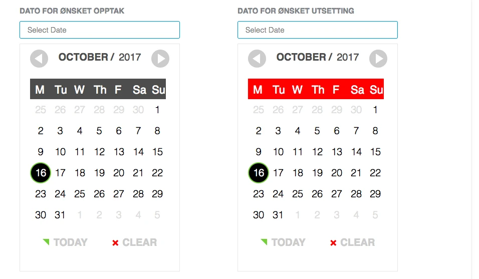
Hi, Have now looked and placed the css and tried to do some adjustment ... but if you look at my page I'm trying to get the look of the Date picker under ... its clean and has good space around the days and dates.
On the one above I don't want the "today" but the Month and year function is nice but the arrows are too small , I want it all to be white like the one under and no blue mark field of the weekend. The most easy thing would be to get the Date picker under to start the week at monday ...)
-
BJoannaReplied on October 13, 2017 at 12:42 PM
I saw your other thread and I saw that you wanted to use Date Picker Widget, but it is not possible to change the start of the week with that widget.
We can help you to customize the Date Picker field, but I would also like to mention that we have other date widgets. Did you check Large Date Picker widget?
The first day of the week is Monday, it does not have "today" and the arrows are larger than on basic Date Picker field.
Here is a demo form: https://form.jotform.com/72854783935977
If you do not like this widget, let us know and we will help you with the CSS code for the basic Date Picker field.
-
milladesignmaccomReplied on October 14, 2017 at 2:16 AM
Thank you, that one is great! Super!
Is there also a way to get this with Norwegian text? maybe in the css?
And in the mobile format it does not adjust ok - is there a css for this?
-
Nik_CReplied on October 14, 2017 at 4:31 AM
I'm afraid that translation of such field will not be possible. Since the translation of such field is not supported by our translation settings.
Regarding the mobile responsiveness, on which device did you test since I wasn't able to replicate this issue? The field is showing fine on my iPhone.
-
milladesignmaccomReplied on October 14, 2017 at 5:26 AM
ok, I leave it in english for now, but if you do now some solution that works for other languages please let me know :)
I view it on my iPhone 7 ... the Yellow circles with arrows goes over the month and year and the black circle that marks the date goes a bit over the date beside.
-
Welvin Support Team LeadReplied on October 14, 2017 at 6:01 AM
I don't have iPhone 7, but tested this on iPhone 6+ and the styles seems to be correct. No overlapping is happening in the widget. I'll ask my colleague to check further.
For the meantime, try injecting the following custom CSS codes in the widget:
.picker__nav--next {
right: -18px !important;
}
.picker__nav--prev {
left: -18px !important;
}
-
milladesignmaccomReplied on October 15, 2017 at 2:40 AM
The arrows is now fine but the circle around the selected date is to close to the date beside and the field for the days sunday: Su is cut of ...
Also I would like to get the border to be 3px radius and 1px solid. Tried this css (and put the font a bit smaller? so that it might fit in the phone size?, but it did not work:
}
.picker__nav--next {
right: -18px !important;
}
.picker__nav--prev {
left: -18px !important;
}
.picker__date {
font: 13px !important;
}
.picker {
font: 13px !important;
border : 1px solid #0092cf !important;
border-radius: 3px !important;
}
-
Nik_CReplied on October 15, 2017 at 4:13 AM
Please check this form: https://form.jotform.com/72872117951966
I inserted the below CSS code in Custom CSS Field:
@media only screen
and (min-device-width : 375px)
and (max-device-width : 667px) {
.custom-field-frame {
width: 120% !important;
}
.picker__table {
width: 271px!important;
}
.picker__frame {
width: 320px!important;
}
.picker__holder {
width: 320px!important;
}
}
That should work better when viewed on mobile:

Please try and let us know if it worked better.
Thank you!
-
milladesignmaccomReplied on October 15, 2017 at 12:08 PM
hmm it's even cut off more , I have tried to put in the css that the outside border should be 1 px as well but something is wrong ... could one cut off the button in the bottom "Today" and "clear"?
My css is:
input{
border : 1px solid #0092cf !important;
border-radius: 3px !important;
font-size: 15px !important;
}
.custom-field-frame {
font: 10px !important;
border : 1px solid #0092cf !important;
border-radius: 3px !important;
}
.picker__table {
font: 13px !important;
border : 1px solid #C5C9CC !important;
border-radius: 3px !important;
}
@media only screen {
and (min-device-width : 375px)
and (max-device-width : 667px)
}
.custom-field-frame {
width: 120% !important;
}
.picker__table {
width: 271px!important;
}
.picker__frame {
width: 320px!important;
}
.picker__holder {
width: 320px!important;
}
-
Nik_CReplied on October 15, 2017 at 3:53 PM
Did you test my form with custom code added?
https://form.jotform.com/72872176351965
I tested on iPhone 7 as well and the form is showing properly:

And in iPhone 7 simulator:

Could you please test the above form and let us know how it worked?
Thank you!
-
milladesignmaccomReplied on October 16, 2017 at 1:07 AM
that works fine. do you have the full css for that one?
And could it include the above issues:
that the outside border should be 1 px as well but something is wrong ... could one cut off the button in the bottom "Today" and "clear"?
-
Nik_CReplied on October 16, 2017 at 2:27 AM
The code I used is:
@media only screen
and (min-device-width : 375px)
and (max-device-width : 667px) {
.custom-field-frame {
width: 120% !important;
}
.picker__table {
width: 271px!important;
}
.picker__frame {
width: 320px!important;
}
.picker__holder {
width: 320px!important;
}
}
And that code you can just copy and paste in your Custom CSS Field.
Regarding the border, just to be sure, you need this increased:

When the day is, selected you need that border increased right?
-
milladesignmaccomReplied on October 16, 2017 at 2:34 AM
ok, I'll try that, but no I meant the grey border - the frame of the whole calendar ... it would be nice then if the yellow stripe under the days: Mo Tu etc got wider so that it don't seem that narrow on the left side for SU on the mobile version.
-
Nik_CReplied on October 16, 2017 at 4:18 AM
Thank you for additional information.
In order to make the border wider, please insert the below CSS in the Custom CSS of the field:
.date_theme .picker__box{
border: 8px solid #E6E6E6!important;
}

Unfortunately, I wasn't able to find a CSS that will increase the yellow stripe without affecting the rest of the field.
Let us know how it worked regarding the border.
Thank you!
-
milladesignmaccomReplied on October 16, 2017 at 11:20 AM
Is there any way for me to control the color and the size of fonts?
Also I don't want the today option and clear option. can I choose that?
And, It would be great if I could choose to write: Select a date in norwegian ... OR if it could be a calendar icon
but, hey I found another one where I could choose danish as language and thats nearby:) and it fits in my iPhone as well - It's not that nice but ... Is there a way for me to control css color and fonts on this one?
https://form.jotformeu.com/72751082288360
-
Nik_CReplied on October 16, 2017 at 12:38 PM
I'm glad you found a solution that works better for you :)
- You can change the color of the stripe by adding the below CSS code to Custom CSS of the widget:
th.picker__weekday {
background-color: red;
}

- To change the color of the next and back button, use the below CSS code:
.picker__nav--next {
background: red!important;
}
.picker__nav--prev{
background: red!important;
}
Just change the color (red).
To change the color of the numbers, the below CSS will do:
.picker__day {
color: red;
}
To change the font of numbers, for example, you can use this CSS:
.picker__day {
font-family: cursive!important;
}
Please try and let us know how it worked.
Thank you!
-
milladesignmaccomReplied on October 16, 2017 at 2:23 PM
Hi. It works fine with the new one, but can I control that the input shall be 290 px width and the datepopup 290 px width? And can I control the color and font?
-
aubreybourkeReplied on October 16, 2017 at 3:53 PM
To change the width of the input and the color of the text you can add this CSS to each date picker:
input{
width: 290px !important;
color:red;border : 1px solid #0092cf !important;
border-radius: 3px !important;
font-size: 15px !important;
}
.picker__nav--next {
right: -18px !important;
}
.picker__nav--prev {
left: -18px !important;
}I wasn't able to find a way to resize the datepopup.
I left a note for nik_c to see if he can fix it.
-
Nik_CReplied on October 16, 2017 at 4:42 PM
The most I could make is 320px in width of the widget, I couldn't make it to go bigger than that and if you shrink the width, it doesn't look good, but feel free to adjust.
Here is the code that goes to the Custom CSS of the widget:
.picker__holder {
width: 320px!important;
}
input.datepicker.picker__input.picker__input--active {
width: 320px!important;
}
And here is the code that you should place in Custom CSS Field:
iframe#customFieldFrame_112 {
width: 320px!important;
}
iframe#customFieldFrame_111{
width: 320px!important;
}
And this is how it looks like:
You can, of course, change the above numbers if you want to shrink the width.
Regarding the "And can I control the color and font?".
To which colors are you referring to? Since in my previous reply I provided the CSS that will change each segment of the field (popup though). So if you could be more specific please so we can provide the correct CSS if possible.
Thank you!
-
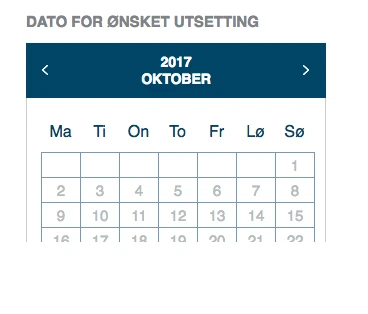
milladesignmaccomReplied on October 17, 2017 at 5:44 AM
I'm so sorry, I meant on the new calendar that worked better - that had danish language ...
DATOR FOR ØNSKET TID
and
DATOR FOR ØNSKET UTSETTING
I would like to be able to change the turquoise color to #0092cf and the font size to 15 px on the dates - and hopefully the rectangle with the dates within will be square and not rectangle...?
https://form.jotformeu.com/72751082288360
-
amyReplied on October 17, 2017 at 8:11 AM
Please add these custom CSS codes to your form to change the color of the theme and also change the font size of dates:
.turquoise-theme~#ui-datepicker-div .ui-datepicker-header, .turquoise-theme~#ui-datepicker-div td a.ui-state-active, .turquoise-theme~#ui-datepicker-div td a:hover {
background: #0092cf;
}
.turquoise-theme~#ui-datepicker-div th {
color: #0092cf;
}
.turquoise-theme~#ui-datepicker-div td {
border: 1px solid #0092cf;
}
#ui-datepicker-div td a {
font-size: 15px;
}
The result is:

However, please accept my apologies for I couldn't understand your request which is about rectangle and square.
-
milladesignmaccomReplied on October 17, 2017 at 8:14 AM
Thank you - I'll try this.
The other question was that the table for the dates has rectangle areas not square ... I guess it will only tak a padding css around the dates? so it's not that close to the lines of the table?
-
aubreybourkeReplied on October 17, 2017 at 10:39 AM
I edited the CSS code for each widget to look like this (replace it with this):
.picker__holder {
width: 320px!important;
height: 800px !important;
}
input.datepicker.picker__input.picker__input--active {
width: 320px!important;
height: 800px !important;
}
input{
border : 1px solid #0092cf !important;
border-radius: 3px !important;
font-size: 15px !important;
width: 292px !important;
}.turquoise-theme~#ui-datepicker-div .ui-datepicker-header, .turquoise-theme~#ui-datepicker-div td a.ui-state-active, .turquoise-theme~#ui-datepicker-div td a:hover {
background: #144564;
}
.turquoise-theme~#ui-datepicker-div th {
color: #144564;
}
.turquoise-theme~#ui-datepicker-div td {
border: 1px solid #7C99B4;
}#ui-datepicker-div td a {
font-size: 15px;
font-weight: normal;
color: #B6BBC0;
padding-top: 4px !important;
padding-bottom: 4px !important;
}Then in your forms CSS I added this:
iframe#customFieldFrame_129 {
width: 320px!important;
height: 800px !important;
}iframe#customFieldFrame_130{
width: 320px!important;
height: 800px !important;
}It will look like this:

-
milladesignmaccomReplied on October 17, 2017 at 11:20 AM
This looks really nice now, only thing is the large space under the calendar - can delete the space so that the calendar push the content below down when its chosen.
-
BJoannaReplied on October 17, 2017 at 12:51 PM
Please change the height of the CSS code that my colleague aubreybourke provided you from 800px to 300px:
iframe#customFieldFrame_129 {
width: 320px!important;
height: 800px !important;
}
iframe#customFieldFrame_130{
width: 320px!important;
height: 800px !important;
}
You test my form, where I changed the height: https://form.jotform.com/72894920653971
-
milladesignmaccomReplied on October 17, 2017 at 3:35 PM
It is still a large empty space when the calendar is not selected - and after the date are selected...
-
Nik_CReplied on October 17, 2017 at 3:52 PM
I'm afraid that you will have to keep the above height to 305px so the calendar will show when you open it. Otherwise, the iframe's height will be less than the height of the popup, therefore the calendar will not show:
So if you want to keep the current size of the popup, it has to be like that, otherwise, the height of the popup needs to decrease in order to make that empty space smaller.
-
milladesignmaccomReplied on October 17, 2017 at 4:19 PM
-
John_BensonReplied on October 17, 2017 at 6:58 PM
Hi,
I have decided to move your new issue to a new thread. Please wait for our response on this URL: https://www.jotform.com/answers/1275795
Thank you.
- Templates
- Integrations
- INTEGRATIONS
- See 100+ integrations
- FEATURED INTEGRATIONS
 PayPal
- Slack
- Google Sheets
- Mailchimp
- Zoom
- Dropbox
- Google Calendar
- Hubspot
- Salesforce
- See more Integrations
- Products
- PRODUCTS
- Form Builder
- Jotform Enterprise
- Jotform Apps
- Store Builder
- Jotform Tables
- Jotform Inbox
- Jotform Mobile App
- Jotform Approvals
- Report Builder
- Smart PDF Forms
- PDF Editor
- Jotform Sign
- Jotform for Salesforce Discover Now
- Support


