


-
mike1444Asked on October 13, 2017 at 10:48 PM
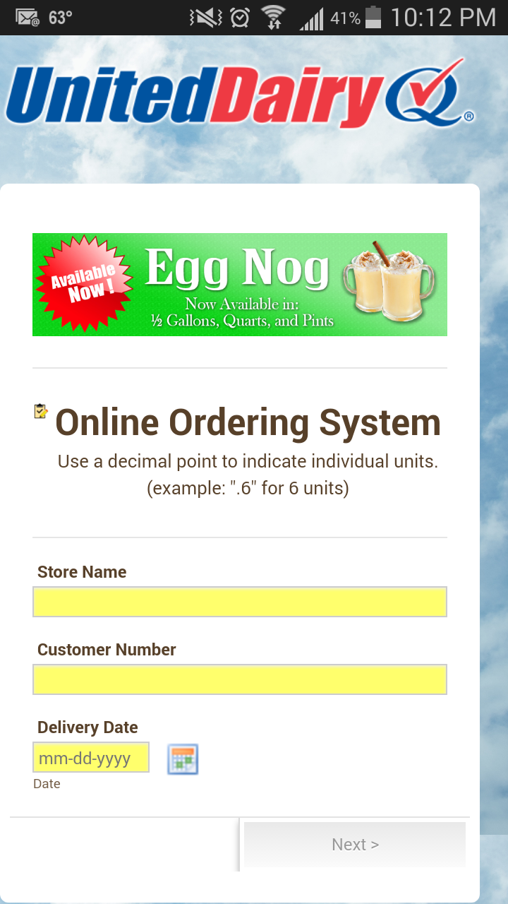
Hello. I've read a lot of forums about centering the form on mobile and tried several css suggestions. Can you take a look and see what I'm doing wrong? I'm viewing the form on a Galaxy S3 and it has no left margin. (*See screenshot and thanks in advance!)
 Page URL: https://form.jotform.co/72767506334865
 -
John_BensonReplied on October 13, 2017 at 11:40 PM
To center the form when viewing it on mobile device, please add this custom CSS code:
@media screen and (max-width: 923px)
.jotform-form .form-all {
width: 100% !important;
}
Here's a guide on: How-to-Inject-Custom-CSS-Codes
Here's the result on my cloned form:

-
mike1444Replied on October 14, 2017 at 12:01 AM
I've injected the code. It hasn't solved the problem but I noticed as the page loads the logo image seems to "push" the form to the left.
-
mike1444Replied on October 14, 2017 at 12:10 AM
Here is the mobile preview on jotform.com after injecting the css.

-
John_BensonReplied on October 14, 2017 at 2:09 AM
Sorry for the confusion.
The custom CSS code that I have provided is missing a bracket. To fix it, please remove the previous custom CSS code and replace it with this:
@media screen and (max-width: 923px)
{
.jotform-form .form-all {
width: 100% !important;
}
}
Here's my screen capture result:

I hope this helps. If you have any questions, please contact us again.
-
mike1444Replied on October 14, 2017 at 8:36 AM
Thanks John! Works perfectly. Based on all the forums I've visited your support team is awesome!
-
Elton Support Team LeadReplied on October 14, 2017 at 10:04 AM
We are happy to hear it and thanks for the compliments.
Cheers! :)
- Templates
- Integrations
- INTEGRATIONS
- See 100+ integrations
- FEATURED INTEGRATIONS
 PayPal
- Slack
- Google Sheets
- Mailchimp
- Zoom
- Dropbox
- Google Calendar
- Hubspot
- Salesforce
- See more Integrations
- Products
- PRODUCTS
- Form Builder
- Jotform Enterprise
- Jotform Apps
- Store Builder
- Jotform Tables
- Jotform Inbox
- Jotform Mobile App
- Jotform Approvals
- Report Builder
- Smart PDF Forms
- PDF Editor
- Jotform Sign
- Jotform for Salesforce Discover Now
- Support


