
-
lscclibraryAsked on October 17, 2017 at 3:37 PM
When viewing my form via a mobile device the form fails to render properly on a small/phone screen. See link (https://cl.ly/n8YN). Here is the link to the form.
Page URL: https://form.jotform.com/72684673524162 -
MikeReplied on October 17, 2017 at 5:35 PM
It looks like that your form design/theme is based on a Adobe FormsCentral imported template, so the form looks a bit different on mobile compared to the standard themes.
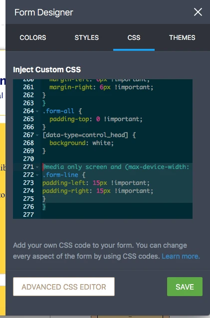
I have replaced the HTML heading element on your form with a standard Header element and added the next CSS:
@media only screen and (max-device-width: 550px){
.form-line.form-line-column {
margin-left: 0;
}
.jotform-form {
padding-top: 0;
}
.form-all {
padding-top: 0 !important;
width: 100% !important;
box-sizing: border-box;
}
.form-submit-button {
height: inherit !important;
}
.header-logo {
min-width: 75px;
vertical-align: middle;
}
div.form-header-group {
margin-left: 6px !important;
margin-right: 6px !important;
}
}
.form-all {
padding-top: 0 !important;
}
[data-type=control_head] {
background: white;
}
Please re-check the form on mobile.
-
lscclibraryReplied on October 17, 2017 at 6:06 PM
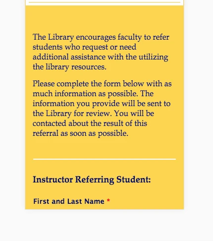
Thanks. The form looks better on my iPad but the form fields are stretched to the edges of my phone. See link below.
-
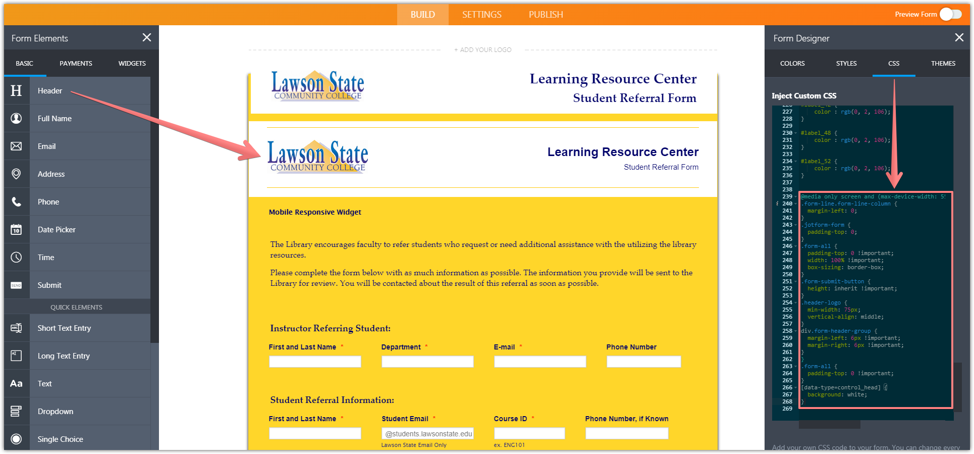
MikeReplied on October 17, 2017 at 7:38 PM
This is normal for mobile view. If you would like to add some paddings around the text boxes we can help with the CSS.
Would you like to have something like this?
-
lscclibraryReplied on October 17, 2017 at 7:43 PM
Yes that would perfect. Could you also provide me the CSS so that I can apply it to my other forms.
-
MikeReplied on October 17, 2017 at 8:54 PM
Here is a sample CSS to set the 15 pixels left and right paddings on the mobile view:
@media only screen and (max-device-width: 550px){
.form-line {
padding-left: 15px !important;
padding-right: 15px !important;
}
}
-
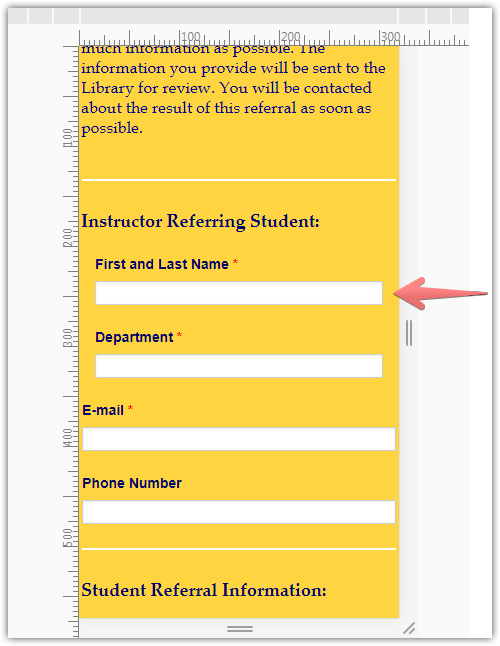
lscclibraryReplied on October 17, 2017 at 10:03 PM
Where exactly would I put this in the form? Once I select the CSS tab in the form is there a specific area where this should be placed?
-
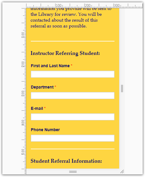
RoseReplied on October 18, 2017 at 4:20 AM
You can put that particular css code to a place where does not engage with other css codes. I put it to the bottom on the cloned form and it just works as my colleague said.
Here is the screenshot how your form will be seen after this:
If you have more questions, please do not hesitate to contact us.
- Templates
- Integrations
- INTEGRATIONS
- See 100+ integrations
- FEATURED INTEGRATIONS
 PayPal
- Slack
- Google Sheets
- Mailchimp
- Zoom
- Dropbox
- Google Calendar
- Hubspot
- Salesforce
- See more Integrations
- Products
- PRODUCTS
- Form Builder
- Jotform Enterprise
- Jotform Apps
- Store Builder
- Jotform Tables
- Jotform Inbox
- Jotform Mobile App
- Jotform Approvals
- Report Builder
- Smart PDF Forms
- PDF Editor
- Jotform Sign
- Jotform for Salesforce Discover Now
- Support