


-
NippersDAsked on October 27, 2017 at 6:33 PM
any suggestions (CSS) to help with ensuring text is wrapping onto next line correctly? For example, on my iPhone 6 in vertical mode (as well as on your Preview), text in the rows is being cut off mid-word and displayed at the start on the next line.
Page URL: https://form.jotform.com/72957527045969 -
MikeReplied on October 27, 2017 at 8:41 PM
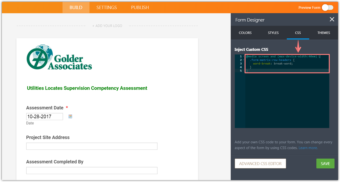
You may try adding the next CSS to the form:
@media screen and (max-device-width:40em) {
.form-matrix-row-headers {
word-break: break-word;
}
}
If you need any further assistance, please let us know.
-
NippersDReplied on October 30, 2017 at 4:19 PM
that worked. thank you
- Templates
- Integrations
- INTEGRATIONS
- See 100+ integrations
- FEATURED INTEGRATIONS
 PayPal
- Slack
- Google Sheets
- Mailchimp
- Zoom
- Dropbox
- Google Calendar
- Hubspot
- Salesforce
- See more Integrations
- Products
- PRODUCTS
- Form Builder
- Jotform Enterprise
- Jotform Apps
- Store Builder
- Jotform Tables
- Jotform Inbox
- Jotform Mobile App
- Jotform Approvals
- Report Builder
- Smart PDF Forms
- PDF Editor
- Jotform Sign
- Jotform for Salesforce Discover Now
- Support

