


-
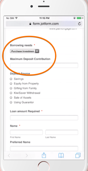
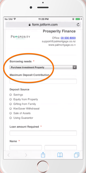
PAL_ConnieAsked on October 28, 2017 at 4:43 PM2. When people access the page from their mobile, the text / dropdown boxes length are out of order - the width I set for the form seems to only work on the desktop version but not mobile version. Please see comparison of the two screenshots. e.g. 'Borrowing Needs' field should be slightly longer (correct in the desktop version on page 1) but very narrow on mobile (page2). In contrast, the ‘Maximum Deposit Contribution' box are too long on mobile but right on desktop version.
-
jonathanReplied on October 28, 2017 at 7:26 PM
I was able to see the issue as well.
To fix, please add this CSS codes on your form.
@media screen and (max-width: 480px)
{
#cid_267,#cid_299,#cid_327 {
width: 100% !important;
}
}
result:
Let us know if this did not work.
-
PAL_ConnieReplied on October 28, 2017 at 9:43 PMThanks. Where do I add this? And it is for every box that not the right size?
... -
John_BensonReplied on October 28, 2017 at 10:26 PM
To add the custom CSS code provided by my colleague, please follow this guide: https://www.jotform.com/help/117-How-to-Inject-Custom-CSS-Codes
Please check it and let us know what other box did not change so we can check it further.
-
PAL_ConnieReplied on October 28, 2017 at 11:43 PMThanks very much. Awesome.
...
- Templates
- Integrations
- INTEGRATIONS
- See 100+ integrations
- FEATURED INTEGRATIONS
 PayPal
- Slack
- Google Sheets
- Mailchimp
- Zoom
- Dropbox
- Google Calendar
- Hubspot
- Salesforce
- See more Integrations
- Products
- PRODUCTS
- Form Builder
- Jotform Enterprise
- Jotform Apps
- Store Builder
- Jotform Tables
- Jotform Inbox
- Jotform Mobile App
- Jotform Approvals
- Report Builder
- Smart PDF Forms
- PDF Editor
- Jotform Sign
- Jotform for Salesforce Discover Now
- Support

