


-
LKostinasAsked on October 30, 2017 at 3:06 PM
I have had several say they can't fill out my form. One I am not sure what device she is using, but one told me it was an Android phone. Is there something I should be doing to make the form enitrely visable?
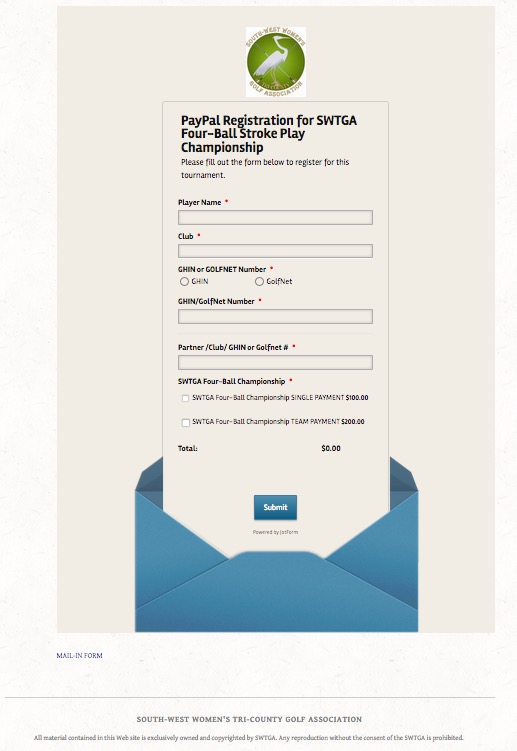 Page URL: http://swtga.org/four-ball
 -
aubreybourkeReplied on October 30, 2017 at 3:33 PM
I tested your form on a Samsung Galaxy S8. And found the problem you are experiencing. Its true that the end of the form is being cut off. So your users cant even see the submit button. And they cant submit the form.
For example:

The solution is to use the following CSS code:
.form-all{
margin-bottom: 400px !important;
}How to Inject Custom CSS Codes
Hope that helps!
-
LKostinasReplied on October 30, 2017 at 4:43 PMLet me make sure I have the code correct:
.form-all{margin-bottom: 400px !important;}
The only spaces in the code are after the colon : and after the x before the exclamation point! . Do I have it correct? I did that and see no difference in the form…but I assume the users of Androids and Galaxies will see the whole form? Can I do this with all my forms in the future to assure the Android users will see the form?
Thank you for all your help.
Lorraine Kostinas
111 Madison Street | Newtown, PA 18940
2145 Aberdeen Lane | #201 | Naples, FL 34109
c: 609.462.9892
... -
aubreybourkeReplied on October 30, 2017 at 4:54 PM
The difference isn't very obvious. But if you apply that code that will increase the length of the form by 400 pixels. You can test it on a mobile phone. It should work.
If you want to prevent this from happening again, yes you could use the same CSS code again. Or you can try a different approach. The problem is not your stand alone form ( the form on JotForm is fine ). Its how you are embedding your form on your site.
I think you must be using the standard embed method right? That can sometimes cause problems. The solution is to use the iFrame embed method for all your forms instead because its much more reliable:
- Templates
- Integrations
- INTEGRATIONS
- See 100+ integrations
- FEATURED INTEGRATIONS
 PayPal
- Slack
- Google Sheets
- Mailchimp
- Zoom
- Dropbox
- Google Calendar
- Hubspot
- Salesforce
- See more Integrations
- Products
- PRODUCTS
- Form Builder
- Jotform Enterprise
- Jotform Apps
- Store Builder
- Jotform Tables
- Jotform Inbox
- Jotform Mobile App
- Jotform Approvals
- Report Builder
- Smart PDF Forms
- PDF Editor
- Jotform Sign
- Jotform for Salesforce Discover Now
- Support


