


-
rbell1Asked on November 7, 2017 at 4:23 PM
Can you please make the "I agree" appear as in the screenshot.
Thanks
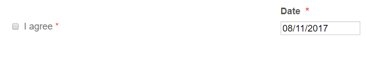 Page URL: https://form.jotform.co/72846082241859
 -
Support_Management Jotform SupportReplied on November 7, 2017 at 5:37 PM
Try the following CSS codes to move the asterisk next to the checkbox option:
.form-required {
position: absolute;
left: 265px;
}
Complete guide: How-to-Inject-Custom-CSS-Codes
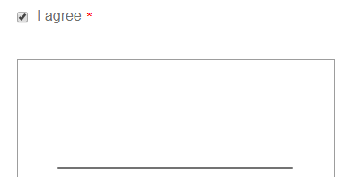
Result:
-
rbell1Replied on November 7, 2017 at 5:53 PM
Sorry but that seemed to move all the asterisk's in the form to that position. Can we move the "I agree" to be left aligned, and then put the asterisk on the right of the "I agree". "I agree" appears twice in the form.
Thanks
-
MarvihReplied on November 7, 2017 at 7:38 PM
Would you like to use the "Terms & Condition" widget instead ?. This would be the perfect choice instead of using the Multiple Choice field .
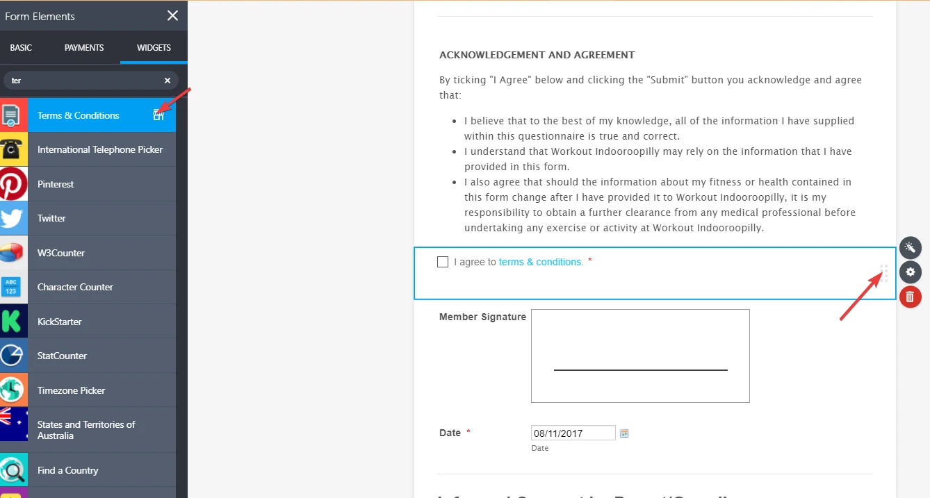
It is very easy to use and supports hyperlink.
-
Support_Management Jotform SupportReplied on November 8, 2017 at 4:54 AM
Sorry about that - Can you please change the CSS codes
FROM:
.form-required {
position: absolute;
left: 265px;
}
TO:
#label_68, #label_63 {
margin-left: 230px;
margin-right: -230px;
}
This should take care of both the I agree fields on your form.
- Templates
- Integrations
- INTEGRATIONS
- See 100+ integrations
- FEATURED INTEGRATIONS
 PayPal
- Slack
- Google Sheets
- Mailchimp
- Zoom
- Dropbox
- Google Calendar
- Hubspot
- Salesforce
- See more Integrations
- Products
- PRODUCTS
- Form Builder
- Jotform Enterprise
- Jotform Apps
- Store Builder
- Jotform Tables
- Jotform Inbox
- Jotform Mobile App
- Jotform Approvals
- Report Builder
- Smart PDF Forms
- PDF Editor
- Jotform Sign
- Jotform for Salesforce Discover Now
- Support


