


-
bdoodleAsked on December 4, 2017 at 11:02 AM
Hello,
I think it's great that you have made my web forms responsive by default. To make the forms easier to use on a phone though, I'd like to have the input fields be less wide. Many of them just need to accommodate a two digit number and others a short color selection. Where I seek an address, the input fields are very wide making entry difficult. Please give me some guidance on how to get my fields less wide when viewed on an iphone. (I don't have an iPad to do any testing, but it should work well there as well.)
To start, please look at:
http://www.madsails.com/gear.html
http://www.madsails.com/Order_FS_sails.html
-
BJoannaReplied on December 4, 2017 at 12:15 PM
Which input fields exactly to your want to make less wider on an iPhone?
Please provide us a screenshots of those fields from your phone and tell us how wide should they be.
-
bdoodleReplied on December 4, 2017 at 2:01 PM
I don't know how to take a screenshot on my phone, but it is almost every field. I should think it would be obvious if you open the links I gave you above.
In addition, on the gear page (link above), the bottom of the form is black, perhaps because it's running into the black webpage footer because the form is lengthened to put each field on one line for phone display.
-
Richie JotForm SupportReplied on December 4, 2017 at 3:59 PM
You can use media queries css to adjust the width of your input fields depending on the size of the mobile device.
Here is a sample media query code:
@media(max-width:480px){ /* for small devices*/
}
@media(max-width:600px) and (min-width:481px){/* for small tilted phones*/
}
For the knowing the ID of an element field, you can click an element then Properties > Advanced then scroll down until you find Field Detial's.
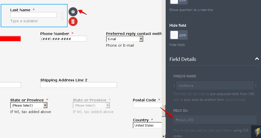
When you have the ID you can insert that in your media query.
@media(max-width:480px){ /* for small devices*/
#input_305{
width:20% !important;
}
}
Note: If you want to change the whole input text width, you can use the css tag "input".
@media(max-width:480px){
input{
width:"your desired width";
}
}
You can refer to this guide on how to inject custom css:
-
bdoodleReplied on December 4, 2017 at 4:22 PM
Thank you for the helpful information. I'll see what I can do to adjust field lengths.
What about the black at the bottom of the gear page that I mention above? Why is that happening when viewed on a phone and how can I prevent it?
-
BJoannaReplied on December 4, 2017 at 6:00 PM
Please re-embed your form with the iFrame code to see if that will resolve the black bottom issue. Inside of this guide, you can find how to get an iFrame code of your form:
-
bdoodleReplied on December 5, 2017 at 10:26 AM
I tried iFrame embed, but it was no better. I have returned to using default script embed.
Also, if I specify that all input should be a certain width, can I override a few to be larger with explicit code and !important?
-
BJoannaReplied on December 5, 2017 at 11:08 AM
Please add this CSS code to your form to see if that will fix the issue with the width of the fields and with the black bottom:
#id_304 {
width : 20%!important;
}
#id_305 {
width : 20%!important;
}
#id_322 {
width : 30%!important;
}
#id_306 {
width : 20%!important;
}
#id_307 {
width : 30%!important;
}
#id_308 {
width : 30%!important;
}
#id_309 {
width : 30%!important;
}
#id_310 {
width : 20%!important;
}
#id_367 {
width : 15%!important;
}
#id_312 {
width : 15%!important;
}
#id_313 {
width : 15%!important;
}
#id_315 {
width : 80%!important;
}
-
bdoodleReplied on December 5, 2017 at 11:20 AM
Before I read your reply above, I added the following to the CSS of a clone of my gear order form embedded in http://www.madsails.com/GearTest.html :
@media(max-width:480px){
input{
width:20%!important;
}
I can't see any difference in the form on my iphone. Did I do it wrong?
Given the number of fields on my forms, I'd rather specify a smaller input width in general and then override the few that should be larger. If that will not work, then I'll do it field by field as you show above.
-
BJoannaReplied on December 5, 2017 at 11:59 AM
You did not add the second closing bracket:
@media(max-width:480px){
input{
width:20%!important;
}
}
However, you will see the difference if you test your standalone form in browser and resize it- https://form.jotform.com/form/73384812909970
Please note that your website is not mobile responsive and your form is also not fully responsive because all of the CSS codes that you added to your form.
When you view your form on a mobile device it is actually a desktop view but everything is smaller so it can fit, so I am not exactly sure if media query will help you to resolve this issue.
You can also try with the CSS code that I previously provided you.
-
bdoodleReplied on December 5, 2017 at 5:24 PM
Hello,
What I did:
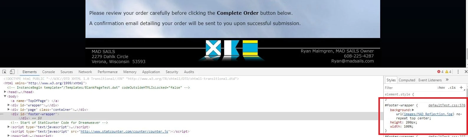
1.) I created and installed a test webpage called:
www.madsails.com/GearTest.html
I inserted <meta name="viewport" content="width=device-width, initial-scale=1.0"> into it, and it invokes my Clone of Gear Order test form. (The webpage is also using test CSS called defaultTest.css.)
2.) I changed the FORM's css...
a.) to include (as you recommended):
#input_304 {
width: 20% !important;
}
b.) I removed the media query code I had inserted that referred to all input.
3.) Then I looked at the resulting pages on my desktop and iphone.
Results:
The #input_304 (first name) field size was adjusted nicely for use on my iphone, but it was adjusted to be too small for use on my desktop.
NOTES:
A.) I also tried min-width. It looked good on my desktop, but the iphone view showed the field way too wide again.
B.) Finally, I tried putting the code for #input_304 within the media query:
@media(max-width:480px){
#input_304 {
width: 20% !important;
}
}
It also looked good on my desktop, but the iphone view showed the field way too wide.
Please advise.
====================
Most or all of the css code in my form that is not specific to a field (e.g. .form-product-item, etc.) was put there to address a problem with my form at the direction of your support team so I don't well understand it. If some of the css code will interfere with the form's responsiveness, please identify it so I can seek alternative solutions.
Thank you.
-
MikeReplied on December 5, 2017 at 7:45 PM
The next query seems to be affecting your form on the mobile:
@media screen and (max-device-width: 40em) {
}So you can try the next query:
@media screen and (max-device-width: 40em) {
#input_304 {
width: 20% !important;
}
}Thank you.
-
bdoodleReplied on December 6, 2017 at 10:18 AM
Thank you. That works to properly size certain fields on both desktop and iphone.
Can you tell what's causing the bottom of the screen on phone display to be black and the footer to be missing? ...something about the height of the form vs page?
-
BJoannaReplied on December 6, 2017 at 11:39 AM
I am not sure what is causing the issue. On the test page, http://www.madsails.com/GearTest.html that you provided the footer is also not shown on the desktop. I inspected the code of that page and the height of the footer is set to 100%. Please change the height form 100% to 200px.
You can also try to increase the height of your webpage.
-
BJoannaReplied on December 6, 2017 at 3:51 PM
I checked this with my colleague Mike and he think that the issue is related your background image that is not covering the whole page.
Please add background-size: cover; to the div element on your webpage to see if that will resolve the issue.

- Templates
- Integrations
- INTEGRATIONS
- See 100+ integrations
- FEATURED INTEGRATIONS
 PayPal
- Slack
- Google Sheets
- Mailchimp
- Zoom
- Dropbox
- Google Calendar
- Hubspot
- Salesforce
- See more Integrations
- Products
- PRODUCTS
- Form Builder
- Jotform Enterprise
- Jotform Apps
- Store Builder
- Jotform Tables
- Jotform Inbox
- Jotform Mobile App
- Jotform Approvals
- Report Builder
- Smart PDF Forms
- PDF Editor
- Jotform Sign
- Jotform for Salesforce Discover Now
- Support


