


-
AusomeAsked on December 7, 2017 at 10:46 AM
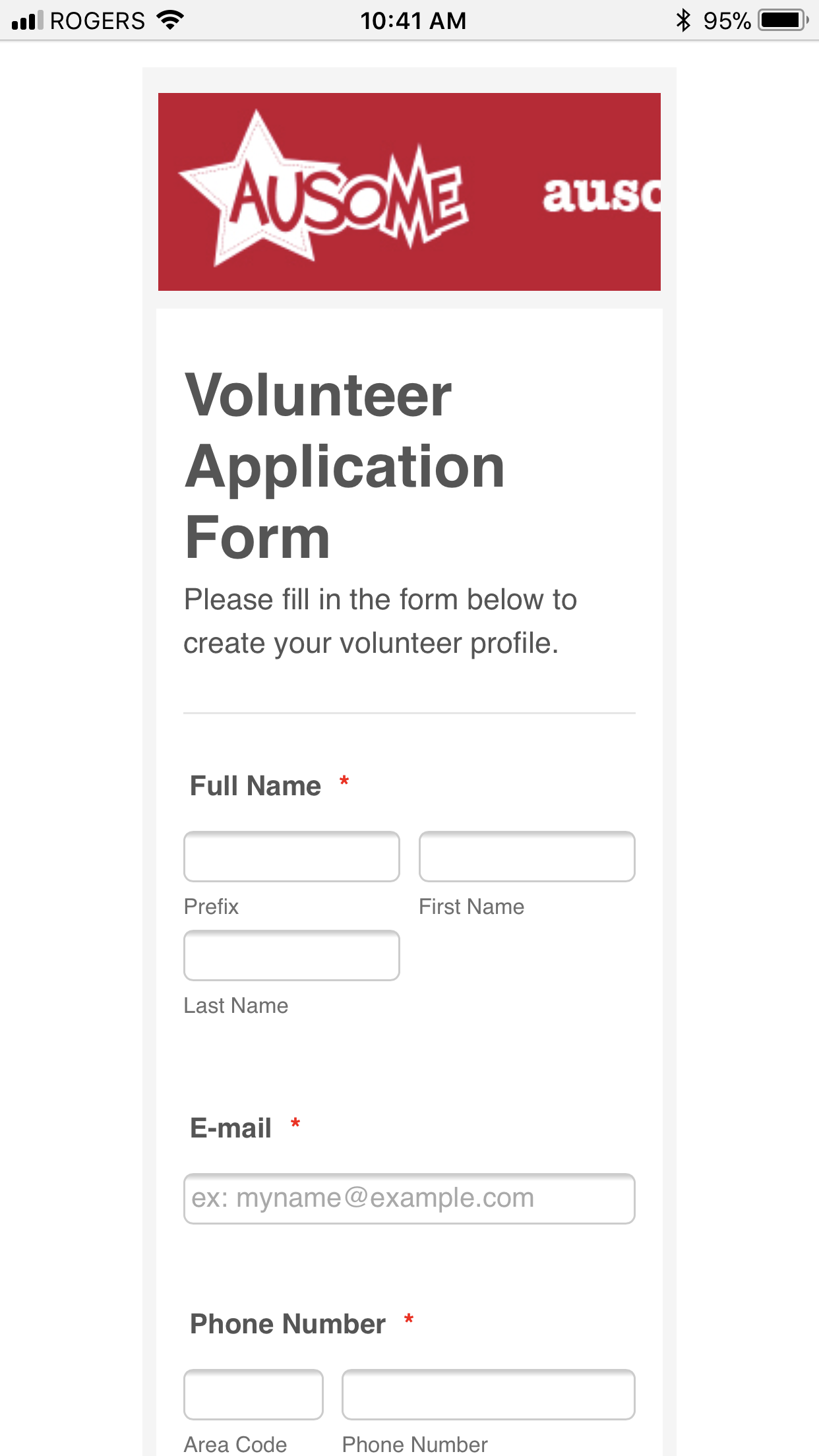
Hi, love JotForm! I've made headers for my form which I'd like to appear on mobile as well, but they're getting cut off on mobile.
Is there a mobile safe zone, or how do you recommend I work around this?
thanks,
Julia Albert
-
Richie JotForm SupportReplied on December 7, 2017 at 11:19 AM
Hi,
You can add this css code to resize your header to fit to mobile.
@media (max-width:600px) and (min-width:481px){
.form-all:before{
background-size : 83% 100% !important;
}
}
@media(max-width:480px){
.form-all:before{
background-size : 100% 100% !important;
}
}Here is a guide on how to insert custom css in to your form :
How-to-Inject-Custom-CSS-Codes
- Templates
- Integrations
- INTEGRATIONS
- See 100+ integrations
- FEATURED INTEGRATIONS
 PayPal
- Slack
- Google Sheets
- Mailchimp
- Zoom
- Dropbox
- Google Calendar
- Hubspot
- Salesforce
- See more Integrations
- Products
- PRODUCTS
- Form Builder
- Jotform Enterprise
- Jotform Apps
- Store Builder
- Jotform Tables
- Jotform Inbox
- Jotform Mobile App
- Jotform Approvals
- Report Builder
- Smart PDF Forms
- PDF Editor
- Jotform Sign
- Jotform for Salesforce Discover Now
- Support

