
-
methodgraphicsAsked on December 8, 2017 at 12:40 PM
The Next button is not responsive at the bottom of the page.
This is on iPad
-
Richie JotForm SupportReplied on December 8, 2017 at 12:59 PM
You can add this css codes to your form to fix the issue.
@media (max-width:480px){
.form-pagebreak-next{
width:100px!important;
margin-left:-130px;
}
}Here is a guide on how to insert custom css to your form. How-to-Inject-Custom-CSS-Codes
I Hope this helps.
-
methodgraphicsReplied on December 8, 2017 at 5:53 PM
It did not help at all. Why am I adding a bandaid to a broken function? You shouldn't be adding more code to broken code.
We are trying to decide if we want this at work, but there are so many bugs that just are not consistent...
-
methodgraphicsReplied on December 8, 2017 at 5:54 PM
And the title of this thread is nowhere close to my issue? I didnt type that.
-
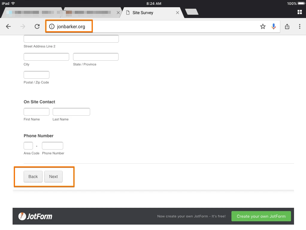
John_BensonReplied on December 8, 2017 at 7:40 PM
Here's a screenshot of your website on my iPad mini 2:
The form is mobile responsive. To test it, please open the form in the form builder and click the preview button.

If you want to change the Next button size, style, etc. you need to add custom CSS code to your form.
Let us know if you need further assistance. Thank you.
- Templates
- Integrations
- INTEGRATIONS
- See 100+ integrations
- FEATURED INTEGRATIONS
 PayPal
- Slack
- Google Sheets
- Mailchimp
- Zoom
- Dropbox
- Google Calendar
- Hubspot
- Salesforce
- See more Integrations
- Products
- PRODUCTS
- Form Builder
- Jotform Enterprise
- Jotform Apps
- Store Builder
- Jotform Tables
- Jotform Inbox
- Jotform Mobile App
- Jotform Approvals
- Report Builder
- Smart PDF Forms
- PDF Editor
- Jotform Sign
- Jotform for Salesforce Discover Now
- Support